Evolution: 2014 – 2018

Evolution-des-wissens

Most things evolve and this blogging lark is no different.

My blog started off as a way to get the ‘madness at work’ things off my chest….which probably explains why the first few posts could be considered a bit ‘ranty’. Ho hum.

I then got a bit more thoughtful (I think). I adopted a stance of ‘professional provocation’ – challenging the status quo but doing so with analysis and evidence…and the length of my posts got longer. Sorry about that.

Then I realised that the blog was a rather useful extension of my work educating and coaching people.  It became a sort of service: you could pick up the phone or drop by my desk – have a conversation about your situation, receive some well-intended ‘organisational therapy’ from me and a promise that I’d try to put our conversation into useful and re-usable words. I’d usually get something out ‘within a week’…. though not always – some of the more involved posts took months!

And at some stage throughout all that, I realised that it was all rather generic anyway. It is applicable to people in organisations all around the world…hence why I decided that anyone curious could read it for themselves.

When ‘going public’ I wanted to keep myself anonymous because I don’t think that people need to know who the hell I am – my words should either stand up as being interesting, credible and useful or not.

Things have slightly changed for me over the last six months – I’ve been dabbling with ‘doing my own thing’ (i.e. from employment to solo consulting)…which partly explains why the blog went rather quiet. I spent a bit of time writing and piloting a one-day education course titled ‘Systems Thinking and Intervention: The Fundamentals’. The day is based around the elements of Deming’s ‘Theory of Profound Knowledge’.

If you are (or know of) a curious organisation in New Zealand (or perhaps over in Australia) and find my work interesting, then you are very welcome to contact me for a chat. I can help with initial education (such as my one-day course) and then with coaching and supporting the curious, to study and improve their system.

  • You can contact me* at: Steve@Schefer.co.uk
  • You can also have a read through my 1 page (2-sided) course brochure:

Systems Thinking and Intervention – The fundamentals – course leaflet

Okay, that’s enough of that! Don’t worry – I’m not about to change this blog into an attempted sales tool 🙂 . I’m interested in talking to people who would like to pull my help. I have no desire to push it onto anyone!

* I’ve also added an ‘About me’ page to the blog menu bar and this also contains my contact details.

Thanks for reading,

Steve


How good is that one number?

Lottery ballsThis post is a promised follow up to the recent ‘Not Particularly Surprising’ post on Net Promoter Score.

I’ll break it into two parts:

  • Relevance; and
  • Reliability

Part 1 – Relevance

A number of posts already written have explained that:

Donald Wheeler, in his superb book ‘Understanding Variation’, nicely sets out Dr Walter Shewhart’s1 ‘Rule One for the Presentation of Data’:

“Data should always be presented in such a way that preserves the evidence in the data…”

Or, in Wheeler’s words “Data cannot be divorced from their context without the danger of distortion…[and if context is stripped out] are effectively rendered meaningless.”

And so to a key point: The Net Promoter Score (NPS) metric does a most excellent job of stripping out meaning from within. Here’s a reminder from my previous post that, when asking the ‘score us from 0 – 10’ question about “would you recommend us to a friend”:

  • NPS scaleA respondent scoring a 9 or 10 is labelled as a ‘Promoter’;
  • A scorer of 0 to 6 is labelled as a ‘Detractor’; and
  • A 7 or 8 is labelled as being ‘Passive’.

….so this means that:

  • A catastrophic response of 0 gets the same recognition as a casual 6. Wow, I bet two such polar-opposite ‘Detractors’ have got very different stories of what happened to them!

and yet

  • a concrete boundary is place between responses of 6 and 7 (and between 8 and 9). Such an ‘on the boundary’ responder may have vaguely pondered which box to tick and metaphorically (or even literally) ‘tossed a coin’ to decide.

Now, you might say “yeah, but Reichheld’s broad-brush NPS metric will do” so I’ve mocked up three (deliberately) extreme comparison cases to illustrate the stripping out of meaning:

First, imagine that I’ve surveyed 100 subjects with my NPS question and that 50 ‘helpful’ people have provided responses. Further, instead of providing management with just a number, I’m furnishing them with a bar chart of the results.

Comparison pair 1: ‘Terrifying vs. Tardy’

Below are two quite different potential ‘NPS question’ response charts. I would describe the first set of results as terrifying, whilst the second is merely tardy.

Chart 1 Terrifying vs Tardy

Both sets of results have the same % of Detractors (below the red line) and Promoters (above the green line)…and so are assigned the same NPS score (which, in this case would be -100). This comparison illustrates the significant dumbing down of data by lumping responses of 0 – 6 into the one category.

I’d want to clearly see the variation within the responses i.e. such as the bar charts shown, rather than have it stripped out for the sake of a ‘simple number’.

You might respond with “but we do have that data….we just provide Senior Management with the single NPS figure”….and that would be the problem! I don’t want Senior Management making blinkered decisions2, using a single number.

I’m reminded of a rather good Inspector Guilfoyle poster that fits perfectly with having the data but deliberately not using it.

Comparison pair 2: ‘Polarised vs. Contented’

Below are two more NPS response charts for comparison….and, again, they both derive the same NPS score (-12 in this case) …and yet they tell quite different stories:

Chart 2 Polarised vs Cotented

The first set of data uncovers that the organisation is having a polarising effect on its customers – some absolutely love ‘em …whilst many others are really not impressed.

The second set shows quite a warm picture of contentedness.

Whilst the NPS scores may be the same, the diagnosis is unlikely to be. Another example where seeing the variation within the data is key.

Comparison pair 3: ‘No Contest vs. No Show’

And here’s my penultimate pair of comparison charts:

Chart 3 No contest vs No show

Yep, you’ve guessed it – the two sets of response data have the same NPS scores (+30).

The difference this time is that, whilst the first chart reflects 50 respondents (out of the 100 surveyed), only 10 people responded in the second chart.

You might think “what’s the problem, the NPS of +30 was retained – so we keep our KPI inspired bonus!” …but do you think the surveys are comparable. Why might so many people not have responded? Is this likely to be a good sign?  Can you honestly compare those NPS numbers? (perhaps see ‘What have the Romans ever done for us?!’)

….which leads me nicely onto the second part of this post:

Part 2 – Reliability

A 2012 article co-authored by Fred Reichheld (creator of NPS), identifies many issues that are highly relevant to compiling that one number:

  • Frequency: that NPS surveys should be frequently performed (e.g. weekly), rather than, say, a quarterly exercise.

The article doesn’t, however, refer to the essential need to always present the results over time, or whether/ how such ‘over time’ charts should (and should not) be interpreted.


  • Consistency: that the survey method should be kept constant because two different methods could produce wildly different scores.

The authors comment that “the consistency principle applies even to seemingly trivial variations in methodologies”, giving an example of the difference between a face-to-face method at the culmination of a restaurant meal (deriving an NPS of +40) and a follow-up email method (NPS of -39).


  • Response rate: that the higher the response rate, then the greater the accuracy – which I think we can all understand. Just reference comparison 3 above.

But the article goes to say that “what counts most, of course, is high response rates from your core or target customers – those who are most profitable…” In choosing these words, the authors demonstrate the goal of profitability, rather than customer purpose. If you want to understand the significance of this then please read ‘Oxygen isn’t what life is about’.

I’d suggest that there will be huge value in studying those customers that aren’t your current status quo.


  • Freedom from bias: that many types of bias can affect survey data.

The authors are clearly right to worry about the non-trivial issue of bias. They go on to talk about some key issues such as ‘confidentiality bias’, ‘responder bias’ and the whopper of employees ‘gaming the system’ (which they unhelpfully label as unethical behaviour, rather than pondering the system-causing motivations – see ‘Worse than useless’)


  • Granularity: that of breaking results down to regions, plants/ departments, stores/branches…enabling “individuals and small teams…to be held responsible for results”.

Owch….and we’d be back at that risk of bias again, with employees playing survival games. There is nothing within the article that recognises what a system is, why this is of fundamental importance, and hence why supreme care would be needed with using such granular NPS feedback. You could cause a great deal of harm.

Wow, that’s a few reliability issues to consider and, as a result, there’s a whole NPS industry being created within organisational customer/ marketing teams3…which is diverting valuable resources from people working together to properly study, measure and improve the customer value stream(s) ‘in operation’, towards each and every customer’s purpose.

Reichheld’s article ends with what it calls “The key”: the advice to “validate [your derived NPS number] with behaviours”, by which he explains that “you must regularly validate the link between individual customers’ scores and those customers’ behaviours over time.”

I find this closing advice amusing, because I see it being completely the wrong way around.

Rather than getting so obsessed with the ‘science’ of compiling frequent, consistent, high response, unbiased and granular Net Promoter Scores, we should be working really hard to:

“use Operational measures to manage, and [lagging4] measures to keep the score.” [John Seddon]

…and so to my last set of comparison charts:

Chart 4 Dont just stand there do something

Let’s say that the first chart corresponds to last month’s NPS survey results and the second is this month. Oh sh1t, we’ve dropped by 14 whole points. Quick, don’t just stand there, do something!

But wait…before you run off with action plan in hand, has anything actually changed?

Who knows? It’s just a binary comparison – even if it is dressed up as a fancy bar chart.

To summarise:

  • Net Promoter Score (NPS) has been defined as a customer loyalty metric;
  • There may be interesting data within customer surveys, subject to a heavy caveat around how such data is collected, presented and interpreted;
  • NPS doesn’t explain ‘why’ and any accompanying qualitative survey data is limited, potentially distorting and easily put to bad use;
  • Far better data (for meaningful and sustainable improvement) is to be found from:
    • studying a system in operation (at the points of demand arriving into the system, and by following units of demand through to their customer satisfaction); and
    • using operational capability measures (see ‘Capability what?’) to understand and experiment;
  • If we properly study and redesign an organisational system, then we can expect a healthy leap in the NPS metric – this is the simple operation of cause and effect;

  • NPS is not a system of management.

Footnotes

1. Dr Walter Shewhart (1891 – 1967) was the ‘father’ of statistical quality control. Deming was heavily influenced by Shewhart’s work and they collaborated together.

2. Blinkered decisions, like setting KPI targets and paying out incentives for ‘hitting it’.

3. I should add that, EVEN IF the (now rather large) NPS team succeeds in creating a ‘reliable’ NPS machine, we should still expect common cause variation within the results over time. Such variation is not a bad thing. Misunderstanding it and tampering would be.

4. Seddon’s original quote is “use operational measures to manage, and financial measures to keep the score” but his ‘keeping the score’ meaning (as demonstrated in other pieces that he has written) can be widened to cover lagging/ outcome/ results measures in general…which would include NPS.

Seddon’s quote mirrors Deming’s ‘Management by Results’ criticism (as explained in the previous post).

Not Particularly Surprising

pH scaleHave you heard people telling you their NPS number? (perhaps with their chests puffed out…or maybe somewhat quietly – depending on the score). Further, have they been telling you that they must do all they can to retain or increase it?1

NPS – what’s one of those?

‘Net Promoter Score’, or NPS, is a customer loyalty metric that has become much loved by the management of many (most?) large corporations. It was introduced to the management world by Fred Reichheld2 in his 2003 HBR article titled ‘One number you need to grow’.

So far, so what.

But as most things in ‘modern management‘ medicine, once introduced, NPS took on a life of its own.

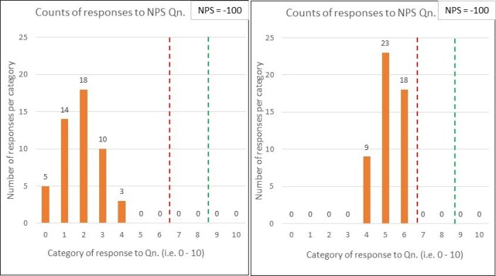
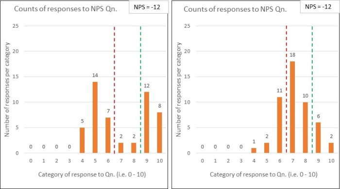
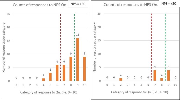
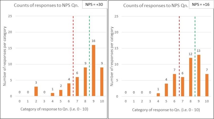
Reichheld designed NPS to be rather simple. You just ask a sample of subjects (usually customers3) one question and give them an 11-point scale of 0 to 10 to answer it. And that question?

‘How likely is it that you would recommend our company/product/ service to a friend or a colleague?’

You then take all your responses (which, incidentally, may be rather low) and boil them down into one number. Marvellous…that will be easy to (ab)use!

But, before you grab your calculators, this number isn’t just an arithmetic average of the responses. Oh no, there’s some magic to take you from your survey results to your rather exciting score…and here’s how:

  • A respondent scoring a 9 or 10 is labelled as a ‘Promoter’;
  • A scorer of 0 to 6 is labelled as a ‘Detractor’; and
  • A 7 or 8 is labelled as being ‘Passive’4.

where the sum of all Promoters, Detractors and Passives = the total number of respondents.

NPS calculation.jpgYou then work out the % of your total respondents that are Promoters and Detractors, and subtract one from the other.

You’ll get a number between -100 (they are all Detractors) and +100 (all Promoters), with a zero meaning Detractors and Promoters exactly balance each other out.

And, guess what…a positive score is desirable…and, over the long term, a likely necessity if you want to stay in business.

Okay, so I’ve done the up-front explanatory bit and regular readers of this blog are probably now ready for me to go on and attempt to tear ‘NPS’ apart.

I’m not particularly bothered by the score – it might be of some interest…though exceedingly limited in its usefulness.

Rather, I’m bothered by:

  1. what use it is said to be; and
  2. what use it is put to.

I’ve split my thoughts into two posts. This post deals with the second ‘bother’, and my next one will go back to consider the first.

Qualitative from Quantitative – trying to ‘make a wrong thing righter’

The sane manager, when faced with an NPS score and a ‘strategic objective’ to improve it, wants to move on from the purely quantitative score and ‘get behind it’ – they want to know why a score of x was given.

Reichheld’s NPS method covers this obvious craving by encouraging a second open-ended question requesting the respondent’s reasoning behind the rating just given – a ‘please explain’ comments box of sorts. The logic being that this additional qualitative data can then be provided to operational management for analysis and follow up action(s).

Reichheld’s research might suggest that NPS provides an indicator of ‘customer loyalty’, but…and here’s the key bit…don’t believe it to be a particularly good tool to help you improve your system’s performance.

There are many limitations with attempting to study the reasons for your system’s performance through such a delayed, incomplete and second-hand ‘the horse has bolted’ method such as NPS.

  • Which subjects (e.g. customers) were surveyed?
  • What caused you to survey them?
  • Which subjects chose to respond…and which didn’t?
  • What effort from the respondent is likely to go into explaining their scoring?
  • Does the respondent even know their ‘why’?
  • Can they put their (potentially hidden) feelings into words?…and do they even want to?

If you truly want to understand how your system works and why, so that you can meaningfully and sustainably improve it, wouldn’t it just be soooo much better (and simpler) to jump straight to (properly5) studying the system in operation?!

A lagging indicator vs. Operational measures

One of my very early posts on this blog covered the mad, yet conventional, idea of ‘management by results’ and subsequent posts have delved into ‘cause and effect’ in more detail (e.g. ‘Chain beats Triangle’).

My ‘cause and effect’ post ends with the key point that:

“Customer Purpose (which, by definition, means quality) comes first…which then delivers growth and profitability, and NOT the other way around!”

Now, if you read up on what Reichheld has to say about NPS, he will tell you that it is a leading measure, whereas I argue that it is a lagging one. The difference is because we are coming from opposite ends of the chain:

  • Reichheld appears to be concerned with growth and profitability, and argues that NPS predicts what is going to happen to these two financial measures (I would say in the short term);

  • I am concerned with customer purpose, and an organisation’s capability at delivering against its customers’ needs. This means that I want to know what IS happening, here and now so that I can understand and improve it …which will deliver (for our customers, for the organisation, for its stakeholders) now, and over the long term.

You might read the above and think I am playing with semantics. I think not.

I want operational measures on the actual demands coming in the door, and how my processes are actually working. I want first hand operational knowledge, rather than attempting to reverse engineer this from partial and likely misleading secondary NPS survey evidence.

“Managers learn to examine results, outcomes. This is wrong. The manager’s concern should be with processes….the concentration of a manager should be to make his processes better and better. To do so, he needs information about the performance of the process – the ‘voice of the process’. “ [‘Four Days with Dr Deming’]

Deming’s clear message was ‘focus on the process and the result will come’ and, conversely, you can look at results all you like but you’d be looking in the wrong place!

NPS thinking fits into the ‘remote control’ school of management. Don’t survey and interrogate. ‘Go to the gemba’ (the place where the work occurs).

 “But what about the Lean Start-up Steve?”

Some readers familiar with Eric Ries’ Lean Start-up movement might respond “but Eric advocates the use of customer data!” and yes, he does.

But he isn’t trying to get a score from them, he is trying to deeply engage with a small number of them, understand how they think and behave when experiencing a product or service, and learn from this…and repeat this loop again and again.

This fits with studying demand, where it comes in, and as it flows.

The Lean Startup movement is about observing and reflecting upon what is actually happening at the point of customer interaction, and not about surveying them afterwards.

To close – some wise words

After writing this post I remembered that John Seddon had written something about NPS…so I searched through my book collection to recover what he had to say…and he didn’t disappoint:

“Even though NPS is completely useless in helping service organisations improve, on our first assignment [e.g. as system improvement interventionists] we say nothing about it, because we know the result of redesigning the system will be an immediate jump in the NPS score…and because when this is reported to the board our work gets the directors’ attention.

It makes it easy to see why NPS is a waste of time and money. First, it is what we call a ‘lagging measure’ – as with all customer satisfaction measures, it assesses the result of something done in the past. Since it doesn’t help anyone understand or improve performance in the present, it fails the test of a good measure5 – it can’t help to understand or improve performance.” [Seddon, ‘The Whitehall Effect’]

Seddon goes on to illuminate a clear and pernicious ‘red herring’ triggered by the use of NPS:  the simple question of ‘would you recommend this service to a friend’ mutates to a hunt for the person who delivered the particular instance of service currently under the microscope. Management become “concerned with the behaviour of people delivering the service” as opposed to the system that makes such behaviour highly likely to occur!

I have experience of this exact management behaviour in full flow, with senior management contacting specified members of staff directly (i.e. those who handled the random transaction in question) to congratulate or interrogate/berate them, following the receipt of particularly outstanding6 NPS responses.

This is to focus on the 5% (the people) and ignore the 95% (the system that they are required to operate within). NPS “becomes an attractive device for controlling them”.

Indeed.

The title of this post follows from Seddon’s point that if you focus on studying, understanding and improving the system then, guess what, the NPS will improve – usually markedly. Not Particularly Surprising.

My next post called ‘How good is that one number’ contains the second part of my NPS critique.

Footnotes

1. This post, as usual, comes from having a most excellent conversation with a friend (and ex-colleague) …and she bought me lunch!

I should add that the title image (the pH scale) is a light-hearted satire of the various NPS images I found i.e. smiley, neutral and angry faces arranged on a coloured and numbered scale.

2. Reichheld has written a number of books on customer loyalty, with one of his more recent ones trying to relabel ‘NPS’ from Net Promoter Score to Net Promoter System (of management) …which, to put it mildly, I am not a fan of.

It reminds me of the earlier ‘Balanced Scorecard’ attempting to morph into a system of management. See ‘Slaughtering the Sacred Cow’.

Yet another ‘management idea’ expanding beyond its initial semblance of relevance, in the hands of book sellers and consultants.

Sorry, but that’s how I feel about it.

NPS is linked to the ‘Balanced Scorecard’ in that it provides a metric for the customer ‘quadrant’ of the scorecard …but, as with financial measures, it is still an ‘outcome’ (lagging) measure of an organisation’s people and processes.

3. The original NPS focused on customers, but this has subsequently been expanded to consider other subjects, particularly employees.

4. Being British (i.e. somewhat subdued), I find the labelling of a 7 or 8 score as ‘Passive’ to be hilarious. A score of 7 from me would be positively gushing in praise! What a great example of the variety inherent within customers…and which NPS cannot reveal.

5. For the ‘tests of a good measure, please see an earlier post titled ‘Capability what?’

6. Where ‘outstanding’ means particularly low, as well as high.