Targets on measures of targets on measures of things

In this post I’m going to differentiate between:

  1. Measures of things
  2. Targets on (measures of things)
  3. Measures of (targets on (measures of things)); and
  4. Targets on (measures of (targets on (measures of things)))

Wow, that last one is hard to write, let alone say out loud! You might think that it’s a nonsense (which it is) but, sadly, it’s very common.

Note: I added the brackets to (hopefully) make really clear how each one builds on the last.

I’ll attempt to explain…

1. Measures of things:

Seems straight forward enough: I’m interested in better understanding a thing, so I’d like to measure it1.

Some examples…

A couple of personal ones:

  • What’s my (systolic) blood pressure level? or
  • How quickly do I ride my regular cycle route?

A couple of (deliberately) generic work ones:

  • how long does it take us to achieve a thing? or
  • how many things did we achieve over a given period?

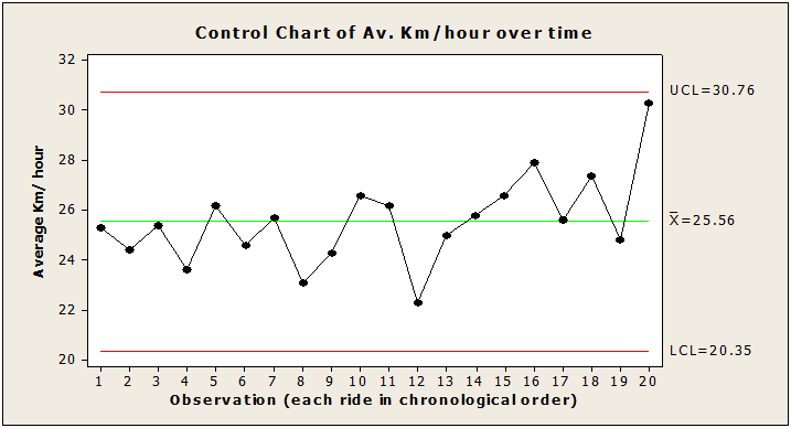
Here’s a graph of a measure of a thing (in chronological order):

Nice, we can clearly see what’s going on. We achieved 13 things in week 1. Each thing took us anything between 2 and 36 days to achieve…and there’s lots of variation in-between.

It doesn’t surprise me that it varies2 – it would be weird if all 13 things took, say, exactly 19 days (unless this had been structurally designed into the system). There will likely be all sorts of reasons for the variation.

However, whilst I ‘get’ that there is (and always will be) variation, the graph allows us to think about the nature and degree of that variation: Does it vary more than we would expect/ can explain?3 Are there any repeating patterns? Unusual one-offs? (statistically relevant) Trends?

Such a review allows us to ask good questions, to investigate against and learn from.

“Every observation, numerical or otherwise, is subject to variation. Moreover, there is useful information in variation.” (Deming)

2. Targets on (measures of things):

Let’s say that we’ve been asked to achieve a certain (arbitrary4) target.

Here’s an arbitrary target of 30 days (the red line) set against our measure:

And here’s how we are doing against that target, with some visual ‘traffic lighting’ added:

Instance (X)12345678910111213
Target of 30 days met? (Yes/No)NYYNYYYYYYYNY

We’ve now turned a rich analogue signal into a dull digital ‘on/off’ switch.

If we only look at whether we met the target or not (red vs. green), then we can no longer see the detail that allowed us to ask the good questions.

  • We met ‘target’ for instances 2 and 3…but the measures for each were quite different
  • Conversely, we met ‘target’ for instances 5 all the way through to 11 and then ‘suddenly’ we didn’t…which would likely make us think to intensely question instance 12 (and yet not see, let alone ponder, the variation between 5 and 11).

The target is causing us to ask the wrong questions5, and miss asking the right ones.

3. Measures of (targets on (measures of things)):

But I’m a fan of measures! So, let’s show a measure over time of how we are doing against our target.

In week 1 we met our 30-day target for 10 out of our 13 instances, which is 77%. Sounds pretty good!

Here’s a table showing how many times we met target for each of the next five weeks:

Week12345
Things achieved1315141112
Number meeting 30-day target10141278
% meeting  30-day target77%93%86%64%67%

Let’s graph that:

It looks like we’ve created a useful graph, just like in point 1.

But we would be fooling ourselves – we are measuring the movement of the dumbed-down ‘yes/no’ digital switch, not the actual signal. The information has been stripped out.

For example: There might have been huge turbulence in our measure of things in, say, week 3 whilst there might have been very little variation in week 4 (with lots of things only just missing our arbitrary ‘target’)…we can’t see this but (if we want to understand) it would be important to know – we are blind but we think we can see.

4. Targets on (measures of (targets on (measures of things))):

And so, we get to the final iteration:

How about setting an arbitrary target on the proportion of things meeting our arbitrary target…such as achieving things in 30 days for 80% of the time (the red line)…

And here’s the table showing how we are doing against that target:

Week number:12345
80% Target on 30-day Target met?NYYNN

Which is a double-dumbing down!

We’ve now got absolutely no clue as to what is actually going on!!!

But (and this is much worse) we ‘think’ we are looking at important measures and (are asked to) conclude things from this.

The table (seemingly) tells us that we didn’t do well in week’s 1, 4 and 5, but we did in week’s 2 and 3…

The base data series used for this example:

In order to write this post, I used the Microsoft Excel random number generator function. I asked it to generate a set of (65) random numbers between 1 and 40 and then I broke these down into imaginary weeks. All the analysis above was on pure randomness.

Here’s what the individual values look like when graphed over time:

(Noting that instances 1 – 13 are as per the graph at point 1, albeit squashed together)

Some key points:

  • There is nothing special about any of the individual data points
  • The 30-day target has got nothing to do with the data
  • There is nothing special about any of the five (made up) weeks within
  • The 80% target on the 30-day target has got nothing to do with anything!

The point: Whilst I would want to throw away all the ‘targets’, ‘measures of target’ and ‘targets on measures of target’…I would like to understand the system and why it varies.

This is where our chance of improving the system is, NOT in the traditional measures.

Our reality:

You might be laughing at the above, and thinking how silly the journey is that I’ve taken you on…

…but, the ‘targets on (measures of (targets on (measures of things)))’ thing is real and all around us.

  • 80% of calls answered within 20 seconds
  • 95% of patients discharged from the Emergency department within 4 hours
  • 70% of files closed within a month
  • [look for and add your own]

Starting from a position of targets and working backwards:

If you’ve got a target and I take it away from you…

…but I still ask you “so tell me, how is [the thing] performing?” then what do you need to do to answer?

Well, you would now need to ponder how has the thing been performing – you would then need to look at a valid measure of a thing over time and ponder what this shows.

In a nutshell: If you’ve got a target, take it away BUT still ask yourself ”how are we doing?”

A likely challenge: “But it’s hard!”

Yes… if you peel back the layers of the ‘targets on targets’ onion so that you get back to the core of what’s actually going on, then you could be faced with lots of data.

I see the (incorrect) target approach as trying to simplify what is being looked at so that it looks easy to deal with. But, in making it look ‘easy to deal with’, we mustn’t destroy the value within the data.

“Everything should be made as simple as possible, but no simpler.” (attributed to Einstein)

The right approach, when faced with a great deal of data, would be to:

  • Look at it in ways that uncover the potential ‘secrets’ within (such as in a histogram, in a time-series plot); and
  • understand how to disaggregate the data, such that we can split it up into meaningful sub-groups. We can then:
    • compare sub-groups to consider if and how they differ; and
    • look at what’s happening within each sub-group (i.e. comparing apples with apples)

To close:

If you are involved in ‘data analysis’ for management, I don’t think your role should be about ‘providing the simple (often 1-page) picture that they’ve asked for’. I would expect that you would wish your profession to be along the lines of ‘how can I clearly show what’s happening and what this means?’

If you are a manager looking at measures: why would you want an (overly) simple picture so that you can review it quickly and then move on to making decisions? Wouldn’t you rather understand what is happening and why … so that good decisions can be made?

Footnotes

1. Measurement of things – a caution: We should be careful not to fall into the trap of thinking that everything is measurable or, if we aren’t measuring it, then it doesn’t matter.

There’s plenty of stuff that we know is really important even though we might not be measuring it.

2. Variation: If you’d like to understand this point, then please read some of my earlier posts, such as ‘The Spice of Life’ and ‘Falling into that trap’

As a simple example: If you took a regular reading of your resting heart rate, don’t you think it would be weird if you got, say, 67 beats per minute every single time? You’d think that you’d turned into some sort of android!

3. Expect/ can explain – clarification: this is NOT the same as ‘what we would like it to be’.

4. Arbitrary: When a numeric target is set, it is arbitrary as to which number was picked. Sure, it might have been picked with reference to something (such as 10% better than average, or the highest we’ve ever achieved, or….) but it’s arbitrary as to which ‘reference’ you choose.

5. Wrong questions: These wrong questions are then likely to cause us to jump to wrong conclusions and actions (also known as tampering). Such actions are likely to focus on individuals, rather than the system that they work within.

6. ‘Trigger’: The writing of this post was ‘triggered’ the other day when I reviewed a table of traffic-lighted (i.e. against a target) measures of targets on measures of things.

’80 in 20’…erm, can we change that?!

80 in 20This is a bit of a ‘back to basics’ post, inspired by refreshing my memory from reading a superb book. It’s long…but hopefully interesting 🙂

Some years back I was working with a most excellent colleague, who managed a busy contact centre operation. Let’s call her Bob. She was absolutely committed to doing the best she could, for her staff and her customers.

Bob came to me one day for some help: Things weren’t going well, she had a meeting with senior management coming up and she was going to ask them to approve a radical thing – to change, by which I mean relax, their current call handling target.

I didn’t know too much about contact centres back then…so I started by asking some dumb questions. And it went something like this:

Me: “What’s this ‘80 in 20’ measure about?”

Bob: “It’s our main ‘Key Performance Indicator’ (KPI), called ‘Grade of Service’ (or GOS for short) and it means that we aim to pick up 80% of all incoming calls within 20 seconds of the customer calling.”

Me: “Oh…and where do these figures comes from?”

Bob: “It’s an industry recognised KPI. All ‘up to date’ contact centres use it to measure how they are doing and ‘80 in 20’ is Best Practise.”

Me: “…what ‘industry body’ and where did they get these figures?”

Bob: “The [insert name of a] ‘Contact Centre Association’…and I’ve got no idea where the figures come from.”

Me: “So, we have a target of picking up a customer’s call within an arbitrary 20 seconds…and we have an arbitrary target on meeting this target 80% of the time? …so it’s a target on a target?”

Bob: “Yes…I suppose it is…but we are having a real tough time at the moment and we hardly ever achieve it.”

Me: “Okay…but why do you want to ask senior management to ‘relax’ this target-on-a-target? What will this achieve?”

Bob: “Because we publish our GOS results against target for all our contact centre team leaders to see…and frankly there’s not much they can do about it…and this is really demoralising. If I could just get senior management to relax it to, say, 70% in 30 seconds then my staff could see that they at least achieve it sometimes.”

…and that’s how my discussion with Bob started.


I have just finished reading Donald Wheeler’s superb book ‘Understanding Variation – the key to managing chaos’ and my work with Bob1 all those years ago came flooding back to me…and so I thought I’d revisit it, and jot down the key points within. Here goes…

Confusing ‘Voice of the Customer’ and ‘Voice of the Process’

VoPI’ll start with clarifying the difference between the customer and the process. In the words of Donald Wheeler:

“The ‘voice of the customer’ defines what you want from a system.

The ‘voice of the process’ defines what you will get from a system.”

The difference in words is subtle, but in meaning is profound.

In Bob’s case, she has determined that customers want the phone to be picked up within 20 seconds2. However, this wishful thinking (a target) is completely outside the system. Bob could set the customer specification (target) at anything, but this has got nothing to do with what the process can, and will predictably3, achieve.

What we really want to see is what the system (‘handling4 customer calls’) is achieving over time.

A target is digital (on/off) – either ‘a pat on the back’ or ‘not good enough!’

On off switch “A natural consequence of this specification [target] approach…is the suddenness with which you can change from a state of bliss to a state of torment. As long as you are ‘doing okay’ there is no reason to worry, so sit back, relax, and let things take care of themselves. However, when you are in trouble, ‘don’t just stand there – do something!’ …This ‘on-again, off again’ approach is completely antithetical to continual improvement.” (Wheeler)

Unfortunately, Bob is constantly the wrong side of the (current) specification and therefore has the unwavering torment of ‘don’t just stand there – do something!’

But do what? And how would Bob know if whatever they try is actually an improvement or not? Using a target is such a blunt (and inappropriate) tool. Future results:

  • might ‘beat target’ (gaining a ‘pat on the back’) and yet simply be noise5; or
  • might still be lower than target (receiving another ‘kick’) and yet contain an important signal.

Bob cannot see the true effects of any experimentation on her system whilst relying on her current Industry best practise ‘Grade of Service’ KPI. She does not have a method to separate out potential signals from probable noise.

Thinking that a target can change things for the better

pressure“When people are pressured to meet a target value, there are three ways they can proceed:

  1. They can work to improve the system;
  2. They can distort the system; or
  3. They can distort the data.               

(Wheeler, referencing Brian Joiner)

What can a call agent do to ‘hit’ that target? Well, not much really. They can’t influence the number of calls coming in or what those customers want or need. They CAN, however, try to ‘get off the phone’ so as to get to the next call. Mmm, that’s not going to help the (customer-defined) purpose…and is probably likely to create failure demand, complaints and re-work…and make things worse.

What can the contact centre management (from team leaders and upwards to Bob) do to ‘hit’ that target? They could try to improve the system* (which, whilst being the right thing to do, is also the hardest) OR they could simply ask for the target to be relaxed. If they aren’t allowed to do either, then they might begin to ‘play games’ with the data…and hide what is actually happening.

* To improve the system, Bob needs contextual data presented such that it uncovers what is happening in the system…which will enable her to listen to the process, see signals, ask relevant questions, understand root cause, experiment and improve. She, and her team, cannot do this at present using her hugely limiting KPI.

In short, the target is doing no good…and probably some (and perhaps a lot of) harm.

It’s perhaps worth reflecting that “Bad measures = bad behaviours = bad service” (Vanguard)

What’s dafter than a target? A target on a target!

stop that its very sillyWhy? Well, because it removes us from the contextual data, stripping out the necessary understanding of variation within and thus further hiding the ‘voice of the process’.

It’s worth noting that, in Bob’s ‘20 seconds to answer’ target world:

  • A call answered in 3 seconds is worth the same as one answered in 19 seconds; and, worse
  • A call answered in 21 seconds is treated the same as one answered in, say, 480 seconds….and beyond…perhaps even an hour!

Note: I’ve added an addendum at the end of this post with a specific ‘target on a target’ example (hospital wait times). I hope that it is of use to demonstrate that using a ‘target on a target’ is to hide the important data underneath it.

“Setting goals [targets] on meeting goals is an act of desperation.” (Wheeler)

Worse still, a ‘target on a target’ can fool us into thinking that we are looking at something useful. After all, I can still graph it…so it must be good…mustn’t it?

Here’s a control chart of Bob’s ‘Grade of Service’ (GOS) KPI:

I-MR

 You might look at it and think “Wow, that looks professional with all that I-MR control charty stuff! I thought you said that we’d be foolish to use this ’80 in 20’ target on a target?”

You can see that Bob’s contact centre never met the ’80 in 20’ target-on-a-target6 (and, with the current system, isn’t likely to)…and you can perhaps see why she wants to ‘relax’ it to ’70 in 30’….but we can’t see what really happens.

What’s the variation in wait times? (times of day, days of week etc.)

Do some people get answered in 5 seconds? Is it common for some people to wait for 200 seconds? (basically, what’s actually gong on?!)

Is the variation predictable? Are there any patterns within?

Are those months really so comparable?…are any games being played?!

Okay, so I’ve shot at what Bob has before her…but what advice can I offer to help?

Does Bob need to change her ’80 in 20’ KPI?  Yes, she does….but not by relaxing the target.

‘The right data, measured right’ (‘what’, and ‘how’)

what how why
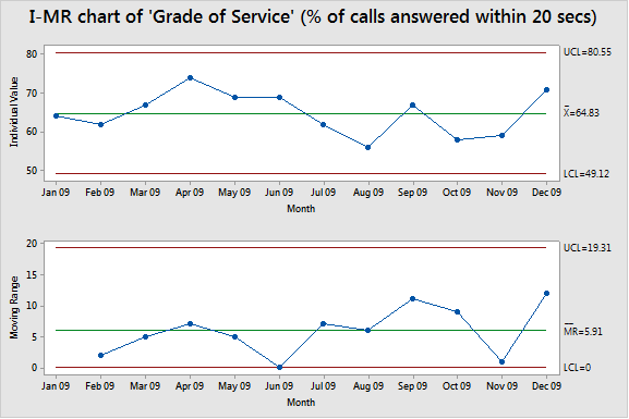
At its very simplest, Bob’s measures need to help her (and her people) understand and improve the system.

To do this, they need to see:

WHAT matters to the customer? …which could be uncovered by:
“Don’t make me queue” Volume of calls, time taken to answer, abandonment rate.
“I want you to deal with me at my first point of contact” % of calls resolved at first point of contact (i.e. didn’t need to be passed on).
“Don’t put me on hold unnecessarily” % of calls put on hold (including reason types and frequencies).
“I want to deal with the right person (i.e. with the necessary knowledge, expertise, and authority)” % of calls passed on (including reason types and frequencies).
“I want you to action what you have promised, when I need it…and to do so first time.” Failure demand, either chasing up or complaining (including reason types and frequencies).

Now, Bob (and most contact centres) might reply “We already measure some of that stuff!”

Yes, I expect you do.

What also matters is HOW you measure it.  Measures should be:

  • shown over time, in chronological order (i.e. in control charts, to show variation), with control limits (to separate out signals from noise);

  • updated regularly (i.e. at meaningful intervals) and shown visually (on the floor, at the gemba), providing feedback to those working in the system;

  • presented/ displayed together, as a set of measures, to show the system and its interactions, rather than a ‘Grade of Service’ KPI on a dashboard;

  • monitored and analysed to identify signals, and consider the effect of each experimental change towards the customer purpose;

  • devoid of a target! The right measures, measured right will do just fine.

Why are control charts so important? Wheeler writes that:

“Instead of attempting to attach a meaning to each and every specific value of the time series, the process behaviour [i.e. control] chart concentrates on the behaviour of the underlying process.”

aeroplane dashboardWhy do we need to see a set of measures together? Simon Guilfoyle uses the excellent analogy of an aeroplane cockpit – you need to see the full set of relevant system measures to understand what is happening (speed, altitude, direction, fuel level…). There isn’t ‘One metric that matters’ and it is madness to attempt to find one.

Looking at Bob’s proposed set of capability measures (the table above), you can probably imagine why you’d want to see them all together, so as to spot any unintended consequences to changes you are experimenting with.

I.e. if one measure appears to be improving, is another one apparently worsening? Remember – it’s a system with components!

To summarise:

In a nutshellIf I am responsible for a process (a system) then I want to:

  • see the actual voice of the process;
  • get behind (and then drop) any numerical target;
  • split the noise from any signals within;
  • understand if the system is ‘in control’ (i.e. stable, predictable) or not; and
  • spot, and investigate any special causes7

and, perhaps more important, I want to:

  • understand what is causing the demand coming into the system (rather than simply treating all demand as work to be done);
  • involve all of the people in their process, through the use of visual management (done in the right way); and then
  • experiment towards improving it…safe in the knowledge that our measures will tell us whether we should adopt, adapt or abandon each proposed change.

Bob and I continued to have some great conversations 🙂


I said that I would add an addendum on the subject of ‘a target on a target’…and here it is:

Addendum: An example to illustrate the point

I’ll borrow two diagrams8 from a really interesting piece of analysis on NHS hospitals (i.e. in the UK) and their Accident and Emergency (A&E) wait times.

The first chart is of Alder Hey Children’s hospital. It shows a nice curve of the time it takes for patients to be discharged:

Alder Hey

The second chart is of Croydon University Hospital. Same type of chart, but their data tells a vastly different story!

Croydon

Q1: Do you think that an activity target has been set on the A&E system and, if so, where do you think it has been set?

I’d bet (heavily) that there is an A&E ‘time to discharge’ target, set from management above, of 4 hours (i.e. 240 minutes). It’s sort of evident from the first graph…but ‘smacks you between the eyes’ in the second.

Two further questions for you to ponder9: Looking at the charts for these two hospitals…


Q2: Which one has a smooth, relatively under control A&E system, and which do you think might be engaged in ‘playing (survival) games’ to meet the target?

I’d say that Alder Hey is doing rather well, whilst Croydon is (likely) engaged in all sorts of tricks to ship patients somewhere (anywhere!) ‘before the 4 hour buzzer’ – with a likely knock-on effect to patient experiences and outcomes;


Q3: Which one looks better on a ‘% of patients that met the 4 hour target’ league table? (i.e. a target on a target)

It is typical for health services to set an A&E ‘target on a target’ of, say, ‘95% discharged from A&E within 4 hours’10. This is just like Bob’s ‘80% in 20 seconds’.

Sadly, Croydon will sit higher up this league table (i.e. appear better) than Alder Hey!

If you don’t understand why, have a closer look at the two charts. Look specifically at the volume of patients being discharged after the 240 min. mark. Alder Hey has some, but Croydon has virtually none.

Foot notes

1. Just in case you hadn’t worked it out, she (or he) wasn’t called Bob!

2. Customer Target: Setting aside that the customer target shouldn’t (and indeed can’t) be used to improve the ‘handling calls’ system, I have two problems with the 20 second ‘customer specification’.

a. An industry figure vs. reality: rather than assuming that a generic industry figure of 20 seconds is what Bob’s customers want, I asked Bob to provide me with her call abandonment data.

I then graphed a histogram of the time (in seconds) that each customer abandoned their call and the corresponding volume of such calls. This provided us with evidence as to what exactly was happening within Bob’s system…which leads me on to:

b. An average customer vs. variety: There’s no such thing as ‘an average customer’ and we should resist thinking in this way. Some people were abandoning after a couple of seconds, others did so after waiting for two minutes. We can see that there is plenty of customer variety within – we should be thinking about how we can absorb that variety rather than meet some non-existent average.

3. Predictably, assuming that it is stable and there is no change made to the process.

4. Handling: I specifically wrote ‘handling’ and not ‘answering’. Customers don’t just want their call answered – they want their need to be met. To properly understand a system we must first set out its purpose from the customer’s perspective, and then use an appropriate set of measures that reveal the capability of the system against this customer purpose. ‘Answering calls’ may be necessary, but it’s not sufficient.

5. Noise vs. Signal: I’m assuming in this post that you understand the difference between noise and signals. If you don’t (or would like a refresh) then an earlier (foundational) posts on variation might assist: The Spice of Life

6. A clarification in respect of the example ‘I’ control chart: The Upper Control Limit (UCL) red line (at 80.55%) does not represent/ is not the 80% target. It just happens to be the case that the calculated UCL for Bob’s data works out to be nearly the same as the arbitrary target – this is an (unfortunate) fluke. A target line does not belong on a control chart!

7. Special Cause tests: The most obvious signal on a control chart can been seen when a point appears outside the upper or lower control limits. There are, however, other types of signals indicating that something special has occurred. These include ‘trends’, ‘shifts’, and ‘hugging’. Here’s a useful diagram (sourced from here):

special causes

8. Hospital charts: The full set of charts (covering 144 NHS hospitals for the period 2012-13) is here. I’ve obviously chosen hospitals at both extremes to best illustrate the point.

I can’t remember where I first came across these hospital charts – which annoys me!…so if it was via a post on your blog – I’m sorry for my crap referencing/ recognition of your efforts 🙂 

9. Here’s a 4th and final question to ponder: If, after pondering those two questions, you still think that a ‘target on a target’ makes sense then how do you cope with someone not always meeting it? Do you set them a target…to motivate them?

How about a target for the ‘target on a target’???

  • A 95% target of achieving an ‘80% of calls answered in 20 seconds’ target
  • A 90% target of achieving an ’95% of patents discharged within 4 hours’ target
  • ….

…and, if you are okay with this…but they don’t always meet it then how about setting them a target…where does the madness end?!

We are simply ‘playing with numbers’, moving ever further from reality and usefulness.

10. Hospital ‘Emergency department’ League tables:

Emergency tableHere’s a New Zealand ‘Emergency departments’ league table, ranking district health boards against each other (Source).

Notice that it shows:

  • A ‘target on a target’ (95% within 6 hrs)
  • A single quarter’s outcome
  • A binary comparison ‘with last quarter’
  • A (competitive) ranking

All of which are, ahem, ‘problematic’ (that’s me being polite 🙂

You can’t actually see how each district is performing (whether stable, getting better…or worse)

…and you certainly can’t see whether games are being played.

What have the Romans ever done for us!!

Biggus DicusFor those of you Python fans out there, I suspect the title of this post draws a smile of recollection from you. It draws out a big hearty grin from me.

For those of you who don’t know what I am writing about (and for those who do…but would like to relive the moment – go on, you know you want to!), here’s the famous clip from the Monty Python film ‘The Life of Brian’:

What have the Romans… (1 min. 25 secs)

This clip was triggered in my mind the other day when pondering how people collect and use data in reports (I had just seen one that offended my sensibilities!). I get frustrated when I point out a serious fault within a report and the response I get is “yes, but apart from that….”

Here’s my attempt at a Python-like response:

Leader (John Cleese): Look at what this report is telling us!”

Minion 1: “…but we don’t have enough data to know what’s actually happening.”

John Cleese: What?”

Minion 1: “We are only using a couple of data points to compare. This tells us virtually nothing and is likely to be highly misleading.”

John Cleese: “Oh. Yeah, yeah. We have only got this month vs. last month. Uh, that’s true. Yeah.”

Minion 2: “…and we’re using averages – we’ve got no idea as to the variation in what is happening.”

Side kick 1 (Eric Idle): “Oh, yeah, averages, John. Remember some of the mad decisions we’ve made in hindsight because of averages?”

John Cleese: “Yeah. All right. I’ll grant you that our lack of data over time and the use of averages makes our report a bit suspect.”

Minion 3: “…and, even if we did have enough data points and could see the variation, we don’t understand the difference between noise and a signal (common and special cause variation)”

John Cleese: “Well, yeah. Obviously we don’t want to be caught tampering. I mean, understanding the difference between common and special cause goes without saying doesn’t it? But apart from a lack of data, (miss)using averages and tampering – ”

Minion 4: “We often compare ‘apples with pears’: Lots of the things we ‘hold people to account for’, they have virtually no ability to influence.”

Minion 5: “Much of the data we use is unrepresentative and/or coerced out of people, which makes any data biased.”

Minions: “Huh? Heh? Huh… “

Minion 6: “And we are focusing on one KPI and not seeing the side effects that this is causing to other parts of the system.”

Minions: “Ohh…”

John Cleese: Yeah, yeah. All right. Fair enough.

Minion 7: “and we are using targets, which are arbitrary measures that have nothing to do with the system and cause dysfunctional ‘survival’ behaviours from our people.”

Minions: “Oh, yes. Yeah… “

Side Kick 2 (Michael Palin): “Yeah. Yeah, our targets cause some pretty mad behaviours, John, and it’s really hard to spot/ find this out because our people don’t like doing ‘bad stuff’ and, as such, don’t like to tell us about it. Huh.”

Minion 8: “Our reports are focused on people (and making judgements about them), rather than on the process that they have to work within.”

Eric Idle: “And our people are ‘in the dark’ about how the horizontal value stream they work within is actually performing, John.”

Michael Palin: “Yeah, they only know about their silo. Let’s face it. If our people knew how the horizontal flow was actually doing, they’d be far more engaged in their work, more collaborative (if we removed some of the management instruments that hinder this) and therefore far more able and willing to continually improve the overall value stream.”

Minions: “Heh, heh. Heh heh heh heh heh heh heh.”

John Cleese: All right, but apart from a lack of data, (miss)use of averages, tampering, comparing apples with pears, biased data, focusing on one KPI, the use of arbitrary targets, reports focused on judging people, and our value workers being ‘in the dark’….Look at what this report is telling us!”

Minion 9: We’re using activity measures (about outputs), rather than seeing the system and its capability for our customers (about outcomes).

John Cleese: Oh. Seeing the capability of the system from the customers’ point of view? SHUT UP!

  • THE END –

In short, many (most?) organisations are terrible when it comes to measurement. They are stuck in a weird ‘conventional reporting’ world. Perhaps this is a blind spot in our human brains?

‘Statistics’ is a word that strikes fear into the hearts and minds of many of us. I’m happy to admit that I’m no expert. But I think we should have a healthy respect for data and how it should and should not be used. I’ve heard many a manager raise their voice to say that they have the data and so can ‘prove it!’…and then go on to make inferences that cannot (and should not) be justified.

(Personal view: I think that it is better to be mindful (and therefore cautious) of our level of competence rather than blissfully ignorant of our incompetence, charging on like a ‘Bull in a china shop.’)

Where to from here?:

I’ve previously written a few posts in respect of measurement. I’ve linked a number of them in the skit above or in the notes below. Perhaps have a (re)read if you’d like to further explore a point I’m attempting to make.

…and here’s a reminder of the brilliant Inspector Guilfoyle blog that is dedicated to measurement. He writes nice ‘stick child’ stories about the mad things we do, why they are mad…and what a better way looks like.

Some closing notes on some of the ‘reporting madness’ points made above:

Binary Comparisons: Here’s a really great explanation of the reasons why we shouldn’t use a couple of data points: Message from the skies

Averages: If you don’t understand the point about averages, then have a think about the following quote: “Beware of drowning in a river of average depth 1 metre.” (Quoted by John Bicheno in ‘The Lean Toolbox’)

Variation: Deming’s red bead experiment is an excellent way to understand and explore the point about variation that is inherent in everything. I’ve written about variation in (what happens to be my most read post to date): The Spice of Life

Tampering: This comes about from people not understanding the difference between common and special cause variation. I wrote a specific post about the effects of tampering on a process: Tampering

Biased data: There are loads of reasons why data collected might be biased. The use of extrinsic motivators (as in contingent monetary incentives) is a BIG one to consider and understand.

Targets: John Seddon  is the place to go if you want a deeper understanding of the huge point being made. His book ‘Freedom from Command and Control’ is superb. Also, see my post The trouble with targets.

Capability measures: I believe that this point can take a bit to understand BUT it is a huge point. I wrote Capability what? In an attempt to assist.

Capability what?

tape_measureReaders of this blog will have likely come across a phrase that I often use but which you might not be too clear on what is meant – this phrase is Capability Measure.

(Note: I first came across the use of this specific phrase from reading the mind opening work of John Seddon).

I thought it worthwhile to devote a post to expand upon these two words and, hopefully, make them very clear.

Now, there are loads of words bandied around when it comes to the use of numbers: measures, metrics, KPIs, targets. Are they all the same or are they in fact different?

Let’s use the good old Oxford dictionary to gain some insights that might assist:

Measure:     “An indication of the degree, extent, or quality of something”

Metric:     “A system or standard of measurement”

KPI (Key performance indicator): “A quantifiable measure used to evaluate the success of an organization, employee, etc. in meeting objectives for performance.

Target:     “An objective or result towards which efforts are directed

So putting these together:

A measure quantifies something…but this of itself doesn’t make it useful. It depends on what you are measuring! In fact, there is a huge risk that something that is easily measureable unduly influences us:

“We tend to overvalue the things we can measure and undervalue the things we cannot.” (John Hayes)

A metric is the way that a measurement is performed – it’s operational definition. There’s not much point in taking two measurements of something if the method of doing so differs so much as to materially affect the results obtained.

KPIs are an attempt to get away from using lots of different measures and, instead, boil them down into a handful of (supposedly) ‘important ones’ because then that will make it sooo much easier to manage won’t it?…I hope your ‘Systems thinking’ alarm bells are ringing – if we want to understand what is really happening, we need to study the system. Any attempts at short-cutting this understanding, combined with the use of targets and extrinsic motivators is likely to lead to some highly dysfunctional behaviour, causing much damage and resulting in sub-optimal outcomes. The idea of ‘management by dashboard’ is deeply flawed.

Targets – well, where to start! The dictionary definition clearly shows that their use is an attempt at ‘managing by results’…which is a daft way to manage! We don’t need a target to measure…and we don’t need (and shouldn’t attempt) to use a target to improve! A target tells us nothing about the system; distorts our thinking; and steals our focus from where it should be.

So what are we measuring?

I hope I’ve usefully covered ‘measure’ and its related terms so let’s go back to the first word: Capability

To start, we need to be clear as to what system we are studying and what its purpose is from the customer’s point of view. Then we need to ask ourselves “so what would show us how capable we are of meeting this purpose (in customer terms)?”

Some important points:

  • Capability is always about meeting the customer’s purpose and should be separate from the method of doing so:
    • An activity measure (i.e. to do with method), such as “how many calls did I take today”, is NOT a capability measure. None of my customers care how many calls I took/made!;
    • Activity measures constrain method (tie us in to the current way of working i.e. “we make calls”) whilst capability measures liberate method and encourage experimentation (“what would happen to our capability if we…”).
  • The best people to explain what really matters to the customer are the front line process performers who help them with their needs (i.e. NOT managers who are remote from the gemba):
    • The process performers know what the customers actually want and whether they are satisfied or not
  • As a rule of thumb, the end-to-end process time from the customer’s point of view is almost always an essential capability measure BUT:
    • end-to-end is defined by the customer, not when we think we have finished;
    • Targets will distort the data that we collect and thereby lead to incorrect findings…so, if you really want to understand your system’s capability you need to remove the targets and related contingent rewards.
  • Other examples of likely capability measures of use are:
    • A system’s ‘one-stop capability’: the amount of demand that can be fully satisfied (as determined by the customer) in one-stop;
    • The accuracy and value created for the customer; and
    • The safety and well-being of your people whilst delivering to the customer

An example:

I am currently moving house. I have to switch the electricity provision from the previous occupants to me. I want this switch to happen as painlessly as possible, I only want to pay for my electricity usage (none of theirs) and I want the confidence to believe that this is the case.

So:

  • The system in question is the electricity switching process;
  • My purpose is to switch:
    • Easily (minimum effort on my part….easy to start the process, no need to chase up what is happening, and easy to know when it is complete)
    • On time (on the switching date/ time requested); and
    • Transparently (so that I trust the meter readings and their timings)
  • I don’t care how the electricity companies actually achieve this switching between themselves (the method, such as whether they use a SMART meter reading or a man comes to the house or…). I just care about the outcomes for me.

The electricity company should be deriving measures to determine how capable they are in achieving against my purpose. They are then free to experiment on method and see whether their capability improves.

I have deliberately used a generic example to make the point about the system in question, its purpose and therefore capability. You can apply this thinking to your work: what the customer actually wants/ needs and how you would know how you are doing against this.

Sense-check: Capability measures are method-agnostic. Think about putting your method inside a metaphorical ‘black box’. Your capability is about what goes into the black box as compared to what comes out and what has been achieved. You can then do ‘magic’ (I mean experiments!) as to what’s inside the black box and then objectively consider whether its capability has improved or not.

What does a capability measure look like, who should see it and why?

Okay, so let’s suppose we now have some useful capability measures. How should they be presented and to whom…and what are we hoping to achieve by this?

The first big point is that the measure should be shown over time*. We should not be making binary comparisons, and then overlaying variance analysis and ‘traffic lights’ to supposedly add meaning to this (ref: Simon Guilfoyle’s excellent blog ).

We want to see the variation that is inherent in the system (the spice of life) so that we can truly see what is happening.

* Note: A control chart is the name for the type of graph used to study how a metric changes over time. The data is plotted in time order. Lines are added for the average, upper and lower control limits – where these are worked out from the data…but don’t worry about ‘how’ – these statistics can be worked out by an appropriate computer application (e.g. Minitab) in the hands of someone ‘in the know’.

Here’s a control chart showing the time it takes me to cycle to or from work:

Cycle time control chart

The second big point is that these capability control charts should be in the hands of those who perform the work. There’s little point in them being hidden within some managerial report!

Here’s what Jeffrey Liker says about how Toyota use visual management:

Every metric that matters…is presented visually for everyone who is involved in meeting the goal [purpose] to see. A key reason…is that it clarifies expectations, determines accountability for all the parties involved and gives them the ability to track their progress and measure their self-development.

[Making these metrics highly visible] is not to control behaviour, as is common in many companies, but primarily to give employees a transparent and understandable way to measure their progress.

Put simply: if the people doing the work can see what is actually happening, they are then in a place to use their brains and think about why this is so, what they could experiment with and whether these changes improved things or not* ….and on and on.

* Looking back at my ‘cycling to work’ control chart: I made a change to my method at cycle ride number 15 and (with the caveat that I need more data to conclude) the control chart shows me whether my change in method made things better, worse or caused no improvement. I cannot tell this from a binary comparison with averages, up/down arrows and traffic lights.

It should by now be clear that a capability measure is about the system, and NOT about the supposed ‘performance’ of individual operators within.

To summarise:

In bringing the above together, John Seddon applies 3 tests to determine whether something is a good measure. These tests are:

  1. Does it relate to purpose? (i.e. what matters to the customer);
  2. Does it help in understanding and improving performance? (i.e. does it reveal how the work works? To do this, it must be a measure over time, showing the variation inherent within the system, and it must be devoid of targets);
  3. Is it integrated with the work? (i.e. in the hands of the people who do the work so that they can develop knowledge and hence improve).

If it passes these three tests then you truly have a useful Capability Measure!

As luck would have it: One of my favourite bloggers, ‘Think Purpose’, released a similar ‘measurement’ post just after I had written the above. It includes a couple of very useful pictures that should compliment my commentary. It’s called A managers guide to good and bad measures – you could print them out and put them on your wall 🙂

A clarification: I’m happy with the use of the word ‘target’ if it is combined with the word ‘condition’. A reminder that a target condition (per the work of Mike Rother) is a description of the desired future state (how a process should operate, intended normal pattern of operation). It is NOT a numeric activity target or deadline. I explain about this in my earlier post called…but why?

Have I got a deal for you!

usedcarsalesmanWhich industry are we really suspicious about, and is the butt of jokes around the world? How about the car salesman?

So why do you think we are so suspicious?

Here’s what we might experience:

  • A rather smooth operator who appears to ask you about what you want but, surprise surprise, “has exactly what you are after”…which, funnily enough, happens to be what he’s got in stock!
  • A personal business card handed over, encouraging you to give him a call whenever you want…but use his direct number: “remember me, my name’s Jim”;
  • Some desperate moves from Jim as you attempt to leave his car yard, saying things like “I can only offer you this fabulous deal today”;
  • …but when you have left the yard, multiple calls from Jim asking how you are getting on and saying that things have changed for the better…so come on by so that we can discuss “…and remember to ask for Jim”;
  • …and if you ring back for Jim but he isn’t available, his ‘colleague’ Bob gladly (yet slyly) takes over the deal, perhaps saying “nah, no need to tell Jim, I can handle it from here!”;
  • Strong attempts to ‘sell you some extras’ like finance, warranty, a tow bar and so on…even when you’ve made clear that you really don’t want them;
  • Assurances that “yes, don’t worry about it – everything works…and if, in the unlikely event you have a problem, just bring it back in and we’ll sort it”;
  • …and if you end up making a purchase, some strange ‘paperwork’ going on to make the deal look a certain way:
    • perhaps trying to bring it forward or put it back (end of the week/ month/ year);
    • perhaps trying to play around with how the figures look

….you might be able to add a whole heap more experiences to the above!

Actually, car salesmen are nothing compared to big financial services business. Let’s move across to the UK Financial sector and have a look at the carnage of the last few decades:

  • the 1988 – 1994 Personal Pension miss-selling scandal in which salespeople on commission persuaded vast numbers of people to trade in generous and safe(r) company pensions for riskier and costlier alternatives. The resultant compensation scheme forced on the industry involved the review of 1.7 million consumers, over 1 million compensation payouts and a total cost to the financial companies involved of £12 billion; (Source of figures here)

  • the 1990s and 2000’s Payment Protection Insurance (PPI) miss-selling scandal in which banks and other financial institutions offered sales incentives to increase the take up of payment protection insurance…which led to a range of miss-selling practises including: putting pressure on customers to buy it in order to secure a loan; failing to make it clear that it was optional; selling to people who were actually ineligible; and even adding it to a loan without the customers consent or knowledge. The resultant compensation scheme forced on the industry (spot the pattern?!) saw the ombudsman receiving “5,000 complaints a week” and payouts being made of more than £15 billion. (Source of figures here)

  • …and on and on (the Endowment Mortgage miss-selling scandal, the Credit Card Protection insurance miss-selling scandal….)

They all shared the same ‘miss-selling’ credentials

  • aggressive, ignorant or incompetent sales tactics,
  • a failure to appropriately advise customers, and
  • deliberate strategies to sell financial services that customers do not need;

So, what’s the common ingredient?

Well, that would be the offering of sales incentives (contingent rewards).

The point is that, if you offer sales incentives, you can virtually guarantee that you will cause dysfunctional behaviour that goes against your (stated) ‘customer’ purpose.

Remember that a valid purpose statement should say something about “helping people…” It does not say “sell what you can to them”. We need to remind ourselves about a system and that ‘sales’ is but one component of it.

If you offer sales incentives, you can expect the system to ‘bite back’ in the form of undesirable discounts and terms given, failure demands from customers contacting you again, cancellations, complaints, debt collection costs, returns and after service costs… all of which will be un-measurable back to your brilliant sales incentive scheme.

You can of course try to put in place ‘compliance’ controls to monitor all these ‘side effects’ but a) you won’t catch the majority of them and b) this is just an additional (and expensive) layer of costs, and waste.

The sobering thing about the UK financial service miss-selling scandals is that the eventual costs dwarfed the original supposed sales benefits! What a huge waste.

If you offer sales incentives, you can expect:

  • people to try to sell what they have in front of them, rather than what the customer wants, or actually needs;
  • a strong desire to ‘get the sale’ and ‘move on’ to the next ‘lead’ meaning that less care is taken explaining the product and what it is and isn’t;
  • ‘dodgy sales’ made, which should never have occurred (i.e. were inappropriate and/or were not desired)

If these incentives are to individuals, you can expect reduced co-operation between ‘colleagues’, who are now in competition for those elusive sales…even leading to sabotage.

Such competition will actually harm, and prevent those many sales that would have occurred because of co-operation between colleagues.

If these incentives are for particular products, you can expect other products to be ignored, and even denigrated in favour of chasing the reward…even if the non-incentivised product was what the customer actually needed.

If you add targets to achieve these incentives, you can expect games to be played:

  • if I am near my target in a given period, I’ll do some creative things to creep over the threshold (perhaps offering discounts and giving things away for free that I shouldn’t be);
  • if I have achieved this period’s target, I might try to defer a sale to my next period, which, again, may not be what the customer wants and clearly distorts information about demand.

And, given that the customer isn’t daft, they ‘feel’ the sales process as opposed to experiencing someone that actually cares about them…providing an awful experience and a massive (yet missed) hit in reputation.

There’s nothing ‘rocket science’ about the above. We all know and recognise it (it happens to us as customers and we hate it!)…yet many of us still work in management systems that think that sales incentives are a good idea.

An important clarification:

If you think that the bad practices described above are only carried out by a handful of ‘bad people’ then you don’t understand human psychology. In fact, the majority of people are having to play a ‘game of survival’ within their incentivised ‘meet target’ management regime and feeling pretty bad about it too…it certainly doesn’t meet their much talked about personal purposes. You’d have to be a pretty strong person to go against the system…and you might not last long in such an organisation if you do!

It’s not a case of ‘bad people’…it’s a case of ‘good people’ having to work in a ‘bad system’….which brings to mind Deming’s quote:

“A bad system will beat a good person every time.”

To close: Going back to our car salesmen opening, most dealers assume that they won’t shift cars without sales incentives. John Seddon, in his latest book ‘The Whitehall Effect’, refers to a Canadian auto dealership client that:

  • studied their system;
  • revealed the tricks used by the salespeople to make sales and gain the incentives; and then
  • understood the resultant negative impacts on the customer.

They removed sales incentives, set out a customer brochure describing all the industry sales tricks and promised that none applied here. Salespeople now co-operate with each other, customer trust improved, sales went up and long term customer relationships were forged.

Falling into that trap!

BearTrap_01.jpga203455b-ef09-4c5a-be36-5fe7351fd23fLargeSo I cycle to work when I can. It’s approx. 22km from one side of the city of Christchurch to the other, right through the middle. I (usually) enjoy it immensely.

I upgraded my cycle computer a few months back to a fancy new GPS one. It’s got this cool screen that tells me lots of information. I can also download each cycle ride’s data onto my computer to analyse later – perfect for a geek!

I’d been using this computer for a few weeks and was starting to get an understanding of my average km/ hour for each trip. Sometimes I could get it into the 27 km/hour range, other times I could only manage 23 km/hour….and before all you MAMILs* out there guffaw thinking “how slow?!” the average speed takes into account stopping at lots of junctions (traffic lights, roundabouts, road works) and crossing busy traffic….not that I’m saying that I am fast.

(* MAMIL: middle-aged men in Lycra…and I must confess to being a member of)

Further, the computer tells me my average km/ hour at the bottom of the screen as I cycle. I can see it going up and down throughout the journey. If I stop at a junction I can see it plunge rapidly whilst I am sat idle and then if I cycle on a long flat straight I see it slowly rise back up again.

Now, I fell into the trap! I began to get distracted by the average km/ hour reading as I cycled. Without consciously thinking about it I set myself a target of completing each ride at an average of 25 km/hour or higher. The fact that I was doing this only dawned on me the other day after I performed a dodgy manoeuvre in my obsession to keep my average above the target… my sudden sense of mortality put me into a reflective mood.

Here’s what I reflected on:

What had I become?

  • I had started to look at the average km/ hour reading all the time and obsess about it dropping below the magical 25;
  • If I was stopped at traffic lights, I watched the average km/hour reading sink before my eyes. I was then in a mad hurry to get off so as to get that average back up again as quickly as possible:
    • which meant that I was trashing my legs and blowing them out too early in the ride…
    • which put me at huge risk of pulling a muscle/ injuring a joint whilst piling on the pressure to get back above that target…
    • which meant that I didn’t cycle the next day because I couldn’t!
  • If I was ‘on the cusp’ of the target and coming up to a junction then I was starting to do dangerous things in order to keep going, like running orange lights or crossing lanes in between cars;
  • Even more bizarrely, I had unconsciously started to cheat!
    • I had changed my behaviour to only turning on the computer after I had got going from my house because the few seconds getting up to speed from rest might count!
    • If my average was 25.0 as I got to work I would turn the computer off before I came to a rest…so that it couldn’t drop down to 24.9 as I slowed…because that would have meant failure!
  • Conversely, if I was well above the target (let’s say because I had a good tail wind or I had been really lucky with the light sequences), then I was pretty happy and relaxed…no need to push since I was ahead. I could have gone faster.

Reading the above, you may think me to be a bit of a nutter! Did I really do those things? Well, yes, I did…and I can honestly say that the 25 km/ hour target that I had set myself was to blame.

Now for those of you who have been on one of my courses or who have read the majority of posts on this blog, you will likely have a good laugh at me – “he bangs on about the evils of targets all the time!”

So, getting away from my target:

What is my actual purpose in cycling to work?

On reflection I came up with the following:

“To safely cycle to work so that I get fitter and I use the car less.”

Three things come out of this purpose:

  • Fitter: I wanted to get better at it
  • Use the car less: I needed to be able to cycle consistently, day after day
  • Safely: there’s no point in getting killed or badly injured cycling!

This clarity of purpose has helped me drastically change the way I cycle!

Thinking about variation within the system:

In this case, the system is the cycling to/from work and the conditions I encounter in doing so. One cycle ride is a single ‘unit of production’. I should be thinking about the capability of the system (about how all units go through it), not about a single unit.

Here’s a control chart showing the variation in the last 20 of my rides:

bike control chart

The control chart enables you to visualise what a table of data can’t…that my riding is stable. It shows the meaninglessness of the target and variance analysis.

The following are the more obvious causes of variation:

  • Head wind or tail wind (makes a huge difference!);
  • Wet or dry weather;
  • Heavy or light traffic;
  • Whether the traffic light sequences are with me or not;
  • …and so on

Some special causes might be:

  • An accident;
  • Road works

…although if you live in Christchurch you will know that there’s nothing special about road works !!!

You can see that it would be bizarre for me to achieve the same average km/ hour every day. Going back to that target: Some days it will be impossible for me to hit the 25, other days it will be really easy…and that’s without me changing anything about my riding.

Note: Looking back at the control chart, you might think that you detect an improvement from around ride 15 onwards. In fact, it was at around ride 15 that I had my ‘I’ve fallen into the target trap’ epiphany….so, yes, there could be something in that. However, you should also know that whilst ride 20 looks fantastic (it was), I had a massive Nor’ Wester wind behind me literally pushing me along.

What can I experiment with to increase my capability?

The first thing I need to do is STOP LOOKING at the average km/hour as I cycle. Then I can consider what I can change about my cycling for every ride.

Since ride 15 I’ve begun to experiment with:

  • Junctions: looking well ahead and adjusting my pace to time myself through them so that I reduce the need to slow down/ stop
  • Pedalling: trying to pedal more smoothly and efficiently
  • Crossing lanes: improving my balance when looking behind me so that I can safely do this whilst retaining my speed with the traffic
  • ….and so on.

Each of these changes will lead to small improvements on every ride, no matter what the conditions are. It’s not about the current unit, it’s about every unit.

Results?

Well, it’s too early to draw valid conclusions (I need more data), and it’s a never ending journey of improvement BUT I can say that I am cycling more often (because I didn’t wreck my legs the day before) and I’m having far less ‘that car’s a bit too close for comfort’ moments.

So what’s the point?

Targets cause dysfunctional behaviour. As Simon Guilfoyle makes clear:

“As a ‘method’ [Setting a target] is rubbish because it disregards the capability of the system and natural variation. … It assumes that the system knows the target is there and will respond to it (it doesn’t and it won’t!) It ignores the fact that the greatest opportunity for improving performance lies in making systemic adjustments rather than berating, comparing, or otherwise trying to ‘motivate’ the workers to achieve the target.”

‘No targets’ doesn’t mean ‘no measurement’! In fact, it’s quite the reverse. It means actually studying meaningful measures (i.e. against purpose) over time (via a control chart), understanding the capability of the system and therefore truly understanding whether it is improving, staying the same or getting worse.

Do you have targets? So what dysfunctional behaviours do they cause, moving us away from purpose?

The Spice of Life

spices-442726_640Variety is the spice of life. If everything were the same it would be rather boring. Happily, there is natural variety in everything.

Let me use an example to explain:

I was thinking about this as I was walking the dog the other day. I use the same route, along the beach each day, and it takes me roughly the same time – about 30 minutes.

If I actually timed myself each and every day (and didn’t let this fact change my behaviour) then I would find that the walk might take me on average 30 minutes but it could range anywhere between, say, 26 and 37 minutes.

I think you would agree with me that it would be somewhat bizarre if it always took me, say, exactly 29 minutes and 41 seconds to walk the dog – that would just be weird!

You understand that there are all sorts of reasons as to why the time would vary slightly, such as:

  • how I am feeling (was it a late night last night?);
  • what the weather is doing, whether the tide is up or down, and even perhaps what season it is;
  • who I meet on the way and their desired level of interaction (i.e. they have some juicy gossip vs. they are in a hurry);
  • what the dog is interested in sniffing…which (I presume) depends on what other dogs have been passed recently;
  • if the dog needs to ‘down load’ or not and, if so, how long this will take today!
  • …and so on.

There are, likely, many thousands of little reasons that would cause variation. None of these have anything special about them – they are just the variables that exist within that process, the majority of which I have little or no control over.

Now, I might have timed myself as taking 30 mins. and 20 seconds yesterday, but taken only 29 mins. and 12 seconds today. Is this better? Have I improved? Against what purpose?

Here’s 3 weeks of imaginary dog walking data in a control chart:

Untitled

A few things to note:

  • You can now easily see the variation within and that it took between 26 and 37 minutes and, on average, 30 mins. Understanding of this variation is hidden until you visualise it;
  • The red lines refer to upper and lower control limits: they are mathematically worked out from the data…you don’t need to worry about how but they signify the range within the data. The important bit is that all of the times sit within these two red lines and this shows that my dog walking is ‘in control’ (stable) and therefore the time range that it will take tomorrow can be predicted with a high degree of confidence!*
  • If a particular walk had taken a time that sits outside of the two red lines, then I can say with a high degree of confidence that something ‘special’ happened – perhaps the dog had a limp, or I met up with a long lost friend or…..
  • Any movement within the two red lines is likely to just be noise and, as such, I shouldn’t be surprised about it at all. Anything outside of the red lines is what we would call a signal, in that it is likely that something quite different occurred.

* This is actually quite profound. It’s worth considering that I cannot predict if I just have a binary comparison (two pieces of data). Knowing that it took 30 mins 20 secs. yesterday and 29 mins 12 secs. today is what is referred to as driving by looking in the rear view mirror. It doesn’t help me look forward.

Back to the world of work

The above example can equally be applied to all our processes at work…yet we ignore this reality. In fact, worse than ignoring it, we act like this isn’t so! We seem to love making binary comparisons (e.g. this week vs. last week), deriving a supposed reason for the difference and then:

  • congratulating people for ‘improvements’; or
  • chastising people for ‘slipping backwards’ whilst coming up with supposed solutions to do something about it (which is in actual fact merely tampering)

So, hopefully you are happy with my walking the dog scenario….here’s a work-related example:

  • Bob, Jim and Jane have each been tasked with handling incoming calls*. They have each been given a daily target of handling 80 calls a day as a motivator!

(* you can substitute any sort of activity here instead of handling calls: such as sell something, make something, perform something….)

  • In reality there is so much about a call that the ‘call agent’ cannot control. Using Professor Frances Frei’s 5 types of service demand variation, we can see the following:
    • Arrival variability: when/ whether calls come in. If no calls are coming in at a point in time, the call agent can’t handle one!
    • Request variability: what the customer is asking for. This could be simple or complex to properly handle
    • Capability variability: how much the customer understands. Are they knowledgeable about their need or do they need a great deal explaining?
    • Effort variability: how much help the customer wants. Are they happy to do things for themselves, or do they want the call agent to do it all for them?
    • Subjective preference variability: different customers have different opinions on things e.g. are they happy just to accept the price or are they price sensitive and want the call agent to break it down into all its parts and explain the rationale for each?

Now, the above could cause a huge difference in call length and hence how many calls can be handled…but there’s not a great deal about the above that Bob, Jim and Jane can do much about – and nor should they try to!. It is pure chance (a lottery) as to which calls they are asked to handle.

As a result, we can expect natural variation as to the number of calls they can handle in a given day. If we were to plot it on a control chart we might see something very similar to the dog walking control chart….something like this:

Control chart 2

We can see that:

  • the process appears to be under control and that, assuming we don’t change the system, the predictable range of calls that a call agent can handle in a day is between 60 and 100;
  • it would be daft to congratulate, say, Bob one day for achieving 95 and then chastise him the next for ‘only’ achieving 77…yet this is what we usually do!

Targets are worse than useless

Let’s go back to that (motivational?!) target of 80 calls a day. From the diagram we can see that:

  • if I set the target at 60 or below then the call agents can almost guarantee that they will achieve it every day;
  • conversely, if I set the target at 100 or above, they will virtually never be able to achieve it;
  • finally, if I set the target anywhere between 60 or 100, it becomes a daily lottery as to whether they will achieve it or not.

….but, without this knowledge, we think that targets are doing important things.

What they actually do is cause our process performers to do things which go against the purpose of the system. I’ve written about the things people understandably do in an earlier post titled The trouble with targets.

What should we actually want?

We shouldn’t be pressuring our call agents (or any of our process performers) to achieve a target for each individual unit (or for an average of a group of units). We should be considering how we can change the system itself (e.g. the process) so that we shift and/or tighten the range of what it can achieve.

So, hopefully you now have an understanding of:

  • variation: that it is a natural occurrence…which we would do well to understand;
  • binary comparisons and that these can’t help us predict;
  • targets and why they are worse than useless; and
  • system, and why we should be trying to improve its capability (i.e. for all units going through it), rather than trying to force individual units through it quicker.

Once we understand the variation within our system we now have a useful measure (NOT target) to consider what our system is capable of, why this variation exists and whether any changes we make are in fact improvements.

Going back to Purpose

You might say to me “but Steve, you could set a target for your dog walks, say 30 mins, and you could do things to make it!”

I would say that, yes, I could and it would change my behaviours…but the crucial point is this: What is the purpose of the dog walk?

  • It isn’t to get it done in a certain time
  • It’s about me and the dog getting what we need out of it!

The same comparison can be said for a customer call: Our purpose should be to properly and fully assist that particular customer, not meet a target. We should expect much failure demand and rework to be created from behaviours caused by targets.

Do you understand the variation within your processes? Do you rely on binary comparisons and judge people accordingly? Do you understand the behaviours that your targets cause?

…but why?

downloadProject Steering Group Meeting starts:

Project Manager: “We’ve had a major setback and we can’t ‘go live’ next week as per the original target date set. We’ve worked some long hours to think about this and what we need to do and have re-planned. We have worked out that, if we work really smart and hard and everything goes to plan, we believe we could be back on track in 8 weeks time.”

Big tough Leader: “I want it in 4 weeks.”

Project Manager: “I know it’s disappointing and you would like it as quickly as possible. That’s why when we did the re-planning we cut out all the fat AND used really stretching estimates…and it is this that gives us the 8 weeks….it could easily have come out at 12 weeks or more.”

Big tough Leader: You’ve got 4 weeks.”

Project Manager: “I’ve spoken with everyone. We got together as a team to work out what is possible. They all rolled their sleeves up, did some good honest talking and they tell me that they will move heaven and earth to hit 8 weeks.”

Big tough Leader: “Look at my fingers [holds up four fingers]. I’m not going to discuss it anymore.”

…and so the meeting ends, with the Big Tough Leader walking off pleased with him/herself and the Project Manager having the unenviable task of trying to explain to the troops and keep them motivated…all of which will take further time (which could have been spent delivering value).

It’s at this point that I would want to press the ‘stop’ button in the conversation, wind back and at the point that the Big Tough Leader says “you’ve got 4 weeks”, I would want the Project manager to say “…but why?”

Now, there appear to be two logical answers to this question:

  1. The leader knows something that the Project Manager doesn’t, like there’s an important constraint that means that 8 weeks is no good….in which case the Project Manager (and the team) needs to know the full facts and can enter a proper dialogue about the options available…with some likely innovative ideas coming out; or
  2. The leader is attempting to ‘manage by fear’ and thinks that their clever ‘stretch-target’ will motivate (!) the workers. Further, it shows that the leader doesn’t trust his/her people and thinks they are lazy, that they are holding effort back and need a carrot/ stick management approach.

So, what actually happens when unrealistic target dates are set?

  • disbelief by those who actually know the reality of the situation…de-motivation…and therefore a major disconnect between worker and leader…leading to an understandable lack of respect in the leader;
  • de-scoping of value from the work so as to hit an arbitrary target date (“we delivered something!”), as opposed to achieving a target condition;
  • the customer (the people receiving the outcomes) never believing the dates that you give them along the lines of ‘the boy that cries wolf’ fable. This is because big tough target dates are published (“because, then, that’ll make ’em work harder!“) and then have to be continually re-published as reality bites and dates are re-set;
  • much effort is wasted ‘analysing’ variances between what was dictated vs. what eventuated…none of which comes as much of a surprise to the workers who knew anyway;
  • much wasted effort is spent after ‘go-live’ coping with the semi-complete outcome and the customer fallout.

Okay, so you hit a published target deadline…big deal!

What matters is what was actually achieved in respect of the purpose of the value stream being affected. Is the value stream more or less capable in the eyes of the customer?

Now, obviously any roll out needs to know a date to be able to plan its implementation, BUT we should be trying to delay the setting of this date as long as possible in the work so that we have the most certainty as to what it will actually be – a ‘just in time’ mentality rather than a ‘hook to hang people on’.

Let’s try to move:

  • away from thinking setting target dates as a management tool is a good thing;
  • to thinking that setting target conditions* is the right thing to do, and then providing an environment in which everyone works to achieve this as effectively as possible.

* A reminder: a target condition is a description of the desired future state (how a process should operate, the intended normal pattern of operation). It is NOT a numerical activity target or deadline.

“First determine where you want to go, then consider how to get there within financial and other constraints.” (Mike Rother)

Do you use target dates as a ‘management by fear’ tool to ‘make people comply’?!

The trouble with targets

1136281264582304The front page article on the Press for Friday 7th November 2014 says “Patients ‘forgotten’ in wait for surgery”.

It goes on to say that research published in the NZ medical journal suggests that:

“One in three people requiring elective surgery are being turned away from waiting lists to meet Government targets.”

It should be no surprise to any of us that if a numeric target is imposed on a system then the process performers will do what they can to achieve it, even when their actions are detrimental to the actual purpose of the system. The controlling influence of the targets will be even greater if contingent financial implications are involved (carrots or sticks).

If we viewed a league table of (say) hospitals and wait times, what would this tell us? Would it tell us which:

  • has the best current method as judged against the purpose of the system; or
  • is best at managing the system against the numeric targets?

…and what about quality?

This NZ research is not an isolated or even new incident. John Seddon has been following, and challenging the fallout from target setters for many years, across the whole range of UK public sector services. Many of his findings are comedy and yet scary at the same time.

Any target-setter should have no surprise by the resultant behaviours of process performers and their managers, such as to:

  • Avoid, or pass on difficult work;
  • Attempt to restrict work in the process, by:
    • making it hard to get into the process; or
    • throwing them back out (‘they didn’t do it correctly’); or
    • inventing new ‘outside the target’ queues earlier in the process
  • Applying the ‘completed’ stamp as soon as possible, and often before the customer has reached the end from their point of view;
  • Earn easy points, by doing things anyway when not strictly necessary…because it will count towards the target

The target-setter has created a ‘survival game’ of ‘how can we make the target’ which replaces ‘serve customer’.

So what to do? How about adding on layers of compliance reporting and inspections to police the process, to spot them doing ‘naughty things’ to meet target and punish bad behaviour…that should work, shouldn’t it?

Thus the battle lines are drawn, with the customer suffering in the cross fire.

Of note, the Press article goes on to explain that the Government target of 6 months is soon to be reduced to 5 and then 4….because, obviously, adding more pressure on them will motivate them to improve!???

What about if we replace numeric targets with capability measures (which measure the capability of the process against the purpose of the system)….and then used these measures to help us improve.

We can laugh (or cry) at the public sector comedy…but let’s not forget what we do with targets in our own organisations.