How good is that one number?

Lottery ballsThis post is a promised follow up to the recent ‘Not Particularly Surprising’ post on Net Promoter Score.

I’ll break it into two parts:

  • Relevance; and
  • Reliability

Part 1 – Relevance

A number of posts already written have explained that:

Donald Wheeler, in his superb book ‘Understanding Variation’, nicely sets out Dr Walter Shewhart’s1 ‘Rule One for the Presentation of Data’:

“Data should always be presented in such a way that preserves the evidence in the data…”

Or, in Wheeler’s words “Data cannot be divorced from their context without the danger of distortion…[and if context is stripped out] are effectively rendered meaningless.”

And so to a key point: The Net Promoter Score (NPS) metric does a most excellent job of stripping out meaning from within. Here’s a reminder from my previous post that, when asking the ‘score us from 0 – 10’ question about “would you recommend us to a friend”:

  • NPS scaleA respondent scoring a 9 or 10 is labelled as a ‘Promoter’;
  • A scorer of 0 to 6 is labelled as a ‘Detractor’; and
  • A 7 or 8 is labelled as being ‘Passive’.

….so this means that:

  • A catastrophic response of 0 gets the same recognition as a casual 6. Wow, I bet two such polar-opposite ‘Detractors’ have got very different stories of what happened to them!

and yet

  • a concrete boundary is place between responses of 6 and 7 (and between 8 and 9). Such an ‘on the boundary’ responder may have vaguely pondered which box to tick and metaphorically (or even literally) ‘tossed a coin’ to decide.

Now, you might say “yeah, but Reichheld’s broad-brush NPS metric will do” so I’ve mocked up three (deliberately) extreme comparison cases to illustrate the stripping out of meaning:

First, imagine that I’ve surveyed 100 subjects with my NPS question and that 50 ‘helpful’ people have provided responses. Further, instead of providing management with just a number, I’m furnishing them with a bar chart of the results.

Comparison pair 1: ‘Terrifying vs. Tardy’

Below are two quite different potential ‘NPS question’ response charts. I would describe the first set of results as terrifying, whilst the second is merely tardy.

Chart 1 Terrifying vs Tardy

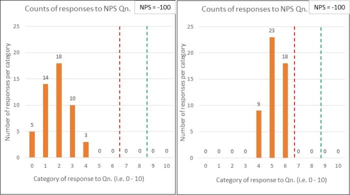
Both sets of results have the same % of Detractors (below the red line) and Promoters (above the green line)…and so are assigned the same NPS score (which, in this case would be -100). This comparison illustrates the significant dumbing down of data by lumping responses of 0 – 6 into the one category.

I’d want to clearly see the variation within the responses i.e. such as the bar charts shown, rather than have it stripped out for the sake of a ‘simple number’.

You might respond with “but we do have that data….we just provide Senior Management with the single NPS figure”….and that would be the problem! I don’t want Senior Management making blinkered decisions2, using a single number.

I’m reminded of a rather good Inspector Guilfoyle poster that fits perfectly with having the data but deliberately not using it.

Comparison pair 2: ‘Polarised vs. Contented’

Below are two more NPS response charts for comparison….and, again, they both derive the same NPS score (-12 in this case) …and yet they tell quite different stories:

Chart 2 Polarised vs Cotented

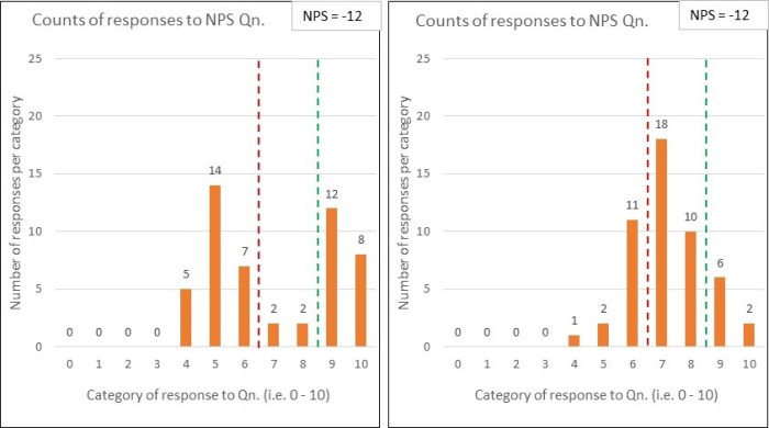
The first set of data uncovers that the organisation is having a polarising effect on its customers – some absolutely love ‘em …whilst many others are really not impressed.

The second set shows quite a warm picture of contentedness.

Whilst the NPS scores may be the same, the diagnosis is unlikely to be. Another example where seeing the variation within the data is key.

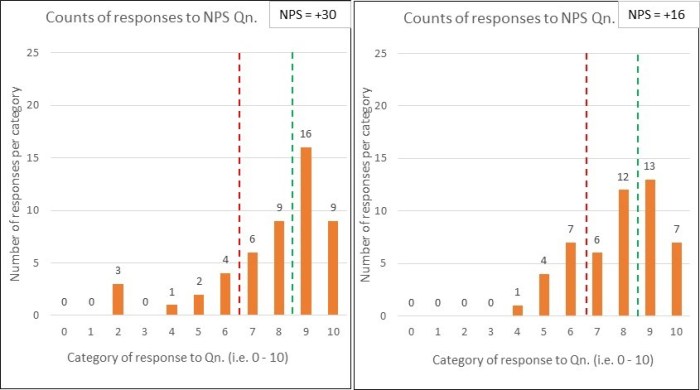
Comparison pair 3: ‘No Contest vs. No Show’

And here’s my penultimate pair of comparison charts:

Chart 3 No contest vs No show

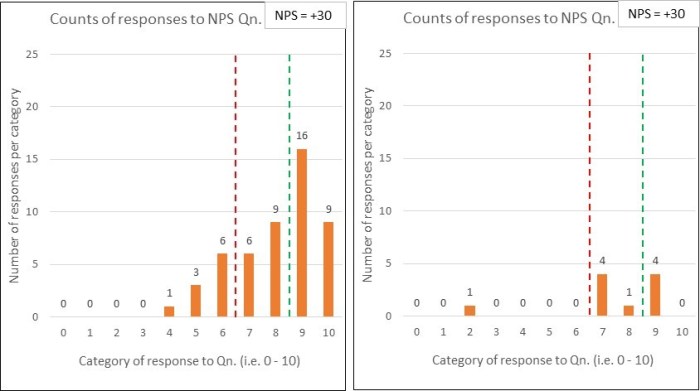
Yep, you’ve guessed it – the two sets of response data have the same NPS scores (+30).

The difference this time is that, whilst the first chart reflects 50 respondents (out of the 100 surveyed), only 10 people responded in the second chart.

You might think “what’s the problem, the NPS of +30 was retained – so we keep our KPI inspired bonus!” …but do you think the surveys are comparable. Why might so many people not have responded? Is this likely to be a good sign?  Can you honestly compare those NPS numbers? (perhaps see ‘What have the Romans ever done for us?!’)

….which leads me nicely onto the second part of this post:

Part 2 – Reliability

A 2012 article co-authored by Fred Reichheld (creator of NPS), identifies many issues that are highly relevant to compiling that one number:

  • Frequency: that NPS surveys should be frequently performed (e.g. weekly), rather than, say, a quarterly exercise.

The article doesn’t, however, refer to the essential need to always present the results over time, or whether/ how such ‘over time’ charts should (and should not) be interpreted.


  • Consistency: that the survey method should be kept constant because two different methods could produce wildly different scores.

The authors comment that “the consistency principle applies even to seemingly trivial variations in methodologies”, giving an example of the difference between a face-to-face method at the culmination of a restaurant meal (deriving an NPS of +40) and a follow-up email method (NPS of -39).


  • Response rate: that the higher the response rate, then the greater the accuracy – which I think we can all understand. Just reference comparison 3 above.

But the article goes to say that “what counts most, of course, is high response rates from your core or target customers – those who are most profitable…” In choosing these words, the authors demonstrate the goal of profitability, rather than customer purpose. If you want to understand the significance of this then please read ‘Oxygen isn’t what life is about’.

I’d suggest that there will be huge value in studying those customers that aren’t your current status quo.


  • Freedom from bias: that many types of bias can affect survey data.

The authors are clearly right to worry about the non-trivial issue of bias. They go on to talk about some key issues such as ‘confidentiality bias’, ‘responder bias’ and the whopper of employees ‘gaming the system’ (which they unhelpfully label as unethical behaviour, rather than pondering the system-causing motivations – see ‘Worse than useless’)


  • Granularity: that of breaking results down to regions, plants/ departments, stores/branches…enabling “individuals and small teams…to be held responsible for results”.

Owch….and we’d be back at that risk of bias again, with employees playing survival games. There is nothing within the article that recognises what a system is, why this is of fundamental importance, and hence why supreme care would be needed with using such granular NPS feedback. You could cause a great deal of harm.

Wow, that’s a few reliability issues to consider and, as a result, there’s a whole NPS industry being created within organisational customer/ marketing teams3…which is diverting valuable resources from people working together to properly study, measure and improve the customer value stream(s) ‘in operation’, towards each and every customer’s purpose.

Reichheld’s article ends with what it calls “The key”: the advice to “validate [your derived NPS number] with behaviours”, by which he explains that “you must regularly validate the link between individual customers’ scores and those customers’ behaviours over time.”

I find this closing advice amusing, because I see it being completely the wrong way around.

Rather than getting so obsessed with the ‘science’ of compiling frequent, consistent, high response, unbiased and granular Net Promoter Scores, we should be working really hard to:

“use Operational measures to manage, and [lagging4] measures to keep the score.” [John Seddon]

…and so to my last set of comparison charts:

Chart 4 Dont just stand there do something

Let’s say that the first chart corresponds to last month’s NPS survey results and the second is this month. Oh sh1t, we’ve dropped by 14 whole points. Quick, don’t just stand there, do something!

But wait…before you run off with action plan in hand, has anything actually changed?

Who knows? It’s just a binary comparison – even if it is dressed up as a fancy bar chart.

To summarise:

  • Net Promoter Score (NPS) has been defined as a customer loyalty metric;
  • There may be interesting data within customer surveys, subject to a heavy caveat around how such data is collected, presented and interpreted;
  • NPS doesn’t explain ‘why’ and any accompanying qualitative survey data is limited, potentially distorting and easily put to bad use;
  • Far better data (for meaningful and sustainable improvement) is to be found from:
    • studying a system in operation (at the points of demand arriving into the system, and by following units of demand through to their customer satisfaction); and
    • using operational capability measures (see ‘Capability what?’) to understand and experiment;
  • If we properly study and redesign an organisational system, then we can expect a healthy leap in the NPS metric – this is the simple operation of cause and effect;

  • NPS is not a system of management.

Footnotes

1. Dr Walter Shewhart (1891 – 1967) was the ‘father’ of statistical quality control. Deming was heavily influenced by Shewhart’s work and they collaborated together.

2. Blinkered decisions, like setting KPI targets and paying out incentives for ‘hitting it’.

3. I should add that, EVEN IF the (now rather large) NPS team succeeds in creating a ‘reliable’ NPS machine, we should still expect common cause variation within the results over time. Such variation is not a bad thing. Misunderstanding it and tampering would be.

4. Seddon’s original quote is “use operational measures to manage, and financial measures to keep the score” but his ‘keeping the score’ meaning (as demonstrated in other pieces that he has written) can be widened to cover lagging/ outcome/ results measures in general…which would include NPS.

Seddon’s quote mirrors Deming’s ‘Management by Results’ criticism (as explained in the previous post).

Slaughtering the ‘Sacred Cow’

moo-cowI’ve written enough posts now to ‘write a book’ 🙂 …so it’s about time I dealt with a seemingly sacred cow – the ‘Balanced Scorecard’.

Context

First, I’ll delve into a bit of history…

Robert Kaplan and David Norton performed a research project back in 1990 in respect of measuring organisational performance.

It was based on the premise that:

  • An organisation’s knowledge-based assets1 were becoming increasingly important;
  • The primary measurement system remained2 the financial accounting system; and
  • Executives and employees pay attention to what they measure and, therefore, were overly focused on the (short term) financials and insufficiently on the (longer term) intangible assets.

balanced-scorecardThe outcome of their research project was the concept of a Balanced Scorecard of measurements (and, of course, the accompanying Harvard Business School (HBS) management book).

This retained the organisation’s financial measures (as historic results) but added three additional perspectives:

  • Customer;
  • Internal Business Processes; and
  • Learning & Growth.

The last two were said to represent the lead indicators of future financial performance.

The Balanced Scorecard quickly gained traction in many corporations. This was helped by many a ‘big consultancy’ cashing in3 on the lucrative ‘implementation’ revenue stream.

Version 2.0

Over a decade later (2004) Kaplan and Norton then took things further by linking strategy formulation and execution to their measurement ideas and came up with the Strategy Map concept (and, you’ve guessed it…an accompanying HBS management book). I imagine that this was for two reasons:

1. They saw some improvements to/ holes in the original idea;

…and with my cynical hat sat jauntily on my head…

2. They now had an adoring following that would buy the sequel which, as ever, sets out:

– the big idea in detail;

– a set of carefully curated case studies; and

– instructions on how to implement ‘the big idea’ in (on?) your organisation

strategy-mapThe ‘Strategy Map’ turned the four quadrants of the balanced scorecard into a linear cause-effect view (see picture)

The idea went that the desired financial outcomes would be stated at the top, which would then be achieved by reverse engineering down the strategy map to the bottom.

Thus, through setting objectives from top down to bottom and using measures, targets and action plans (involving initiatives with business cases and budgets), the desired outcome could be achieved.

Wow, that all looks really cool – neat looking and oh-so-complete! Doesn’t it?

So why the ‘Sacred Cow’ reference?

Well, many (most?) organisations feverishly adopted the Balanced Scorecard/ Strategy Map tools and technique as if it were common sense. Indeed, some 20 years later, it has become ‘part of the management furniture’. Unquestioned…even unquestionable.

However, I believe that there are a number of serious problems within…so let’s consider whether that proverbial sacred cow deserves to be slaughtered…

There are two angles that I could come at it from:

  1. The thinking within the Balanced Scorecard/Strategy Map logic; and
  2. How organisations typically implement these ‘big ideas’.

It would be too easy to shoot at how organisations typically implement them (i.e. how they might have bastardised it4)…and you could easily accuse me of ‘cheap shots’, saying that these aren’t Kaplan and Norton’s fault. So, instead, I’ll critique the foundational logic using four headings.

Here goes…


1. Measurement:

The foundation of Kaplan and Norton’s logic is that we must have measures if we are to manage something…and this is regarded as conventional wisdom…but here’s a counter-quote from W. Edwards Deming to ponder:

“Of course visible figures are important but he that would run his company on visible figures alone will in time have neither company nor figures. The most important figures are unknown and unknowable but successful management must nevertheless take account of them.”

His point is that we seem to be obsessed with trying to measure the effect of a given change (usually to ‘claim it’ for some recognition or even reward), but that we cannot accurately do so…and it is a mistake to think that we can. Sure, we can likely determine whether a change is having a positive or negative effect on the system (and thereby try to amplify or dampen it) but we cannot isolate the change from everything else going on (internally or externally; occurring right now, previously or in the future)

Deming went on to provide some examples of ‘important but unknowable’:

  • The multiplying effect on sales that comes from a happy customer, and the opposite from an unhappy one;
  • The improvement of quality and productivity from teamwork (across the horizontal value stream and with suppliers);
  • The boost in quality and productivity all along a value stream from an improvement at any activity upstream;
  • The loss from the annual rating of people’s performance (the time taken by everyone to perform this process and, of far greater concern, the resulting de-motivation and relational damage caused)
  • …and so on

Deming famously wrote that “it is wrong to suppose that if you can’t measure it, you can’t manage it – a costly myth.”

feedback-cartoonExample: Can I manage how employees feel? Yes, by how I behave.

Should I become obsessed with measuring employee feeling through those dreaded culture surveys? No!!!!

…just continue to manage how people feel – by constantly and consistently applying simple philosophies such as the most excellent “Humanity above Bureaucracy” (Buurtzorg).

Leave the constant crappy ‘surveying of the obvious’ to those organisations that (still) don’t get it.

The balanced scorecard was derived because of the major limitations of purely financial measures. However, we should not assume that such a tool is a definitive answer for what we need to manage.

Indeed, it causes damaging behaviours – with management wearing blinkers when focusing on the scorecard “because we’ve tied all our management instruments into it and therefore that’s all that counts round here.”

The highly limited and ‘helicopter view’ scorecard becomes a major part of the ‘wrong management system’ problem.


2. Balance:

This word is used as if we need to balance our focus on the four different quadrants, playing one off against the others as if they are counterbalances to keep in check.

But this isn’t the case. If we did a little bit of, say, learning and growth (e.g. developing our people) and/or customer focus but then said “whoa…steady on, not too much…we need to balance the financials” then we aren’t understanding the nature of the system….and we certainly don’t ‘get’ cause and effect.

cause-and-effect

A metaphor for business to help explain the point:

Let’s suppose that you keep breaking out in a nasty skin rash.

You could pour ice cold water on it, apply a lotion or scratch it…until it bleeds (ouch).

These actions might appear to alleviate the effects…but they are also likely to make things worse…and none of them have considered (let alone dealt with) the cause!

If you continue to ignore the cause and just treat the (currently visible) effects, things could escalate…with new effects presenting…complicating any necessary treatments…causing long lasting or permanent damage…and even death.

If you want to get rid of the rash…and keep it that way (and perhaps even improve your skin complexion and wider health)…then you need to focus your attention on its cause:

  • are you reacting to something you are putting on your skin?
  • what about something you eat, drink or otherwise introduce into your body?
  • maybe it’s something else more complicated?

And once you’ve worked out the likely cause(s) then you need to do something about it.

You work on the cause (such as stop using that brand of sun cream or stop eating shell fish or…stop injecting heroin!!) whilst checking whether it is working by observing the effect (what the likes of Seddon and Johnson would refer to as ‘keeping the score’).

You don’t think “mmm, I’ll balance the cause and the effect”…because you understand the glaringly obvious definitions behind the words ‘cause’ and ‘effect’

Cause: A person or thing that gives rise to an action, phenomenon, or condition

Effect: A change which is a result or consequence of an action or other cause.” (Oxford Dictionary)

Okay, back to that Balanced Scorecard/Strategy map thingy and a cause – effect journey:

  • mgmt-cause-and-effect
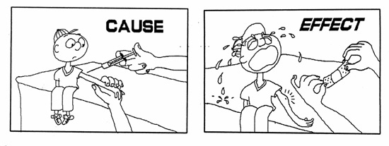
Senior Management’s beliefs and behaviours determine (i.e. cause) the management system that they choose to put into effect and (often stubbornly) retain;
  • The management system creates (i.e. causes) much of the environment that the people work within (effect);
  • The work environment is the foundation of (i.e. causes) how people act and react whilst doing their jobs (e.g. whether they are engaged, innovative, intrinsically motivated…or not);
  • How people act influences (i.e. causes) how processes are operated and the nature, size and speed of their evolution (whether by continuous or breakthrough improvements);
  • How processes operate and improve creates (i.e. causes) the outcomes that customers experience…and tell other potential customers about (i.e. as advocates or detractors);
  • Customers (whether they buy from, and advocate for us or ignore, avoid and slag us off) determine (i.e. cause) whether we stay in business.

The bl00dy obvious point is that THE FINANCIALS ARE THE EFFECT! So why are we so focused on them, other than to keep the score5.

…or, in a short, snappy sentence: This isn’t something to be BALANCED!!!!!!!!

The ‘balanced’ word keeps people tied to a ‘manage by results’ mentality, rather than managing the causes of the results such that the results then look after themselves.

What winds me up even more than the balanced bit is….wait for it…applying % weightings on the four quadrants5….usually with the financials (yes, the effect) getting the lions share!

That’s like saying “We’ll focus 75% on scratching the rash but only 25% on taking fewer heroin injections”. Aaaargh!!!

Now, you might respond to me by saying you believe that Kaplan and Norton understood the problem with the ‘balanced’ word…which is why they, ahem, ‘refreshed’ their logic with their ‘Strategy Maps’ book.

The problem with this is that they didn’t attack the results thinking, they merely added to it and, as such, many (most?) organisations continue with balancing and weighting…and spectacularly missing the point.


3. Key Performance Indicators vs. Capability:

kpi-statusOkay – let’s suppose that senior management accept that measures aren’t everything and that we shouldn’t be balancing (let alone weighting) things – I hope that we can all agree that some “right measures, measured right” (Inspector Guilfoyle) are going to be very useful…

…and so to the next whopper problem – the “measured right” bit.

Nothing (that I have seen) within the Balanced Scorecard/ Strategy Map logic reflects on, let alone deals with, the hugely important subject of variation and the need to always visualise measures over time.

Management simply use a set of KPIs on a ‘scorecard’ and look at their red down/ green up arrows against last period and/or their traffic lights against budget.

This is to completely ignore the dynamics of a system, and whether such movements are predictable or not….and therefore whether any special attention should be paid to them.

The Balanced Scorecard/Strategy Map approach can therefore create a set of Executives exhibiting the ‘God complex’ (as in “I have the answer!”) whilst being fooled by randomness” (Taleb) – blissfully ignorant of the capability of their value streams (or processes within) and doing much damage by tampering.


and last, but by no means least…

4. Strategy vs. Purpose:

The underlying assumptions within the Balanced Scorecard/Strategy Map thinking would appear to be the conventional ‘shareholder value’ view of the world.

(I’ve previously written a 5-part serialised post on what I think about this….so I won’t repeat this here)

We get fed a feast of:

In short: The core problem (for me) with Kaplan and Norton’s two books is that, not only do they retain the problematic traditional command and control management system, focused on delivering shareholder value – they use it as their foundation to build upon.

It’s therefore no wonder that organisations carry on as before (doing the same crappy stuff), whilst waving their supposedly game-changing ‘Strategy Map’ around a lot.

Have you got hold of that cow? Good…now where’s my ceremonial knife?


To end: ‘having a go’ at me because I’m being so negative

You might shout back “okay you cynic…what would you do instead?!”

Well, I’m not going to be able to answer that in a paragraph – even Kaplan and Norton took two (rather verbose) books…and more than a decade in-between…to present their logic – but I’d suggest that, if you are curious, the 130+ posts on this site would go some way to expressing what I (and I believe my giants) think.

…and if you want to start at measurement then you might want to look here first.

Footnotes:

1. Knowledge based assets: Kaplan and Norton list the following as examples of assets that aren’t measured and managed by financial measures: employee capabilities, databases, information systems, customer relationships, quality, responsive processes, innovative products and services.

2. Measurement system remaining financially based: H. Thomas Johnson’s book ‘Relevance Regained’ makes clear that it wasn’t always so. Financial measures used as operational measures (a bad idea) only came into being from the 1950s onwards. Johnson refers to the period 1950s – 1980s as the ‘Dark Age of Relevance Lost’ and ‘Management by Remote Control’. I would argue that many an organisation hasn’t exited this period.

3. Big consultancies ‘cashing in’: I can (sadly) write this because I have first hand evidence – I was there! 😦

4. Bastardising the Strategy Map includes organisations changing the order of the four elements!!!

5. Financials: There’s a HUGE difference between a) using financial measures to keep the score (which would be good governance) and b) attempting to use them to make operational decisions! Using financials to make operational decisions is to attempt to ‘make the tail wag the dog’.

Yes, accountants should keep the score, for cash flow monitoring and assisting with longer term investment decisions…but accountants should not be attempting ‘remote control management’ of operations.

6. Weighting the elements of the scorecard: See, for example, fig. 9.8 in ‘The Balanced Scorecard’ (1996) and the related commentary.

7. Diversity: I understand that the cow is a holy animal to some. Please don’t be offended by my use of an English phrase in expressing my thinking – no real cows were harmed in the writing of this post…and no harm is intended to those living now, or in the future 🙂


“Sir, Sir, Sir…have you marked it yet?!”

class with hands upSo my son had some school exams and this post was triggered from a conversation I had with him just afterwards:

I expect all of you can cast your minds back to school and if you’ve got teenagers then, like me, you will also be sharing their experiences.

Picture the following scenario:

  • You’ve studied for, let’s say, a maths exam1;
  • You’ve spent 2 long hours sat on an uncomfortable school chair, whilst being watched by the beady eyes of the maths teacher (who was actually asleep), and have just emerged from the exam hall;
  • You and your mates fall straight into discussing the trauma that you’ve just been through:

“What did you put for question 4?”

“Oh [beep], I hadn’t realised it was about that! I wrote about [something else that was completely irrelevant to the question]”

“Could you work out the pattern in that sequence of numbers?…’Fibonacci’ who?”

“What do you mean there were more questions over the page?!!!”

…and so on.

What you will notice is that they are all ‘switched on’ in the moment, whether they ‘enjoyed’ the exam or not. They really want to know what the answers were and how they did against them!

The after’math’ 🙂

So, next day, they have double-maths…whoopee!

The Students all plead together: “Sir, Sir, Sir…have you marked our exam yet?”

Teacher: “Whoa, hold your horses, I’ve barely sat down! I’ll do it as soon as I can.”

…and the students engage in yet more chatter about the exam but their memory of the exam is beginning to fade.

At the end of the week, they have maths again:

The majority of Students: “Sir, Sir, Sir…have you marked our exam yet?”

Teacher: “No, not yet, I’ll do it over the weekend.”

…much less chatter now. They have forgotten most of it.

So, now it’s the following week and maths:

A few keen Students: “Sir, have you marked our exam yet?”

Teacher: “Sorry, no, I’ve been writing reports so I haven’t got around to it yet. I’ll definitely do it by the end of this week.”

…the mood has changed. The content of the exam has been forgotten and so, instead, they fall back to merely wanting to know a score.

End of week 2 maths lesson:

One diligent Student: “Sir, have you marked our exam yet?”

Teacher: “Yes I have! I’ll read out the marks” and the marks are duly read out to the class, which brings out the whole spectrum of emotions (from feelings of elation to tears of despair, with a healthy dose of indifference in between).

That diligent Student again: “…but Sir, can I have my marked exam paper back?”

Teacher: “Erm, yes…I haven’t got them with me now…I’ll bring them in next week.”

What do we think about this?

We all know that by far the best thing to do for effective learning to take place is to mark this exam, get the marked papers back to the students and then go through the paper to explain and then discuss it question-by-question…and to do all of this As Soon As Possible.

(… and I know that this is what all good teachers will try to do)

We can see that:

  • There is a human desire for immediate and meaningful feedback, which quickly dissipates over time;
  • An overall score (the result), whilst potentially providing some useful indicative data, cannot help with learning – you can feel emotions from receiving a score but you can’t improve. Instead, you need to know about the method (or, in this exam scenario, each question);

“We don’t learn from our mistakes, we learn from thinking about our mistakes” (Ralph Tyler, Educator)

  • There is little point in just the teacher knowing the current capability of each of their students. Each student should be very clear on this for themselves.

So, to organisations:

The above might seem blindingly obvious and a world away from work but every day we all carry out actions and interactions within value-streams for the good of our customers…and the usual buzz phrase uttered at regular intervals is ‘we want to continuously improve!‘…but do we provide ourselves with what we need to do so?

Think of the richly varied units of customer demand that we* strive to satisfy as analogous to the maths exam:

  • (how) do we all know how we (really) did?
  • (how) do we find this out quickly?
  • (how) do we know what specifically went well and what didn’t?
  • …and thus, (how) can we learn where to experiment and how this went?!

(* where ‘we’ refers to the complete team along the horizontal value stream)

There’s not much point in senior managers receiving a report at the end of the month that provides them with activity measures against targets and some misleading up/down arrows or traffic light colouring. Very little learning is going to occur from this…and, worse, perhaps quite a bit of damage!

…and when I say learning, I hope you understand that I am referring to meaningful changes being made that improve the effectiveness of the value stream at the gemba.

The value-creating people ‘at the gemba’:

The people who need the (relevant) measures are the people who manage and perform the work with, and for, the customer.

If the people who do the work don’t know how they are truly doing from the customer’s point of view then they are no different from the students who don’t have their marked exam papers back.

hamster wheelThere should be no surprise if the workers are merely clocking in, turning the wheel, collecting their pay and going home again. It’s what people end up doing when they are kept in the dark….though they likely didn’t start out like this!

Senior Management may respond with “but we regularly hold meetings/ send out communications to share our financial results with them, and how they are doing against budget!”

  • This gives people the wrong message! If you lead with, and constantly point at, the financials, you are telling people that the purpose of the system is profit, and NOT your stated ‘customer centric’ purpose;
  • You can’t manage by financial results. This is an outcome – ‘read only’. You have to look at the causes of the results – the operational measures;

To repeat a hugely important John Seddon quote:

“Use operational measures to manage, and financial measures to keep the score”

I am championing what may be termed as ‘visual management’: being able to easily see and understand what is happening, in customer terms, where the work is done.

A whopping big caution

caution signHowever, ‘visual management’ should have a whopping big warning message plastered all over its box, that people would have to read before undoing the clasps and pushing back the lid…because visual management works for whatever you put up on the wall!

If you put up a visual display of how many calls are waiting or how long your current call has taken or a league table of how many sales each member of your team has made or….etc. etc. etc. people WILL see it and WILL react….and you won’t like the dysfunctional behaviours that they feel compelled to engage in!

So, rather than posting activity measures and people’s performance comparisons, what do the value creating people need to know? Well, put simply, they need to know how their system is operating over time, towards its purpose.

Here’s what John Seddon says about the operational measures that should be “integrated with the work: In other words they must be in the hands of the people who do the work. This is a prerequisite for the development of knowledge and, hence, improvement.

  • Flow: what is the capability of the system to handle demands in one-stop transactions? Where a customer demand needs to go through a flow, what is the capability of that flow, measured in customer terms? 

…in both cases we need to know the extent of variation – by revealing variation we invite questioning of its causes. By acting on2 the causes, we improve performance.”

A final thought: This blog has often said “don’t copy manufacturing because Service is different! But gemba walks through a well run ‘Lean thinking’ factory floor may very well assist your understanding of what is meant by good visual management. No, I’m not saying ‘copy what you see’…I’m suggesting that you might understand how a well run value stream has a physical place alongside the gemba where its participants gather and collaborate against a background of what they are currently achieving (their current condition) and what experiments they are working on to improve towards some future target condition.

To close – A shameless segue:

So I’ve been writing this blog for nearly 2 years…and I know many people read it…but I don’t get much feedback3.

If you have read, and accept the thinking within this post, you will understand that this limited feedback ensures that I am somewhat ‘in the dark’ as to how useful my writings are for you.

I do know that people see/ open my posts…but I don’t know too much more:

  • you might read the title or first few lines of a post, yawn, and go and do something else;
  • you might get half way through and not understand what on earth I am rambling on about;
  • you might read to the end and violently disagree with some or all of what I’ve written;

but…and here’s the punch line, how would I know? 🙂

Notes:

  1. It’s clearly a totally separate, and MUCH bigger question as to whether taking exams is good for learning – I’m aware that many educators think otherwise. The genesis of this post merely comes from my son’s exam reality. Just for clarity: I’m not a fan of the ‘top-down standards and constant testing’ movement.  
  2. Seddon writes ‘acting on’, NOT ‘removing’ the causes of variation. The aim is not to standardise demand in a service offering…because you will fail: the customer comes in ‘customer shaped’. The aim is to understand each customer’s nominal value and absorb it within your system as best you can…and continue to experiment with, and improve how you can do this.
  3. A big thanks to those of you that do provide me with feedback!….and I’m most definitely not criticising those that don’t comment – I’m just saying that I have a very limited view on how I am performing against my purpose…just like many (most?) people within their daily work lives.


What have the Romans ever done for us!!

Biggus DicusFor those of you Python fans out there, I suspect the title of this post draws a smile of recollection from you. It draws out a big hearty grin from me.

For those of you who don’t know what I am writing about (and for those who do…but would like to relive the moment – go on, you know you want to!), here’s the famous clip from the Monty Python film ‘The Life of Brian’:

What have the Romans… (1 min. 25 secs)

This clip was triggered in my mind the other day when pondering how people collect and use data in reports (I had just seen one that offended my sensibilities!). I get frustrated when I point out a serious fault within a report and the response I get is “yes, but apart from that….”

Here’s my attempt at a Python-like response:

Leader (John Cleese): Look at what this report is telling us!”

Minion 1: “…but we don’t have enough data to know what’s actually happening.”

John Cleese: What?”

Minion 1: “We are only using a couple of data points to compare. This tells us virtually nothing and is likely to be highly misleading.”

John Cleese: “Oh. Yeah, yeah. We have only got this month vs. last month. Uh, that’s true. Yeah.”

Minion 2: “…and we’re using averages – we’ve got no idea as to the variation in what is happening.”

Side kick 1 (Eric Idle): “Oh, yeah, averages, John. Remember some of the mad decisions we’ve made in hindsight because of averages?”

John Cleese: “Yeah. All right. I’ll grant you that our lack of data over time and the use of averages makes our report a bit suspect.”

Minion 3: “…and, even if we did have enough data points and could see the variation, we don’t understand the difference between noise and a signal (common and special cause variation)”

John Cleese: “Well, yeah. Obviously we don’t want to be caught tampering. I mean, understanding the difference between common and special cause goes without saying doesn’t it? But apart from a lack of data, (miss)using averages and tampering – ”

Minion 4: “We often compare ‘apples with pears’: Lots of the things we ‘hold people to account for’, they have virtually no ability to influence.”

Minion 5: “Much of the data we use is unrepresentative and/or coerced out of people, which makes any data biased.”

Minions: “Huh? Heh? Huh… “

Minion 6: “And we are focusing on one KPI and not seeing the side effects that this is causing to other parts of the system.”

Minions: “Ohh…”

John Cleese: Yeah, yeah. All right. Fair enough.

Minion 7: “and we are using targets, which are arbitrary measures that have nothing to do with the system and cause dysfunctional ‘survival’ behaviours from our people.”

Minions: “Oh, yes. Yeah… “

Side Kick 2 (Michael Palin): “Yeah. Yeah, our targets cause some pretty mad behaviours, John, and it’s really hard to spot/ find this out because our people don’t like doing ‘bad stuff’ and, as such, don’t like to tell us about it. Huh.”

Minion 8: “Our reports are focused on people (and making judgements about them), rather than on the process that they have to work within.”

Eric Idle: “And our people are ‘in the dark’ about how the horizontal value stream they work within is actually performing, John.”

Michael Palin: “Yeah, they only know about their silo. Let’s face it. If our people knew how the horizontal flow was actually doing, they’d be far more engaged in their work, more collaborative (if we removed some of the management instruments that hinder this) and therefore far more able and willing to continually improve the overall value stream.”

Minions: “Heh, heh. Heh heh heh heh heh heh heh.”

John Cleese: All right, but apart from a lack of data, (miss)use of averages, tampering, comparing apples with pears, biased data, focusing on one KPI, the use of arbitrary targets, reports focused on judging people, and our value workers being ‘in the dark’….Look at what this report is telling us!”

Minion 9: We’re using activity measures (about outputs), rather than seeing the system and its capability for our customers (about outcomes).

John Cleese: Oh. Seeing the capability of the system from the customers’ point of view? SHUT UP!

  • THE END –

In short, many (most?) organisations are terrible when it comes to measurement. They are stuck in a weird ‘conventional reporting’ world. Perhaps this is a blind spot in our human brains?

‘Statistics’ is a word that strikes fear into the hearts and minds of many of us. I’m happy to admit that I’m no expert. But I think we should have a healthy respect for data and how it should and should not be used. I’ve heard many a manager raise their voice to say that they have the data and so can ‘prove it!’…and then go on to make inferences that cannot (and should not) be justified.

(Personal view: I think that it is better to be mindful (and therefore cautious) of our level of competence rather than blissfully ignorant of our incompetence, charging on like a ‘Bull in a china shop.’)

Where to from here?:

I’ve previously written a few posts in respect of measurement. I’ve linked a number of them in the skit above or in the notes below. Perhaps have a (re)read if you’d like to further explore a point I’m attempting to make.

…and here’s a reminder of the brilliant Inspector Guilfoyle blog that is dedicated to measurement. He writes nice ‘stick child’ stories about the mad things we do, why they are mad…and what a better way looks like.

Some closing notes on some of the ‘reporting madness’ points made above:

Binary Comparisons: Here’s a really great explanation of the reasons why we shouldn’t use a couple of data points: Message from the skies

Averages: If you don’t understand the point about averages, then have a think about the following quote: “Beware of drowning in a river of average depth 1 metre.” (Quoted by John Bicheno in ‘The Lean Toolbox’)

Variation: Deming’s red bead experiment is an excellent way to understand and explore the point about variation that is inherent in everything. I’ve written about variation in (what happens to be my most read post to date): The Spice of Life

Tampering: This comes about from people not understanding the difference between common and special cause variation. I wrote a specific post about the effects of tampering on a process: Tampering

Biased data: There are loads of reasons why data collected might be biased. The use of extrinsic motivators (as in contingent monetary incentives) is a BIG one to consider and understand.

Targets: John Seddon  is the place to go if you want a deeper understanding of the huge point being made. His book ‘Freedom from Command and Control’ is superb. Also, see my post The trouble with targets.

Capability measures: I believe that this point can take a bit to understand BUT it is a huge point. I wrote Capability what? In an attempt to assist.

Capability what?

tape_measureReaders of this blog will have likely come across a phrase that I often use but which you might not be too clear on what is meant – this phrase is Capability Measure.

(Note: I first came across the use of this specific phrase from reading the mind opening work of John Seddon).

I thought it worthwhile to devote a post to expand upon these two words and, hopefully, make them very clear.

Now, there are loads of words bandied around when it comes to the use of numbers: measures, metrics, KPIs, targets. Are they all the same or are they in fact different?

Let’s use the good old Oxford dictionary to gain some insights that might assist:

Measure:     “An indication of the degree, extent, or quality of something”

Metric:     “A system or standard of measurement”

KPI (Key performance indicator): “A quantifiable measure used to evaluate the success of an organization, employee, etc. in meeting objectives for performance.

Target:     “An objective or result towards which efforts are directed

So putting these together:

A measure quantifies something…but this of itself doesn’t make it useful. It depends on what you are measuring! In fact, there is a huge risk that something that is easily measureable unduly influences us:

“We tend to overvalue the things we can measure and undervalue the things we cannot.” (John Hayes)

A metric is the way that a measurement is performed – it’s operational definition. There’s not much point in taking two measurements of something if the method of doing so differs so much as to materially affect the results obtained.

KPIs are an attempt to get away from using lots of different measures and, instead, boil them down into a handful of (supposedly) ‘important ones’ because then that will make it sooo much easier to manage won’t it?…I hope your ‘Systems thinking’ alarm bells are ringing – if we want to understand what is really happening, we need to study the system. Any attempts at short-cutting this understanding, combined with the use of targets and extrinsic motivators is likely to lead to some highly dysfunctional behaviour, causing much damage and resulting in sub-optimal outcomes. The idea of ‘management by dashboard’ is deeply flawed.

Targets – well, where to start! The dictionary definition clearly shows that their use is an attempt at ‘managing by results’…which is a daft way to manage! We don’t need a target to measure…and we don’t need (and shouldn’t attempt) to use a target to improve! A target tells us nothing about the system; distorts our thinking; and steals our focus from where it should be.

So what are we measuring?

I hope I’ve usefully covered ‘measure’ and its related terms so let’s go back to the first word: Capability

To start, we need to be clear as to what system we are studying and what its purpose is from the customer’s point of view. Then we need to ask ourselves “so what would show us how capable we are of meeting this purpose (in customer terms)?”

Some important points:

  • Capability is always about meeting the customer’s purpose and should be separate from the method of doing so:
    • An activity measure (i.e. to do with method), such as “how many calls did I take today”, is NOT a capability measure. None of my customers care how many calls I took/made!;
    • Activity measures constrain method (tie us in to the current way of working i.e. “we make calls”) whilst capability measures liberate method and encourage experimentation (“what would happen to our capability if we…”).
  • The best people to explain what really matters to the customer are the front line process performers who help them with their needs (i.e. NOT managers who are remote from the gemba):
    • The process performers know what the customers actually want and whether they are satisfied or not
  • As a rule of thumb, the end-to-end process time from the customer’s point of view is almost always an essential capability measure BUT:
    • end-to-end is defined by the customer, not when we think we have finished;
    • Targets will distort the data that we collect and thereby lead to incorrect findings…so, if you really want to understand your system’s capability you need to remove the targets and related contingent rewards.
  • Other examples of likely capability measures of use are:
    • A system’s ‘one-stop capability’: the amount of demand that can be fully satisfied (as determined by the customer) in one-stop;
    • The accuracy and value created for the customer; and
    • The safety and well-being of your people whilst delivering to the customer

An example:

I am currently moving house. I have to switch the electricity provision from the previous occupants to me. I want this switch to happen as painlessly as possible, I only want to pay for my electricity usage (none of theirs) and I want the confidence to believe that this is the case.

So:

  • The system in question is the electricity switching process;
  • My purpose is to switch:
    • Easily (minimum effort on my part….easy to start the process, no need to chase up what is happening, and easy to know when it is complete)
    • On time (on the switching date/ time requested); and
    • Transparently (so that I trust the meter readings and their timings)
  • I don’t care how the electricity companies actually achieve this switching between themselves (the method, such as whether they use a SMART meter reading or a man comes to the house or…). I just care about the outcomes for me.

The electricity company should be deriving measures to determine how capable they are in achieving against my purpose. They are then free to experiment on method and see whether their capability improves.

I have deliberately used a generic example to make the point about the system in question, its purpose and therefore capability. You can apply this thinking to your work: what the customer actually wants/ needs and how you would know how you are doing against this.

Sense-check: Capability measures are method-agnostic. Think about putting your method inside a metaphorical ‘black box’. Your capability is about what goes into the black box as compared to what comes out and what has been achieved. You can then do ‘magic’ (I mean experiments!) as to what’s inside the black box and then objectively consider whether its capability has improved or not.

What does a capability measure look like, who should see it and why?

Okay, so let’s suppose we now have some useful capability measures. How should they be presented and to whom…and what are we hoping to achieve by this?

The first big point is that the measure should be shown over time*. We should not be making binary comparisons, and then overlaying variance analysis and ‘traffic lights’ to supposedly add meaning to this (ref: Simon Guilfoyle’s excellent blog ).

We want to see the variation that is inherent in the system (the spice of life) so that we can truly see what is happening.

* Note: A control chart is the name for the type of graph used to study how a metric changes over time. The data is plotted in time order. Lines are added for the average, upper and lower control limits – where these are worked out from the data…but don’t worry about ‘how’ – these statistics can be worked out by an appropriate computer application (e.g. Minitab) in the hands of someone ‘in the know’.

Here’s a control chart showing the time it takes me to cycle to or from work:

Cycle time control chart

The second big point is that these capability control charts should be in the hands of those who perform the work. There’s little point in them being hidden within some managerial report!

Here’s what Jeffrey Liker says about how Toyota use visual management:

Every metric that matters…is presented visually for everyone who is involved in meeting the goal [purpose] to see. A key reason…is that it clarifies expectations, determines accountability for all the parties involved and gives them the ability to track their progress and measure their self-development.

[Making these metrics highly visible] is not to control behaviour, as is common in many companies, but primarily to give employees a transparent and understandable way to measure their progress.

Put simply: if the people doing the work can see what is actually happening, they are then in a place to use their brains and think about why this is so, what they could experiment with and whether these changes improved things or not* ….and on and on.

* Looking back at my ‘cycling to work’ control chart: I made a change to my method at cycle ride number 15 and (with the caveat that I need more data to conclude) the control chart shows me whether my change in method made things better, worse or caused no improvement. I cannot tell this from a binary comparison with averages, up/down arrows and traffic lights.

It should by now be clear that a capability measure is about the system, and NOT about the supposed ‘performance’ of individual operators within.

To summarise:

In bringing the above together, John Seddon applies 3 tests to determine whether something is a good measure. These tests are:

  1. Does it relate to purpose? (i.e. what matters to the customer);
  2. Does it help in understanding and improving performance? (i.e. does it reveal how the work works? To do this, it must be a measure over time, showing the variation inherent within the system, and it must be devoid of targets);
  3. Is it integrated with the work? (i.e. in the hands of the people who do the work so that they can develop knowledge and hence improve).

If it passes these three tests then you truly have a useful Capability Measure!

As luck would have it: One of my favourite bloggers, ‘Think Purpose’, released a similar ‘measurement’ post just after I had written the above. It includes a couple of very useful pictures that should compliment my commentary. It’s called A managers guide to good and bad measures – you could print them out and put them on your wall 🙂

A clarification: I’m happy with the use of the word ‘target’ if it is combined with the word ‘condition’. A reminder that a target condition (per the work of Mike Rother) is a description of the desired future state (how a process should operate, intended normal pattern of operation). It is NOT a numeric activity target or deadline. I explain about this in my earlier post called…but why?