 This post is a promised follow up to the recent ‘Not Particularly Surprising’ post on Net Promoter Score.
I’ll break it into two parts:
- Relevance; and
- Reliability
Part 1 – Relevance
A number of posts already written have explained that:
- there is variety within everything (e.g. see ‘The Spice of Life’);
- such variety is hugely important, particularly in service organisations (e.g. see ‘I’m just a spanner’);
- we should make sure that we uncover (rather than hide) variation…so that we can properly understand what’s going on (e.g. see ’80 in 20…erm, how can we change that’).
Donald Wheeler, in his superb book ‘Understanding Variation’, nicely sets out Dr Walter Shewhart’s1 ‘Rule One for the Presentation of Data’:
“Data should always be presented in such a way that preserves the evidence in the data…”
Or, in Wheeler’s words “Data cannot be divorced from their context without the danger of distortion…[and if context is stripped out] are effectively rendered meaningless.”
And so to a key point: The Net Promoter Score (NPS) metric does a most excellent job of stripping out meaning from within. Here’s a reminder from my previous post that, when asking the ‘score us from 0 – 10’ question about “would you recommend us to a friend”:
 A respondent scoring a 9 or 10 is labelled as a ‘Promoter’;
- A scorer of 0 to 6 is labelled as a ‘Detractor’; and
- A 7 or 8 is labelled as being ‘Passive’.
….so this means that:
- A catastrophic response of 0 gets the same recognition as a casual 6. Wow, I bet two such polar-opposite ‘Detractors’ have got very different stories of what happened to them!
and yet
- a concrete boundary is placed between responses of 6 and 7 (and between 8 and 9). Such an ‘on the boundary’ responder may have vaguely pondered which box to tick and metaphorically (or even literally) ‘tossed a coin’ to decide.
Now, you might say “yeah, but Reichheld’s broad-brush NPS metric will do” so I’ve mocked up three (deliberately) extreme comparison cases to illustrate the stripping out of meaning:
First, imagine that I’ve surveyed 100 subjects with my NPS question and that 50 ‘helpful’ people have provided responses. Further, instead of providing management with just a number, I’m furnishing them with a bar chart of the results.
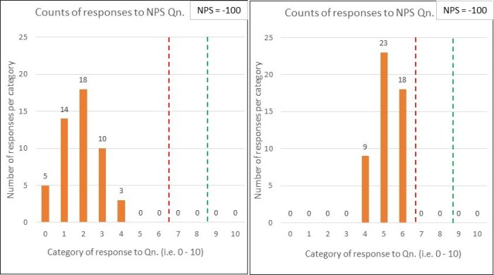
Comparison pair 1: ‘Terrifying vs. Tardy’
Below are two quite different potential ‘NPS question’ response charts. I would describe the first set of results as terrifying, whilst the second is merely tardy.

Both sets of results have the same % of Detractors (below the red line) and Promoters (above the green line)…and so are assigned the same NPS score (which, in this case would be -100). This comparison illustrates the significant dumbing down of data by lumping responses of 0 – 6 into the one category.
I’d want to clearly see the variation within the responses i.e. such as the bar charts shown, rather than have it stripped out for the sake of a ‘simple number’.
You might respond with “but we do have that data….we just provide Senior Management with the single NPS figure”….and that would be the problem! I don’t want Senior Management making blinkered decisions2, using a single number.
I’m reminded of a rather good Inspector Guilfoyle poster that fits perfectly with having the data but deliberately not using it.
Comparison pair 2: ‘Polarised vs. Contented’
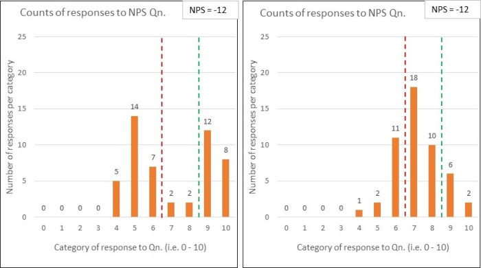
Below are two more NPS response charts for comparison….and, again, they both derive the same NPS score (-12 in this case) …and yet they tell quite different stories:

The first set of data uncovers that the organisation is having a polarising effect on its customers – some absolutely love ‘em …whilst many others are really not impressed.
The second set shows quite a warm picture of contentedness.
Whilst the NPS scores may be the same, the diagnosis is unlikely to be. Another example where seeing the variation within the data is key.
Comparison pair 3: ‘No Contest vs. No Show’
And here’s my penultimate pair of comparison charts:

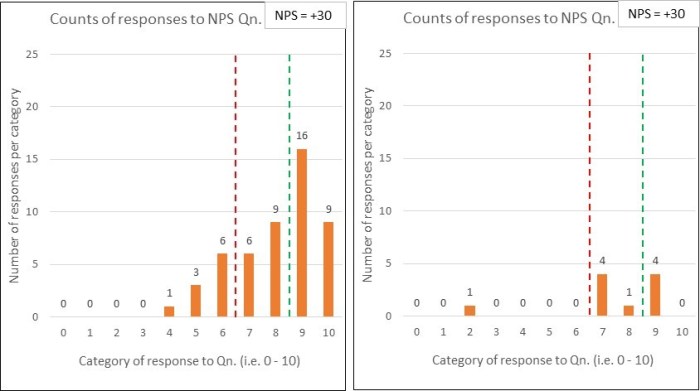
Yep, you’ve guessed it – the two sets of response data have the same NPS scores (+30).
The difference this time is that, whilst the first chart reflects 50 respondents (out of the 100 surveyed), only 10 people responded in the second chart.
You might think “what’s the problem, the NPS of +30 was retained – so we keep our KPI inspired bonus!” …but do you think the surveys are comparable. Why might so many people not have responded? Is this likely to be a good sign? Can you honestly compare those NPS numbers? (perhaps see ‘What have the Romans ever done for us?!’)
….which leads me nicely onto the second part of this post:
Part 2 – Reliability
A 2012 article co-authored by Fred Reichheld (creator of NPS), identifies many issues that are highly relevant to compiling that one number:
- Frequency: that NPS surveys should be frequently performed (e.g. weekly), rather than, say, a quarterly exercise.
The article doesn’t, however, refer to the essential need to always present the results over time, or whether/ how such ‘over time’ charts should (and should not) be interpreted.
-
Consistency: that the survey method should be kept constant because two different methods could produce wildly different scores.
The authors comment that “the consistency principle applies even to seemingly trivial variations in methodologies”, giving an example of the difference between a face-to-face method at the culmination of a restaurant meal (deriving an NPS of +40) and a follow-up email method (NPS of -39).
-
Response rate: that the higher the response rate, then the greater the accuracy – which I think we can all understand. Just reference comparison 3 above.
But the article goes to say that “what counts most, of course, is high response rates from your core or target customers – those who are most profitable…” In choosing these words, the authors demonstrate the goal of profitability, rather than customer purpose. If you want to understand the significance of this then please read ‘Oxygen isn’t what life is about’.
I’d suggest that there will be huge value in studying those customers that aren’t your current status quo.
-
Freedom from bias: that many types of bias can affect survey data.
The authors are clearly right to worry about the non-trivial issue of bias. They go on to talk about some key issues such as ‘confidentiality bias’, ‘responder bias’ and the whopper of employees ‘gaming the system’ (which they unhelpfully label as unethical behaviour, rather than pondering the system-causing motivations – see ‘Worse than useless’)
-
Granularity: that of breaking results down to regions, plants/ departments, stores/branches…enabling “individuals and small teams…to be held responsible for results”.
Owch….and we’d be back at that risk of bias again, with employees playing survival games. There is nothing within the article that recognises what a system is, why this is of fundamental importance, and hence why supreme care would be needed with using such granular NPS feedback. You could cause a great deal of harm.
Wow, that’s a few reliability issues to consider and, as a result, there’s a whole NPS industry being created within organisational customer/ marketing teams3…which is diverting valuable resources from people working together to properly study, measure and improve the customer value stream(s) ‘in operation’, towards each and every customer’s purpose.
Reichheld’s article ends with what it calls “The key”: the advice to “validate [your derived NPS number] with behaviours”, by which he explains that “you must regularly validate the link between individual customers’ scores and those customers’ behaviours over time.”
I find this closing advice amusing, because I see it being completely the wrong way around.
Rather than getting so obsessed with the ‘science’ of compiling frequent, consistent, high response, unbiased and granular Net Promoter Scores, we should be working really hard to:
“use Operational measures to manage, and [lagging4] measures to keep the score.” [John Seddon]
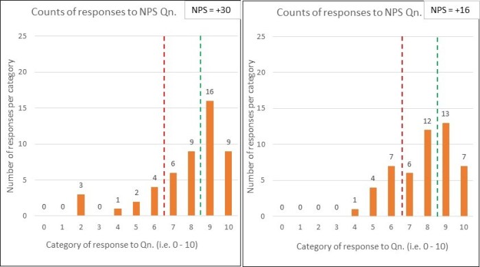
…and so to my last set of comparison charts:

Let’s say that the first chart corresponds to last month’s NPS survey results and the second is this month. Oh sh1t, we’ve dropped by 14 whole points. Quick, don’t just stand there, do something!
But wait…before you run off with action plan in hand, has anything actually changed?
Who knows? It’s just a binary comparison – even if it is dressed up as a fancy bar chart.
To summarise:
- Net Promoter Score (NPS) has been defined as a customer loyalty metric;
- There may be interesting data within customer surveys, subject to a heavy caveat around how such data is collected, presented and interpreted;
- NPS doesn’t explain ‘why’ and any accompanying qualitative survey data is limited, potentially distorting and easily put to bad use;
- Far better data (for meaningful and sustainable improvement) is to be found from:
- studying a system in operation (at the points of demand arriving into the system, and by following units of demand through to their customer satisfaction); and
- using operational capability measures (see ‘Capability what?’) to understand and experiment;
- If we properly study and redesign an organisational system, then we can expect a healthy leap in the NPS metric – this is the simple operation of cause and effect;
-
NPS is not a system of management.
Footnotes
1. Dr Walter Shewhart (1891 – 1967) was the ‘father’ of statistical quality control. Deming was heavily influenced by Shewhart’s work and they collaborated together.
2. Blinkered decisions, like setting KPI targets and paying out incentives for ‘hitting it’.
3. I should add that, EVEN IF the (now rather large) NPS team succeeds in creating a ‘reliable’ NPS machine, we should still expect common cause variation within the results over time. Such variation is not a bad thing. Misunderstanding it and tampering would be.
4. Seddon’s original quote is “use operational measures to manage, and financial measures to keep the score” but his ‘keeping the score’ meaning (as demonstrated in other pieces that he has written) can be widened to cover lagging/ outcome/ results measures in general…which would include NPS.
Seddon’s quote mirrors Deming’s ‘Management by Results’ criticism (as explained in the previous post).
I’m glad you are back posting again. Love this blog! Thanks!
LikeLiked by 1 person