This post sits squ arely within the ‘measurement’ section of this blog – a topic dear to me, given the vagaries of measurements that we are subjected to or are required to produce in our working lives1.
The catalyst for writing it was from revisiting a ‘Donald Wheeler’ chapter2 and reminding myself of being around some ‘daft work assignments’ of years ago.
I’ll start with an ordinary looking table that (let’s say) represents3 the feedback received by a presenter (Bob), after running a 1 hour session at a multi-day conference.
I’ve deliberately used a rather harmless-looking subject (i.e. feedback to a presenter) so that I can cover some general points…which can then be applied more widely.
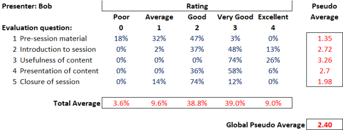 So, let’s walk through this table.
Conference attendees were asked to evaluate Bob’s session against five perfectly reasonable questions, using a five-point rating scale (from ‘Poor’ through to ‘Excellent’). The body of the table (in blue) tells us the percentage of evaluators that awarded each rating per question (and, as you would expect, the ratings given for each question sum to 100%).
Nice, obvious, easy….but that table is sure hard to read. It’s just a blur of boring numbers.
Mmm, we’d better add some statistics3 (numbers in red)…to make it more, ahem, useful.
Pseudo-Average
So the first ‘analysis’ usually added is the ‘average score per question’. i.e. we can see that there is variation in how people score…and we feel the need to boil this down into the score that a (mythical) ‘average respondent’ gave.
To do this, we assume a numerical weighting for each rating (e.g. a ‘poor’ scores a 0…all the way up to an ‘excellence’ scoring a 4) and then use our trusty spreadsheet to crunch out an average. Looking at the table, Bob scored an overall 1.35 on the quality of her pre-session material, which is somewhere between ‘average’ (a score of 1) and ‘good’ (a score of 2).
…and it is at this point that we should pause to reflect on the type of data that we are dealing with.
“While numbers may be used to denote an ordering among categories, such numbers do not possess the property of distance. The term for numbers used in this way is ordinal data.” (Wheeler)
There is a natural order between poor, average, good, very good and excellent…however there is no guarantee that the distance between ‘excellent’ and ‘very good’ is the same as the distance from ‘good’ to ‘average’ (and so on)…yet by assigning numbers to categories we make distances between categories appear the same5.
If you compute an average of ordinal data then you have a pseudo-average.
“Pseudo averages are very convenient, but they are essentially an arbitrary scoring system which is used with ordinal data. They have limited meaning, and should not be over interpreted.”
Total Average
Okay, so going back to our table of Bob’s feedback: we’ve averaged each row (our pseudo-averages)…so our next nifty piece of analysis will be to average each column, to (supposedly) find out how Bob did in general…and we get our total average line. This shows that Bob mainly scored, on average, in the ‘good’ and ‘very good’ categories.
But what on earth does this mean? Combining scores for different variables (e.g. the five different evaluation questions in this case) is daft. They have no meaningful relationship between themselves.
It’s like saying “I’ve got 3 bikes and 10 fingers….so that’s an average of 6.5”. Yes, that’s what the calculator will say…but so what?!
“The total average line (i.e. computing an average from different variables) is essentially a triumph of computation over common sense. It should be deleted from the summary.”
Global Pseudo-Average
And so to our last piece of clever analysis…that table of numbers is quite hard to deal with. Is there one number that tells us ‘the answer’?
Well, yes, we could create a global pseudo average, which would be to compute a pseudo average from the total average line. Excellent, we could calculate a one-number summary for each presenter at our conference…and then we could compare them…we could even create a (fun!) league table 🙂
Oh, bugger, our Bob only got a 2.4. That doesn’t seem very good.
To compute a global pseudo-average would be to cross-pollinate the misleading pseudo-average with the nonsensical total average line and arrive in computation purgatory.
The wider point
 Let’s move away from Bob’s presentation skills.
Who’s seen pseudo-averages, total average lines and global pseudo-averages ‘used in anger’ (i.e. with material decisions being made) on ordinal data?
A classic example would be within software selection exercises, to (purportedly) compare competing vendors in a robust, objective and transparent manner.
- In terms of pseudo averages, we get situations where 10 ‘nice to have’ features end up supposedly equaling 1 ‘essential’ function;
- In terms of total average lines, we get variables like software functionality, support levels and vendor financial strength all combined together (which is akin to my bikes and fingers);
- …and at the very end, the ‘decider’ between selecting Vendor A or B might go down to which one has been lucky enough to garner a slightly superior global pseudo-average. “Hey, Vendor B wins because they got 6.85”
The above example refers to software but could be imagined across all selection exercises (recruitment, suppliers,….).
Ordinal data is used and abused regularly. The aim of this short post is just to remind (or educate) people (including myself) of the pitfalls.
Side note: as a rule-of-thumb, my ‘bullshit-ohmmeter’ usually starts to crackle into life (much like a Geiger counter) whenever I see weightings applied to categories…
In summary
Before ‘playing with numbers’, the first thing we should do is think about what we are dealing with.
“In order to avoid a ‘triumph of computation over common sense’ it is important for you to think about the nature of your data…
…a spreadsheet programme doesn’t have any inhibitions about computing the average for a set of telephone numbers.”
Addendum: ‘Back to school’ on data types
This quick table gives a summary of the traditional (though not exhaustive) method of categorising numerical data:

Footnotes
1. It’s not just our working lives: We are constantly fed ‘numbers’ by central and local government, the media, and the private sector through marketing and advertisement.
2. Wheeler’s excellent book called ‘Making Sense of Data: SPC for the service sector’. All quotes above (in blue) are from this book.
3. ‘Represents’: If you are wondering, these are not real numbers. I’ve mocked it up so that you can hopefully see the points within.
4. Statistic: “a fact in the form of a number that shows information about something” (Cambridge Dictionary).
We should note, however, that just because we’ve been able to perform a calculation on a set of numbers doesn’t make it useful.
5. Distance: A nice example to show the lack of the quality of distance within ordinal data is to think of a race: Let’s say that, after over 2 hours of grueling racing, two marathon runners A and B sprint over the line in a photo finish, whilst runner C crawls over the line some 15 minutes later…and yet they stand on the podium in order of 1st, 2nd and 3rd. However, you can’t comprehend what happened from viewing the podium.
 6. Visualising the data: So how might we look at the evaluation of Bob’s session?
How about visually…so that we can easily see what is going on and take meaningful action. How about this set of bar graphs?
There’s no computational madness, just the raw data presented in such a way as to see the patterns within:
- The pre-session material needs working on, as does the closure of the session;
- However, all is not lost. People clearly found the content very useful;
- …Bob just needs to make some obvious improvements. She could seek help from people with expertise in these areas.
Note: There is nothing to be learned within an overall score of ‘2.4’…and plenty of mischief.
