A key component of Deming’s ‘Theory of Profound Knowledge’ is in relation to the measurement of performance (of a system) and the ‘Theory of Variation’.
I’ve noticed over the years that, whilst the foundational points around variation can be well understood, the use of control charts within operational practice can be ‘absolutely butchered’ (technical term 🙂 ).
This caused me to write a ‘how to’ guide a while back, for me and my colleagues.
I recently ‘dusted it down’ and tidied it up into a version 2.0 in order that I can share it more widely, for anyone who can find value within.
I attach it as a pdf document for anyone interested:
It doesn’t replace the excellent writings of Donald Wheeler…though it hopefully makes you curious to ‘pull’ his writings towards you.
It doesn’t tell you what to measure…because it couldn’t!
It doesn’t ‘do it for you’…but, hopefully, it does give you enough so that you can experiment with doing it for yourself.
…and it can’t beat working alongside someone who knows what they are doing, and can act as your coach.
Note: If you do end up using/ sharing this guide then I’d be grateful if you could add a simple comment at the bottom of this page so that I am aware of this. Not because I’m going to invoice you (I’m not!)…but because I would find this knowledge useful (#feedback).
You might tell me: what you thought of it (warts and all), where you might use it, whether you have shared it with others (and whether they appreciated this or not!)… and if it has improved your measurement practices.
I’ve written a fair bit on this blog over the years using the v word(s).
A useful interaction with a colleague1 today caused us to become clearer on our terms (always a good thing).
In the spirit of sharing (and at the risk of stating the bleedin obvious):
1. Variance = a difference, usually between what was expected/wanted and what happened (e.g. a discrepancy)
2. Variation = the act of varying (i.e. that something changes/ is changing)
3. Variety = the quality of being varied; diversity
4. A variant = a specific instance of variety
They are inter-related, though different terms. They vary 🙂
I’d add: beware of (improperly) analysing 1; constantly work to see and understand 2; embrace 3; and you are a great example of 4.
For those of you who are now wondering what on earth I’m on about, here are links to some previous posts that explain the importance of the V words (particularly variation and variety):
Measures of (targets on (measures of things)); and
Targets on (measures of (targets on (measures of things)))
Wow, that last one is hard to write, let alone say out loud! You might think that it’s a nonsense (which it is) but, sadly, it’s very common.
Note: I added the brackets to (hopefully) make really clear how each one builds on the last.
I’ll attempt to explain…
1.Measures of things:
Seems straight forward enough: I’m interested in better understanding a thing, so I’d like to measure it1.
Some examples…
A couple of personal ones:
What’s my (systolic) blood pressure level? or
How quickly do I ride my regular cycle route?
A couple of (deliberately) generic work ones:
how long does it take us to achieve a thing? or
how many things did we achieve over a given period?
Here’s a graph of a measure of a thing (in chronological order):
Nice, we can clearly see what’s going on. We achieved 13 things in week 1. Each thing took us anything between 2 and 36 days to achieve…and there’s lots of variation in-between.
It doesn’t surprise me that it varies2 – it would be weird if all 13 things took, say, exactly 19 days (unless this had been structurally designed into the system). There will likely be all sorts of reasons for the variation.
However, whilst I ‘get’ that there is (and always will be) variation, the graph allows us to think about the nature and degree of that variation: Does it vary more than we would expect/ can explain?3 Are there any repeating patterns? Unusual one-offs? (statistically relevant) Trends?
Such a review allows us to ask good questions, to investigate against and learn from.
“Every observation, numerical or otherwise, is subject to variation. Moreover, there is useful information in variation.” (Deming)
2.Targets on (measures of things):
Let’s say that we’ve been asked to achieve a certain (arbitrary4) target.
Here’s an arbitrary target of 30 days (the red line) set against our measure:
And here’s how we are doing against that target, with some visual ‘traffic lighting’ added:
Instance (X)
1
2
3
4
5
6
7
8
9
10
11
12
13
Target of 30 days met? (Yes/No)
N
Y
Y
N
Y
Y
Y
Y
Y
Y
Y
N
Y
We’ve now turned a rich analogue signal into a dull digital ‘on/off’ switch.
If we only look at whether we met the target or not (red vs. green), then we can no longer see the detail that allowed us to ask the good questions.
We met ‘target’ for instances 2 and 3…but the measures for each were quite different
Conversely, we met ‘target’ for instances 5 all the way through to 11 and then ‘suddenly’ we didn’t…which would likely make us think to intensely question instance 12 (and yet not see, let alone ponder, the variation between 5 and 11).
The target is causing us to ask the wrong questions5, and miss asking the right ones.
3.Measures of (targets on (measures of things)):
But I’m a fan of measures! So, let’s show a measure over time of how we are doing against our target.
In week 1 we met our 30-day target for 10 out of our 13 instances, which is 77%. Sounds pretty good!
Here’s a table showing how many times we met target for each of the next five weeks:
Week
1
2
3
4
5
Things achieved
13
15
14
11
12
Number meeting 30-day target
10
14
12
7
8
% meeting 30-day target
77%
93%
86%
64%
67%
Let’s graph that:
It looks like we’ve created a useful graph, just like in point 1.
But we would be fooling ourselves – we are measuring the movement of the dumbed-down ‘yes/no’ digital switch, not the actual signal. The information has been stripped out.
For example: There might have been huge turbulence in our measure of things in, say, week 3 whilst there might have been very little variation in week 4 (with lots of things only just missing our arbitrary ‘target’)…we can’t see this but (if we want to understand) it would be important to know – we are blind but we think we can see.
4.Targets on (measures of (targets on (measures of things))):
And so, we get to the final iteration:
How about setting an arbitrary target on the proportion of things meeting our arbitrary target…such as achieving things in 30 days for 80% of the time (the red line)…
And here’s the table showing how we are doing against that target:
Week number:
1
2
3
4
5
80% Target on 30-day Target met?
N
Y
Y
N
N
Which is a double-dumbing down!
We’ve now got absolutely no clue as to what is actually going on!!!
But (and this is much worse) we ‘think’ we are looking at important measures and (are asked to) conclude things from this.
The table (seemingly) tells us that we didn’t do well in week’s 1, 4 and 5, but we did in week’s 2 and 3…
The base data series used for this example:
In order to write this post, I used the Microsoft Excel random number generator function. I asked it to generate a set of (65) random numbers between 1 and 40 and then I broke these down into imaginary weeks. All the analysis above was on pure randomness.
Here’s what the individual values look like when graphed over time:
(Noting that instances 1 – 13 are as per the graph at point 1, albeit squashed together)
Some key points:
There is nothing special about any of the individual data points
The 30-day target has got nothing to do with the data
There is nothing special about any of the five (made up) weeks within
The 80% target on the 30-day target has got nothing to do with anything!
The point: Whilst I would want to throw away all the ‘targets’, ‘measures of target’ and ‘targets on measures of target’…I would like to understand the system and why it varies.
This is where our chance of improving the system is, NOT in the traditional measures.
Our reality:
You might be laughing at the above, and thinking how silly the journey is that I’ve taken you on…
…but, the ‘targets on (measures of (targets on (measures of things)))’ thing is real and all around us.
80% of calls answered within 20 seconds
95% of patients discharged from the Emergency department within 4 hours
70% of files closed within a month
[look for and add your own]
…
Starting from a position of targets and working backwards:
If you’ve got a target and I take it away from you…
…but I still ask you “so tell me, how is [the thing] performing?” then what do you need to do to answer?
Well, you would now need to ponder how has the thing been performing – you would then need to look at a valid measure of a thing over time and ponder what this shows.
In a nutshell: If you’ve got a target, take it away BUT still ask yourself ”how are we doing?”
A likely challenge: “But it’s hard!”
Yes… if you peel back the layers of the ‘targets on targets’ onion so that you get back to the core of what’s actually going on, then you could be faced with lots of data.
I see the (incorrect) target approach as trying to simplify what is being looked at so that it looks easy to deal with. But, in making it look ‘easy to deal with’, we mustn’t destroy the value within the data.
“Everything should be made as simple as possible, but no simpler.” (attributed to Einstein)
The right approach, when faced with a great deal of data, would be to:
Look at it in ways that uncover the potential ‘secrets’ within (such as in a histogram, in a time-series plot); and
understand how to disaggregate the data, such that we can split it up into meaningful sub-groups. We can then:
compare sub-groups to consider if and how they differ; and
look at what’s happening within each sub-group (i.e. comparing apples with apples)
To close:
If you are involved in ‘data analysis’ for management, I don’t think your role should be about ‘providing the simple (often 1-page) picture that they’ve asked for’. I would expect that you would wish your profession to be along the lines of ‘how can I clearly show what’s happening and what this means?’
If you are a manager looking at measures: why would you want an (overly) simple picture so that you can review it quickly and then move on to making decisions? Wouldn’t you rather understand what is happening and why … so that good decisions can be made?
Footnotes
1. Measurement of things – a caution: We should be careful not to fall into the trap of thinking that everything is measurable or, if we aren’t measuring it, then it doesn’t matter.
There’s plenty of stuff that we know is really important even though we might not be measuring it.
As a simple example: If you took a regular reading of your resting heart rate, don’t you think it would be weird if you got, say, 67 beats per minute every single time? You’d think that you’d turned into some sort of android!
3. Expect/ can explain – clarification: this is NOT the same as ‘what we would like it to be’.
4. Arbitrary: When a numeric target is set, it is arbitrary as to which number was picked. Sure, it might have been picked with reference to something (such as 10% better than average, or the highest we’ve ever achieved, or….) but it’s arbitrary as to which ‘reference’ you choose.
5. Wrong questions: These wrong questions are then likely to cause us to jump to wrong conclusions and actions (also known as tampering). Such actions are likely to focus on individuals, rather than the system that they work within.
6. ‘Trigger’: The writing of this post was ‘triggered’ the other day when I reviewed a table of traffic-lighted (i.e. against a target) measures of targets on measures of things.
such variety is hugely important, particularly in service organisations (e.g. see ‘I’m just a spanner’);
we should make sure that we uncover (rather than hide) variation…so that we can properly understand what’s going on (e.g. see ’80 in 20…erm, how can we change that’).
Donald Wheeler, in his superb book ‘Understanding Variation’, nicely sets out Dr Walter Shewhart’s1‘Rule One for the Presentation of Data’:
“Data should always be presented in such a way that preserves the evidence in the data…”
Or, in Wheeler’s words “Data cannot be divorced from their context without the danger of distortion…[and if context is stripped out] are effectively rendered meaningless.”
And so to a key point: The Net Promoter Score (NPS) metric does a most excellent job of stripping out meaning from within. Here’s a reminder from my previous post that, when asking the ‘score us from 0 – 10’ question about “would you recommend us to a friend”:
A respondent scoring a 9 or 10 is labelled as a ‘Promoter’;
A scorer of 0 to 6 is labelled as a ‘Detractor’; and
A 7 or 8 is labelled as being ‘Passive’.
….so this means that:
A catastrophic response of 0 gets the same recognition as a casual 6. Wow, I bet two such polar-opposite ‘Detractors’ have got very different stories of what happened to them!
and yet
a concrete boundary is placed between responses of 6 and 7 (and between 8 and 9). Such an ‘on the boundary’ responder may have vaguely pondered which box to tick and metaphorically (or even literally) ‘tossed a coin’ to decide.
Now, you might say “yeah, but Reichheld’s broad-brush NPS metric will do” so I’ve mocked up three (deliberately) extreme comparison cases to illustrate the stripping out of meaning:
First, imagine that I’ve surveyed 100 subjects with my NPS question and that 50 ‘helpful’ people have provided responses. Further, instead of providing management with just a number, I’m furnishing them with a bar chart of the results.
Comparison pair 1: ‘Terrifying vs. Tardy’
Below are two quite different potential ‘NPS question’ response charts. I would describe the first set of results as terrifying, whilst the second is merely tardy.
Both sets of results have the same % of Detractors (below the red line) and Promoters (above the green line)…and so are assigned the same NPS score (which, in this case would be -100). This comparison illustrates the significant dumbing down of data by lumping responses of 0 – 6 into the one category.
I’d want to clearly see the variation within the responses i.e. such as the bar charts shown, rather than have it stripped out for the sake of a ‘simple number’.
You might respond with “but we do have that data….we just provide Senior Management with the single NPS figure”….and that would be the problem! I don’t want Senior Management making blinkered decisions2, using a single number.
I’m reminded of a rather goodInspector Guilfoyle posterthat fits perfectly with having the data but deliberately not using it.
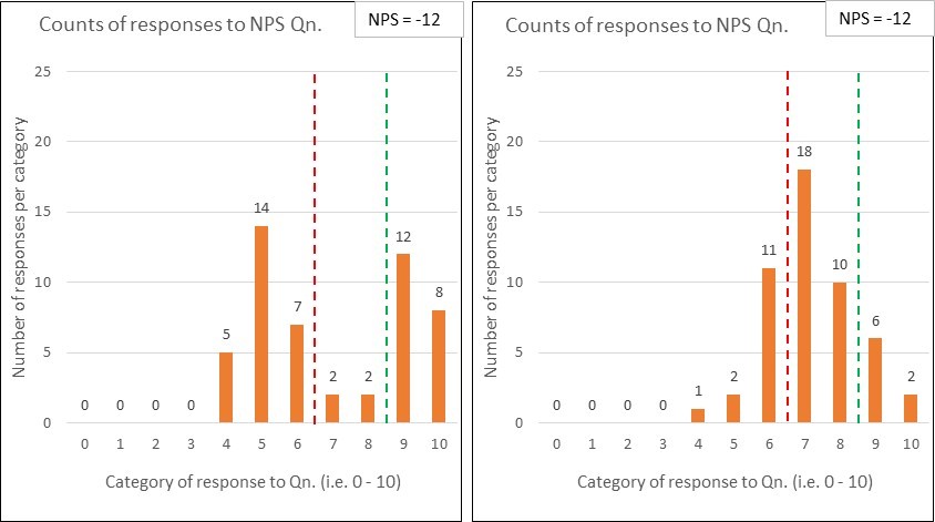
Comparison pair 2: ‘Polarised vs. Contented’
Below are two more NPS response charts for comparison….and, again, they both derive the same NPS score (-12 in this case) …and yet they tell quite different stories:
The first set of data uncovers that the organisation is having a polarising effect on its customers – some absolutely love ‘em …whilst many others are really not impressed.
The second set shows quite a warm picture of contentedness.
Whilst the NPS scores may be the same, the diagnosis is unlikely to be. Another example where seeing the variation within the data is key.
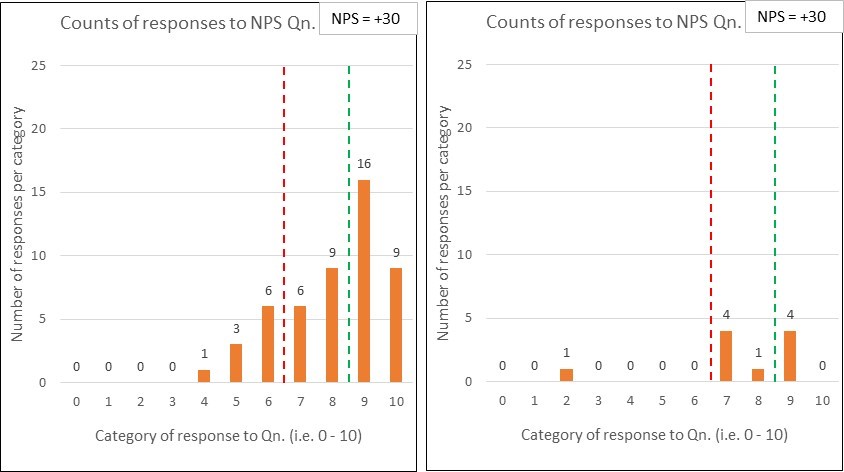
Comparison pair 3: ‘No Contest vs. No Show’
And here’s my penultimate pair of comparison charts:
Yep, you’ve guessed it – the two sets of response data have the same NPS scores (+30).
The difference this time is that, whilst the first chart reflects 50 respondents (out of the 100 surveyed), only 10 people responded in the second chart.
You might think “what’s the problem, the NPS of +30 was retained – so we keep our KPI inspired bonus!” …but do you think the surveys are comparable. Why might so many people not have responded? Is this likely to be a good sign? Can you honestly compare those NPS numbers? (perhaps see ‘What have the Romans ever done for us?!’)
….which leads me nicely onto the second part of this post:
Frequency: that NPS surveys should be frequently performed (e.g. weekly), rather than, say, a quarterly exercise.
The article doesn’t, however, refer to the essential need to always present the results over time, or whether/ how such ‘over time’ charts should (and should not) be interpreted.
Consistency: that the survey method should be kept constant because two different methods could produce wildly different scores.
The authors comment that “the consistency principle applies even to seemingly trivial variations in methodologies”, giving an example of the difference between a face-to-face method at the culmination of a restaurant meal (deriving an NPS of +40) and a follow-up email method (NPS of -39).
Response rate: that the higher the response rate, then the greater the accuracy – which I think we can all understand. Just reference comparison 3 above.
But the article goes to say that “what counts most, of course, is high response rates from your core or target customers – those who are most profitable…” In choosing these words, the authors demonstrate the goal of profitability, rather than customer purpose. If you want to understand the significance of this then please read ‘Oxygen isn’t what life is about’.
I’d suggest that there will be huge value in studying those customers that aren’t your current status quo.
Freedom from bias: that many types of bias can affect survey data.
The authors are clearly right to worry about the non-trivial issue of bias. They go on to talk about some key issues such as ‘confidentiality bias’, ‘responder bias’ and the whopper of employees ‘gaming the system’ (which they unhelpfully label as unethical behaviour, rather than pondering the system-causing motivations – see ‘Worse than useless’)
Granularity: that of breaking results down to regions, plants/ departments, stores/branches…enabling “individuals and small teams…to be held responsible for results”.
Owch….and we’d be back at that risk of bias again, with employees playing survival games. There is nothing within the article that recognises what a system is, why this is of fundamental importance, and hence why supreme care would be needed with using such granular NPS feedback. You could cause a great deal of harm.
Wow, that’s a few reliability issues to consider and, as a result, there’s a whole NPS industry being created within organisational customer/ marketing teams3…which is diverting valuable resources from people working together to properly study, measure and improve the customer value stream(s) ‘in operation’, towards each and every customer’s purpose.
Reichheld’s article ends with what it calls “The key”: the advice to “validate [your derived NPS number] with behaviours”, by which he explains that “you must regularly validate the link between individual customers’ scores and those customers’ behaviours over time.”
I find this closing advice amusing, because I see it being completely the wrong way around.
Rather than getting so obsessed with the ‘science’ of compiling frequent, consistent, high response, unbiased and granular Net Promoter Scores, we should be working really hard to:
“use Operational measures to manage, and [lagging4] measures to keep the score.”[John Seddon]
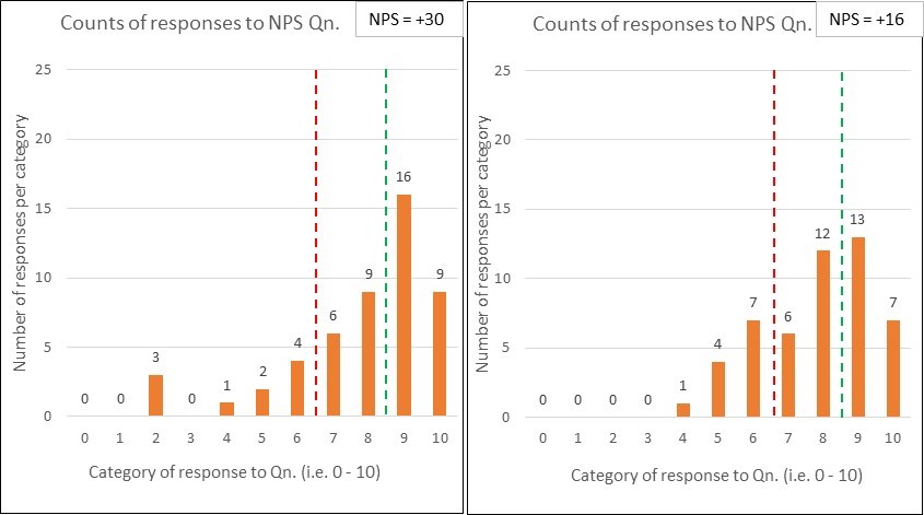
…and so to my last set of comparison charts:
Let’s say that the first chart corresponds to last month’s NPS survey results and the second is this month. Oh sh1t, we’ve dropped by 14 whole points. Quick, don’t just stand there, do something!
But wait…before you run off with action plan in hand, has anything actually changed?
Who knows? It’s just a binary comparison – even if it is dressed up as a fancy bar chart.
To summarise:
Net Promoter Score (NPS) has been defined as a customer loyalty metric;
There may be interesting data within customer surveys, subject to a heavy caveat around how such data is collected, presented and interpreted;
NPS doesn’t explain ‘why’ and any accompanying qualitative survey data is limited, potentially distorting and easily put to bad use;
Far better data (for meaningful and sustainable improvement) is to be found from:
studying a system in operation (at the points of demand arriving into the system, and by following units of demand through to their customer satisfaction); and
using operational capability measures (see ‘Capability what?’) to understand and experiment;
If we properly study and redesign an organisational system, then we can expect a healthy leap in the NPS metric – this is the simple operation of cause and effect;
NPS is not a system of management.
Footnotes
1. Dr Walter Shewhart (1891 – 1967) was the ‘father’ of statistical quality control. Deming was heavily influenced by Shewhart’s work and they collaborated together.
2. Blinkered decisions, like setting KPI targets and paying out incentives for ‘hitting it’.
3. I should add that, EVEN IF the (now rather large) NPS team succeeds in creating a ‘reliable’ NPS machine, we should still expect common cause variation within the results over time. Such variation is not a bad thing. Misunderstanding it andtamperingwould be.
4. Seddon’s original quote is“use operational measures to manage, and financial measures to keep the score” but his ‘keeping the score’ meaning (as demonstrated in other pieces that he has written) can be widened to cover lagging/ outcome/ results measures in general…which would include NPS.
Seddon’s quote mirrors Deming’s ‘Management by Results’ criticism (as explained in the previous post).
creating a detailed budget for the next year and then holding people to it is a very poor way to manage;
the budget is part of a wider ‘fixed performance contract’ that understandably causes budget holders and their teams to engage in a set of games that are hugely harmful to the system and its purpose;
but there is a better way…which will be discussed in (this) part 2.
If you can’t remember, or haven’t yet read, why part 1 came to these conclusions then please (re)read it…otherwise read on:
So what do you do instead of a budget?
So there’s a short, simple (and insufficient) answer, and then there’s the rest of what needs to be said.
In simple financial process terms, those organisations that no longer use budgets work with rolling forecasts instead. Here are a few explanatory quotes from successful practitioners:
“Rolling forecasts are updated quarterly and look five quarters ahead…and because [they] are separated from any form of performance evaluation and control*, we get far more accurate forecasts than was ever the case with the budgeting system.”
(* a necessary discussion point covered later in this post)
“…this approach has reduced dramatically the amount of time managers now spend in forecasting compared with the previous budgeting process.”
“Forecasts are used in conjunction with actual results to show trends for high level KPIs such as return on capital, profitability, volumes and so forth. These typically show the last eight quarter’s actual results and the next five quarters forecasts.”(i.e. they see, and understand variation rather than making binary comparisons)
“Rolling forecasts…place the CEO in a much stronger position to anticipate financial results.”
Right, so you’ve got the basic idea about rolling forecasts…but I started by stating that this was insufficient:
Necessary…but not sufficient!
Here’s a rather nice animation of a seven-levered lock:
I find it mesmerising! And it’s pretty cool seeing how it actually works 🙂
Using the lock as an analogy:
The lock is a system. Each of the seven levers (along with the key and accompanying barrel) is a component part;
You can uncover the existence of one lever, work out what position it needs to be in, and get this sorted (e.g. moving from budgets to rolling forecasts)…and yet the lock won’t open;
Further, the moving of this one lever into the ‘right’ position will very likely upset the positioning of all the other levers;
It is only when all of the necessary components work together that the lock opens;
Each component is necessary, but not sufficient.
…and so it is the same for any organisation’s stated desire for (what is often termed) ‘Operational Excellence’.
Clarification: The lock system as an analogy is obviously limited because it is a simple ‘digital’ system – it is either locked or unlocked, on or off, black or white, 0 or 1. This doesn’t represent the real world but it is still useful.
The ‘locked – unlocked’ states in my analogy are the difference between:
a command and control management system (that will likely be playing with a few levers in the hope of change but which hasn’t unlocked the underlying issues with its ideology); and
a truly devolved, adaptive and purpose-seeking system.
The lock is only truly open when all the necessary levers are working together.
What levers?!
Here’s a brief touch on them (with links to further discussions):
1. System-level Clarity:
Of purpose: a meaningful ‘why’ for the organisation, and each of its value streams, from the perspective of the customer and society…where profit is an ongoing result, not an excuse;
Of philosophy: i.e. how to get there (which incorporates the other four levers)
…where this clarity is instead of, not as well as, a ‘management has the answer for you’ plan.
2. Transparency:
Fast, frequent, unadulterated, open-to-all and useful information feedback on what your value streams are achieving over time and if/ how this is changing, NOT activity measures, targets, binary comparisons and management reports
Actual trends and rolling forecasts NOT budgets and variance analysis (as explained at the top of this post)
…meaning that the people who do the work gain constant feedback on the capability of their value stream(s) against customer purpose.
3. Front-line Control (Devolution):
Ownership of decisions and customers by the value creators: that’s the people working at the front line with the customer and their needs;
“Self-managed teams are far more productive than any other form of organising. There is a clear correlation between participation and productivity.” (Margaret Wheatley)
4. Management as Support (NOT control):
Provision of enabling technologies and expertise, NOT dictating what these shall be and how they shall be used;
…in short, value enablers instead of, not as well as, commanders and controllers.
5. Collective Accountability:
You may have noticed that I’ve put this in the centre of my fancy bubbles diagram. That’s because it will be a catalyst for everything else yet, without it, nothing great is likely to be achieved because individualism and extrinsic rewards will act as a highly effective brake.
Recognition and reward only byLong term, (equal) sharing in success a.k.a Profit Sharing;
Balance of collaboration with healthy competition (knowing how everyone is doing AND wanting to help them do better because it is in your interest to do so);
…can you imagine if you and everyone around you were all truly harnessed together towards the same aim, and how this would change/ enhance your behaviour?!
With these five levers working together then you will get a ‘whole organisation’ that is very clear on what it is trying to achieve, that is laser-focused on their customers, that will constantly innovate and adapt, that is never satisfied with where it’s at, that wants to know who’s doing well (and why) and who’s not (and, importantly, how to help them).
It will also avoid the huge waste inherent within the fixed performance contract (with all the ‘budget setting, target tracking, performance appraising and contingent reward’ paraphernalia dismantled and replaced).
Revisiting those 10 games
In part 1 of this post I set out, and explained, a series of recognisable games that budget holders and their teams play.
However, if you are working on the set of levers explained above, you can expect to create a management system that reverses those games into highly desirable outcomes (for employees, customers and investors). Here are those opposites:
“Always aim to improve upon and beat the competition”
“Never let the team down and be the one that drains the profit-sharing pool”
“Always aim to know and care for customers”
“Always share knowledge and resources with other teams – they are our partners!”
“Never acquire more resources than you need”
“Always aim to challenge (and reduce) costs”
“Always have the ability to understand root causes”
“Always ‘tell it like it is’ and share bad news”
“Always do your best, never fudge the numbers”
“Always challenge conventional wisdom”
Wow, that would be a cool place to work!
‘Beyond Budgeting’: The movement
So, I might well hear you asking “who’s actually doing this mad-as-a-hatter stuff eh Steve?!!” and I would answer that there are loads and loads of organisations (large and small) all around the world who are somewhere along their journey.
And, whilst obviously they don’t all agree on exactly everything, they all point towards what has been called by some ‘Management 2.0’ – the realisation that the command and control management system is ‘the problem’ and advocating evolving to a new one (by humbly studying, experimenting and learning).
It’s not a recipe – it’s a philosophy
A recipe has a set of ingredients and related instructions as to how to combine them – it is something that is implemented (being repeatable and reproducible).
A (scientific) philosophy is a theory, based on sound evidence, that acts as a guiding principle for behaviour. It is a direction to follow, where the path is found through experimentation and learning.
This (or any other) post is not meant to prescribe what needs doing. Instead, this whole blog advocates a move away from command-and-control, and towards systemic thinking and adaptive progress towards a meaningful purpose through empowered (which must imply engaged) people.
Caveat: setting out a ‘philosophy’ is absolute twaddle if it isn’t actually believed in, understood and expertly, humbly and continuously practiced by those in leadership.
‘Lipstick on a pig’
What a great phrase! Putting lipstick, some earrings and a blonde wig on a pig doesn’t change what it is…even if you are doing so with good intentions! (Ewe, that’s a weird thought).
There are many organisations out there attempting to command-and-control their way to ‘Operational Excellence’ but this is an oxymoron.
There is a subtle, yet gargantuan, difference between an organisation fumbling (with best intent) with a few of the levers and one that understands the lock.
Note: All quotes, unless specifically stated, come from Hope and Fraser’s book ‘Beyond Budgeting’ (2003) and their associated case studies.
So there’s a TV programme that I love called ‘How it’s made’. It takes the viewer through the manufacturing journey of a unit of production. An episode might focus on something small, like making a can of fizzy drink. Another episode might focus on something HUGE, like building a cruise ship…but there is a similarity within.
The other day I watched an episode that showed how a spanner was made (a ‘combination wrench’ if we are being techy). Watch it here (it’s only 5 mins).
Once you’ve watched it, I’d ask you to put yourself in the place of one of those wonderful spanners (call yourself Sammy if you like and have a think about yourself)….I did, and here’s what I thought:
“I’m just a spanner….
I don’t have a brain
I’m not purposeful – I just ‘am’
I don’t have a genetic make-up passed on to me – I don’t have a mum and dad!
I have no memory of my past experiences from which to form opinions
I’m not capable of emotion
I can’t respond to things that happen to me or make choices for myself
In short: I cannot think or communicate, which is ironic given that I appear to be writing this post 🙂
Further, all of this is relatively static – it doesn’t change over time…other than perhaps the ever-so-slow process of entropy as I likely corrode.
…and so, given this I really don’t mind that:
my destiny (to be ‘that spanner’) is predetermined for me, and completely specified ‘up front’ by my makers…without any input from me;
there is nothing unique/ special about me: I am treated exactly the same as every other ‘standardised’ spanner;
I am bundled together with other spanners in convenient batches as and when my makers see fit;
I am passed from process to process as my makers determine, for their benefit;
I sit around (in piles) waiting for when the next process is ready for me
which may be days or even weeks…in fact whenever my makers wish
…and nothing really happens to me whilst I am waiting
…and so on
Each process knows exactly what it is getting from the last one and knows exactly what to do (e.g. I will arrive at process ‘x’ as a blank and I will then have a hole stamped through me, ready for process ‘y’)
It doesn’t really matter what mood each worker on my production line is in, how they are presented…even what language they speak or views they hold. They will ‘process me’ and move on with their lives!
This arrangement may very well work out just fine for our Sammy the spanner…but now let’s turn our attention to service organisations (and service value streams):
If you go back to the monologue above and substituted a customer into the role of our hero, the spanner, you would find that all is most definitely NOT okay! Go on, take a short minute to do it – it’s a good exercise in realising how and why service and manufacturing are VERY different.
Treating customers as brain-less, purpose-less, emotion-less and lacking in memory is not recommended. “Fine” I hear you say ”….we’d never do that!”
But, now consider whether many (most?) service organisations:
attempt to standardise customers into a service ‘straight jacket’;
pass customers through rigid pre-defined processes (e.g. from front office to back office; through vertical silos of order taking – assessment – solution – payment and closure…and then ‘after care’)
juggle customers between multiple members of staff (with no-one really taking responsibility);
put customers into queues to process at the service’s convenience (perhaps using computers to elicit ‘data attributes to classify, sort, prioritise and schedule’*)
treat the customer’s time and effort as free; and
decide when the customer’s need has been fulfilled (rather than allow the customer to determine this for themselves)
* If that sounds awfully boring and techy, it’s meant to because that’s what computers are good at – algorithms, not people.
Now, you might yawn and say “Steve, you are on your ‘service is different’ band wagon again” and you’d be right! You might even point me at some posts that I have already written in a similar vein.
But the fact is that every single day we, as customers, experience service organisations treating us more like a spanner than a person. This likely causes huge frustration, failure demand and negativity towards the service being experienced.
Many a service has gone down the wrong path. It is time for them to wake up…
“No matter how long you have been on the wrong road, turn back.”
Do you sometimes feel like you are being treated like a spanner instead of a customer?
Conversely, if you work in a service organisation (or service value stream), what do you think your customers feel like?
A final reflection:
It’s worth considering the following quote: “In service, the best hand-off is no hand-off.”
I’m not saying that this is necessarily achievable…it’s more of a challenge towards which we should be pointing. At its most basic it is a sobering antidote to all those out there running in the other direction whilst chanting the ‘standardise and specialise’ mantra.
For those of you Python fans out there, I suspect the title of this post draws a smile of recollection from you. It draws out a big hearty grin from me.
For those of you who don’t know what I am writing about (and for those who do…but would like to relive the moment – go on, you know you want to!), here’s the famous clip from the Monty Python film ‘The Life of Brian’:
This clip was triggered in my mind the other day when pondering how people collect and use data in reports (I had just seen one that offended my sensibilities!). I get frustrated when I point out a serious fault within a report and the response I get is “yes, but apart from that….”
Here’s my attempt at a Python-like response:
Leader (John Cleese):“Look at what this report is telling us!”
Minion 1:“…but we don’t have enough data to know what’s actually happening.”
John Cleese:“What?”
Minion 1:“We are only using a couple of data points to compare. This tells us virtually nothing and is likely to be highly misleading.”
John Cleese:“Oh. Yeah, yeah. We have only got this month vs. last month. Uh, that’s true. Yeah.”
Minion 2:“…and we’re using averages – we’ve got no idea as to the variation in what is happening.”
Side kick 1 (Eric Idle):“Oh, yeah, averages, John. Remember some of the mad decisions we’ve made in hindsight because of averages?”
John Cleese:“Yeah. All right. I’ll grant you that our lack of data over time and the use of averages makes our report a bit suspect.”
Minion 3:“…and, even if we did have enough data points and could see the variation, we don’t understand the difference between noise and a signal (common and special cause variation)”
John Cleese:“Well, yeah. Obviously we don’t want to be caught tampering. I mean, understanding the difference between common and special cause goes without saying doesn’t it? But apart from a lack of data, (miss)using averages and tampering – ”
Minion 4:“We often compare ‘apples with pears’: Lots of the things we ‘hold people to account for’, they have virtually no ability to influence.”
Minion 5:“Much of the data we use is unrepresentative and/or coerced out of people, which makes any data biased.”
Minions:“Huh? Heh? Huh… “
Minion 6:“And we are focusing on one KPI and not seeing the side effects that this is causing to other parts of the system.”
Minions:“Ohh…”
John Cleese:Yeah, yeah. All right. Fair enough.
Minion 7:“and we are using targets, which are arbitrary measures that have nothing to do with the system and cause dysfunctional ‘survival’ behaviours from our people.”
Minions:“Oh, yes. Yeah… “
Side Kick 2 (Michael Palin):“Yeah. Yeah, our targets cause some pretty mad behaviours, John, and it’s really hard to spot/ find this out because our people don’t like doing ‘bad stuff’ and, as such, don’t like to tell us about it. Huh.”
Minion 8:“Our reports are focused on people (and making judgements about them), rather than on the process that they have to work within.”
Eric Idle:“And our people are ‘in the dark’ about how the horizontal value stream they work within is actually performing, John.”
Michael Palin: “Yeah, they only know about their silo. Let’s face it. If our people knew how the horizontal flow was actually doing, they’d be far more engaged in their work, more collaborative (if we removed some of the management instruments that hinder this) and therefore far more able and willing to continually improve the overall value stream.”
Minions:“Heh, heh. Heh heh heh heh heh heh heh.”
John Cleese:“All right, but apart from a lack of data, (miss)use of averages, tampering, comparing apples with pears, biased data, focusing on one KPI, the use of arbitrary targets, reports focused on judging people, and our value workers being ‘in the dark’….Look at what this report is telling us!”
Minion 9: We’re using activity measures (about outputs), rather than seeing the system and its capability for our customers (about outcomes).
John Cleese:Oh. Seeing the capability of the system from the customers’ point of view? SHUT UP!
THE END –
In short, many (most?) organisations are terrible when it comes to measurement. They are stuck in a weird ‘conventional reporting’ world. Perhaps this is a blind spot in our human brains?
‘Statistics’ is a word that strikes fear into the hearts and minds of many of us. I’m happy to admit that I’m no expert. But I think we should have a healthy respect for data and how it should and should not be used. I’ve heard many a manager raise their voice to say that they have the data and so can ‘prove it!’…and then go on to make inferences that cannot (and should not) be justified.
(Personal view: I think that it is better to be mindful (and therefore cautious) of our level of competence rather than blissfully ignorant of our incompetence, charging on like a ‘Bull in a china shop.’)
Where to from here?:
I’ve previously written a few posts in respect of measurement. I’ve linked a number of them in the skit above or in the notes below. Perhaps have a (re)read if you’d like to further explore a point I’m attempting to make.
…and here’s a reminder of the brilliant Inspector Guilfoyle blog that is dedicated to measurement. He writes nice ‘stick child’ stories about the mad things we do, why they are mad…and what a better way looks like.
Some closing notes on some of the ‘reporting madness’ points made above:
Binary Comparisons: Here’s a really great explanation of the reasons why we shouldn’t use a couple of data points: Message from the skies
Averages: If you don’t understand the point about averages, then have a think about the following quote: “Beware of drowning in a river of average depth 1 metre.” (Quoted by John Bicheno in ‘The Lean Toolbox’)
Variation:Deming’sred bead experiment is an excellent way to understand and explore the point about variation that is inherent in everything. I’ve written about variation in (what happens to be my most read post to date): The Spice of Life
Tampering: This comes about from people not understanding the difference between common and special cause variation. I wrote a specific post about the effects of tampering on a process: Tampering
Biased data: There are loads of reasons why data collected might be biased. The use of extrinsic motivators (as in contingent monetary incentives) is a BIG one to consider and understand.
Targets:John Seddon is the place to go if you want a deeper understanding of the huge point being made. His book ‘Freedom from Command and Control’ is superb. Also, see my post The trouble with targets.
Capability measures: I believe that this point can take a bit to understand BUT it is a huge point. I wrote Capability what?In an attempt to assist.
Service is different to manufacturing…and this difference is gob-smackingly important for a service organisation to understand if it is to truly move towards its (stated) customer purpose.
I was recently passed a link to a Malcolm Gladwell TED talk by a colleague and whilst watching it I thought…
“Nice! This is a simple tie-in to the incredibly important concept of variety in customer demand.”
that Howard Moskowitz (a psychophysicist) had his ‘aha moment’ that “they had been looking for the perfect pickle…but they should have been looking for the perfect pickles“;
the false assumption that the way to find out about what people want is to ask them….leading to years of fruitless and misleading focus groups. The truth is that:
people commonly don’t actually know, or cannot (and even will not) express, what they want; and
they will be constrained by what they currently know. “No customer asked for an automobile. We have horses: what could be better.” (Deming)
the importance of horizontal rather than hierarchical thinking about customer demand: we thought that customer demand was hierarchical (from cheap up to expensive products or services). Instead, there are only different kinds of products and services that suit different kinds of people;
that, instead of looking for one way to treat all of us, we now understand the importance of variability;
when we pursue universal truths [one standardised product/ service/ way of doing things], we aren’t just making an error, we are actually doing our customers a massive disservice;
We need to embrace the diversity of human beings
Hang on a minute….
So, I started off this post by saying that service is different to manufacturing but Gladwell uses lots of examples of physical products in his TED talk to make his point about the importance of customer variety (cola, pickle, spaghetti sauce, coffee,)…“make your mind up Steve!”
Well, this is a nice segue to explain about two types of variation, and how incredibly important this understanding should be to a service organisation (or the service part of any value stream).
These two types of variety are:
Customer-introduced (i.e. within their demand); and
Internally created within the process (regarding flow)
To go back to Gladwell’s spaghetti sauce: Different consumers like different sauces (this is variety in demand) but, once they have determined which variety of sauce they like, they then expect each jar they buy to be the same week in, week out (i.e. minimal variation in the process that creates that sauce).
So, whilst we definitely want to reduce and remove variation in the quality of the process, we should not remove the ability of the process to provide a suitably varied experience and outcome. Rather, it is the opposite – we should be trying to cater for this variety.
In fact, variety in service is MUCH bigger than Gladwell’s product examples:
One of my earlier posts set out five categories of variety in customer demand, as identified by Professor Frances Frei (see The Spice of Life).
Now, whilst it might be useful to categorise service variation (purely to help you ‘see’), the bigger point is that the customer sets the nominal value – the specific value of a service to them.
“The customer comes in customer shaped“
…there is virtually infinite variety in people….and that variety can change for a given person depending on, say, time of day/ external influences/ mood….
Standardisation is NOT the answer…in fact, it is often the problem:
There are legions of service organisations that have hired manufacturing improvement experts (or people who have read books about them) to ‘standardise, specialise, centralise and automate’ because they say “this is the solution”.
Examples at attempts to standardise the customer include:
using IVRs to standardise customers into categories (“press 1, then press 3…”);
using call scripts to standardise the content of customer conversations;
using average handling times to standardise the length of a conversation;
using ‘box ticking’ forms to standardise customer information collection;
using ‘black and white’ rules above common sense, when dealing with a customer’s needs;
forcing customers down one path (e.g. you can only pay by direct debit, you can only interact online, you can only use these suppliers, …….and on and on).
…..
Interestingly, if you read the list above with your ‘I am a customer’ hat on, you will likely recall many instances where you have tried interacting with a service organisation and one or many of the above attempts at standardising you and your demand has seriously frustrated you!
This leads to much failure demand, waste (and cost) but with little value delivered (as written about in an earlier post).
Clarification: this isn’t to say that technology cannot assist or that there is no place for any standards. It’s making the point that the starting point should be that:
“….in service organisations, the problem is how to design the system to absorb variety” [and not frustrate it]. (Seddon)
Our starting point always seems to be ‘efficiency’ and a focus on activity cost. Perverse as it may seem, a focus on activity cost often has the unintended consequence of increasing total cost (though this is not visible to a silo’d organisation and is nigh on impossible for them to measure).
If we standardise, say, a site visit (the activity) such that it can’t absorb the variety in the customer’s demand…then don’t be surprised that:
there is failure demand from the customer when they complain and/or disagree with the outcome of the visit;
there is much ‘expert’ time spent reviewing this complaint;
there are yet more site visits required to resolve the problems;
there is lots more paperwork/ computer inputting/ workflow management required;
there is much confusion created by all this extra work (who did what when, who authorised what change from the standard, who is explaining all this jumble to the customer?); and
trust has been lost with the customer who now questions everything we do
The most important point to note is that “cost is in flow, not in activity”
So why the title of this post?
Well, the above is quite different thinking to where ‘command and control’ service organisations have been going. A revolution if you will.
Put simply, if we understand the variety in our customer demand and try to design our system to absorb (rather than frustrate) it we will go a long way towards our customer purpose…with the likely side effect of doing so for less cost.
“Managing value [for the customer] drives out cost….Focussing on cost paradoxically adds cost and harms value.” (Seddon)
Any of you reading this who have been on my Systems Thinking course will have had the fun of being involved in Dr Deming’s famous red bead experiment.
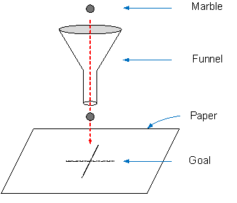
This post is about Dr Deming’s other (not quite so famous but equally important) Funnel experiment. The experiment teaches about the harm caused by ‘Management by Results’ (MBR) …where this occurs through tampering.
Here’s the experiment set up:
We have a flat horizontal surface (let’s say a table) with a piece of paper placed on top of it. We also have a kitchen funnel (like we would use to decant a liquid from one bottle to another), and a marble that we will drop through the funnel towards the paper below.
Let’s assume that the funnel is held upright in some sort of stand, say 50cm above the piece of paper.
Now we mark a cross in the middle of the piece of paper.
Goal: to hit the cross with the marble by dropping it through the funnel.
Round 1: We position the funnel over the cross and then drop the marble through the funnel 50 times. For each marble drop, we mark the spot on the paper where it hits.
We are likely to see something like this on the paper (looking from above):
Remember, we simply dropped 50 marbles without attempting to make any changes in-between drops and the paper shows the system to be stable. However, note that there is variation as to where the marble landed. It continually landed near the cross (with probably a few direct hits) but there was variation.
Round 2: So this time, we think that by adjusting the position of the funnel between each marble drop, we can ensure that the marble hits the cross on the next drop!
So we drop the 1st marble, note where it lands as compared to the cross and then move the funnel to compensate for this error. i.e.
if the marble landed 1 cm to the left (west) of the cross, we move the funnel 1cm to the right (east) of its current position….because this ‘fine tuning’ will make the next drop hit the cross, right?;
if this 2nd marble lands 2cm below (south of) its new position, then we move the funnel 2cm north from where it is currently positioned;
….and so on, iteratively moving the funnel
So, what happens after we use this approach with our 50 marbles, iteratively adjusting the funnel’s position after each drop?
Well, it’s somewhat disappointing!
Our attempts at compensation have made the variation increase drastically (experiments show by approx. 40%). We’ve made things much worse.
Clearly our ’round 2′ method of compensating didn’t work as we wished. Is there another way of compensating and therefore getting better at hitting the cross?
Round 3: The new idea is to do the opposite of the last idea! This time, we will move the funnel directly over where the last marble landed and keep doing this for the 50 drops.
Oh dear, the marble is moving away from the cross and will eventually move off the table and (as Deming put it) all the way “off to the Milky Way”.
Perhaps using the last marble drop as a guide isn’t a good idea!
Conclusions: So which method was best?
Round 1 was clearly the best.
Round’s 2 and 3 are examples of tampering (though in different ways). They show the effects of tweaking a process based on the ongoing results of that process…it will simply increase the variation and the chances of failures.
So, what should we do? To actually improve a process requires an understanding of the sources of the variation…and then the performance of controlled experiments to identify process improvements.
For our Funnel system we could experiment with:
lowering the funnel;
decreasing the size of the funnel hole;
strengthening the stand holding the funnel to make it more stable;
…performing the process in a vacuum 🙂
All of these proposed improvements involve changing the system rather than merely tampering with it based on previous results.
So what?
Now all of the above looks like good fun…I’m already thinking about borrowing a funnel…but it seems an awful long way from our working lives. So let’s explain why in fact it’s not…
Taking the production/ selling of something, let’s say a sandwich shop as an example:
you sold 10 sandwiches on Monday, so you make 10 for Tuesday..
you only sold 2 sandwiches on Tuesday, so you throw 8 in the bin (not fresh anymore) and you only make 2 sandwiches for Wednesday….
you have 6 customers on Wednesday, so you sell the 2 sandwiches you made, have 4 disappointed would-be-customers but make 6 sandwiches for Thursday…
…and so on. You can expect to have major stock problems and a lot of unhappy customers!
it would be much better to make a set number of sandwiches each day, collect information about demand variation over a sensible period of time and then adjust your system accordingly.
The sandwiches are a very simple example of any process. What about taking a call centre as an example:
There will be a great deal of natural variation in customer calls throughout a day (with a number of causes, categorised and explained in this earlier ‘Spice of Life’ post)…so the number of ‘calls waiting’ will constantly fluctuate, though likely between predictable bounds. No surprises there.
…let’s assume that Bob’s job is to constantly monitor the current ‘calls waiting’…
…it gets to a point where Bob thinks the number of calls waiting is high…so he sends out an urgent request for everyone to drop what else they are doing and get on the phones…and they all rush to do so…
….so the number of ‘calls waiting’ now drops really low and even disappears…excellent. Now Bob sends out a screen pop-up message along the lines of “panic over, people who missed out on their breaks can go now”…
….so the number of ‘calls waiting’ now jumps up again…and the up-and-down cycle continues.
Bob has a really stressful job looking at the numbers and continually tampering (using the ’round 2′ method) in a hopeless attempt to exactly match supply to demand.
A better way would be to increase our understanding of the system by studying demand (its types and frequencies) and amending its design based on what we learned. There might be:
loads of failure demand in there (which is a waste of capacity); and
frequency patterns within the different types of value demand
Clarification: Many of you working in contact centres may say “but Steve, of course we analyse incoming calls and look for patterns!” I would note that:
whilst you can, and should, look for predictable patterns in the data, I doubt that you can tell me how many calls you will get in the next 15 minutes and how long they will take. There will be variation and this is outside your control….does this make you tamper?
Nearly all contact centres simply see incoming calls as ‘work to do’ with an ‘average handling time’. Hardly any will analyse this demand. Can you tell me what types of value and failure demand you get, and their frequencies…and what conclusions you draw from this?
I’m not picking on contact centres – I simply use it as an example that we should all be able to understand. Tampering happens all over the place.
In general, managers often look at the results of the last hour/ day/ week/ month* and attempt to make adjustments accordingly, whether by congratulating or berating staff, moving people between queues, changing work quotas, knee-jerk reacting to defects and so on.
(* where the unit of time will depend on the nature of the transactional service being provided)
In fact, praising someone one week for a perceived outstanding result (likely against the lottery of a target that they had very little control over meeting) and then giving them a ‘talking to’ the next because their result was considered poor is tampering.
The point is to understand the system and the reasons for variation. Then (and only then) you can make meaningful changes instead of merely tampering.
Note: The ‘Round 3’ type of tampering is not as common as the ‘Round 2’ type…but it does happen. Consider the following cases of using the last example to inform the next:
Using the last board cut as a pattern for the next; or
Train the trainer: Mary trains John who trains Bob who trains Jess.
Both of these examples show that any variation from purpose will be retained and amplified as it is passed on, like a chain of whispers.
Credit: I’ve seen the funnel experiment performed a few times now but, rather than taking the laborious time to recreate it, I have borrowed the 3 marble drop pattern pictures used above from this website.
Note: For those aficionados amongst you, this post represents a slightly simplified version of Deming’s full funnel experiment. There is yet another tampering rule (which I have left out for the sake of brevity) …but, just so you know, it also doesn’t work. You can read all about the funnel experiment in Chapter 9 of Deming’s book ‘The New Economics’.
So I cycle to work when I can. It’s approx. 22km from one side of the city of Christchurch to the other, right through the middle. I (usually) enjoy it immensely.
I upgraded my cycle computer a few months back to a fancy new GPS one. It’s got this cool screen that tells me lots of information. I can also download each cycle ride’s data onto my computer to analyse later – perfect for a geek!
I’d been using this computer for a few weeks and was starting to get an understanding of my average km/ hour for each trip. Sometimes I could get it into the 27 km/hour range, other times I could only manage 23 km/hour….and before all you MAMILs* out there guffaw thinking “how slow?!” the average speed takes into account stopping at lots of junctions (traffic lights, roundabouts, road works) and crossing busy traffic….not that I’m saying that I am fast.
(* MAMIL: middle-aged men in Lycra…and I must confess to being a member of)
Further, the computer tells me my average km/ hour at the bottom of the screen as I cycle. I can see it going up and down throughout the journey. If I stop at a junction I can see it plunge rapidly whilst I am sat idle and then if I cycle on a long flat straight I see it slowly rise back up again.
Now, I fell into the trap! I began to get distracted by the average km/ hour reading as I cycled. Without consciously thinking about it I set myself a target of completing each ride at an average of 25 km/hour or higher. The fact that I was doing this only dawned on me the other day after I performed a dodgy manoeuvre in my obsession to keep my average above the target… my sudden sense of mortality put me into a reflective mood.
Here’s what I reflected on:
What had I become?
I had started to look at the average km/ hour reading all the time and obsess about it dropping below the magical 25;
If I was stopped at traffic lights, I watched the average km/hour reading sink before my eyes. I was then in a mad hurry to get off so as to get that average back up again as quickly as possible:
which meant that I was trashing my legs and blowing them out too early in the ride…
which put me at huge risk of pulling a muscle/ injuring a joint whilst piling on the pressure to get back above that target…
which meant that I didn’t cycle the next day because I couldn’t!
If I was ‘on the cusp’ of the target and coming up to a junction then I was starting to do dangerous things in order to keep going, like running orange lights or crossing lanes in between cars;
Even more bizarrely, I had unconsciously started to cheat!
I had changed my behaviour to only turning on the computer after I had got going from my house because the few seconds getting up to speed from rest might count!
If my average was 25.0 as I got to work I would turn the computer off before I came to a rest…so that it couldn’t drop down to 24.9 as I slowed…because that would have meant failure!
Conversely, if I was well above the target (let’s say because I had a good tail wind or I had been really lucky with the light sequences), then I was pretty happy and relaxed…no need to push since I was ahead. I could have gone faster.
Reading the above, you may think me to be a bit of a nutter! Did I really do those things? Well, yes, I did…and I can honestly say that the 25 km/ hour target that I had set myself was to blame.
Now for those of you who have been on one of my courses or who have read the majority of posts on this blog, you will likely have a good laugh at me – “he bangs on about the evils of targets all the time!”
So, getting away from my target:
What is my actual purpose in cycling to work?
On reflection I came up with the following:
“To safely cycle to work so that I get fitter and I use the car less.”
Use the car less: I needed to be able to cycle consistently, day after day
Safely: there’s no point in getting killed or badly injured cycling!
This clarity of purpose has helped me drastically change the way I cycle!
Thinking about variation within the system:
In this case, the system is the cycling to/from work and the conditions I encounter in doing so. One cycle ride is a single ‘unit of production’. I should be thinking about the capability of the system (about how all units go through it), not about a single unit.
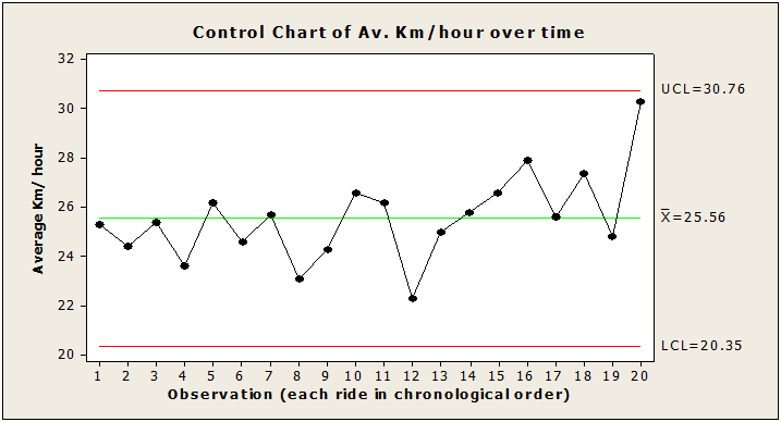
Here’s a control chart showing the variation in the last 20 of my rides:
The control chart enables you to visualise what a table of data can’t…that my riding is stable. It shows the meaninglessness of the target and variance analysis.
The following are the more obvious causes of variation:
Head wind or tail wind (makes a huge difference!);
Wet or dry weather;
Heavy or light traffic;
Whether the traffic light sequences are with me or not;
…and so on
Some special causes might be:
An accident;
Road works
…although if you live in Christchurch you will know that there’s nothing special about road works !!!
You can see that it would be bizarre for me to achieve the same average km/ hour every day. Going back to that target: Some days it will be impossible for me to hit the 25, other days it will be really easy…and that’s without me changing anything about my riding.
Note: Looking back at the control chart, you might think that you detect an improvement from around ride 15 onwards. In fact, it was at around ride 15 that I had my ‘I’ve fallen into the target trap’ epiphany….so, yes, there could be something in that. However, you should also know that whilst ride 20 looks fantastic (it was), I had a massive Nor’ Wester wind behind me literally pushing me along.
What can I experiment with to increase my capability?
The first thing I need to do is STOP LOOKING at the average km/hour as I cycle. Then I can consider what I can change about my cycling for every ride.
Junctions: looking well ahead and adjusting my pace to time myself through them so that I reduce the need to slow down/ stop
Pedalling: trying to pedal more smoothly and efficiently
Crossing lanes: improving my balance when looking behind me so that I can safely do this whilst retaining my speed with the traffic
….and so on.
Each of these changes will lead to small improvements on every ride, no matter what the conditions are. It’s not about the current unit, it’s about every unit.
Results?
Well, it’s too early to draw valid conclusions (I need more data), and it’s a never ending journey of improvement BUT I can say that I am cycling more often (because I didn’t wreck my legs the day before) and I’m having far less ‘that car’s a bit too close for comfort’ moments.
So what’s the point?
Targets cause dysfunctional behaviour. As Simon Guilfoyle makes clear:
“As a ‘method’ [Setting a target] is rubbish because it disregards the capability of the system and natural variation. … It assumes that the system knows the target is there and will respond to it (it doesn’t and it won’t!) It ignores the fact that the greatest opportunity for improving performance lies in making systemic adjustments rather than berating, comparing, or otherwise trying to ‘motivate’ the workers to achieve the target.”
‘No targets’ doesn’t mean ‘no measurement’! In fact, it’s quite the reverse. It means actually studying meaningful measures (i.e. against purpose) over time (via a control chart), understanding the capability of the system and therefore truly understanding whether it is improving, staying the same or getting worse.
Do you have targets? So what dysfunctional behaviours do they cause, moving us away from purpose?


 This post is a promised follow up to the recent
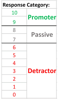 A respondent scoring a 9 or 10 is labelled as a ‘Promoter’;
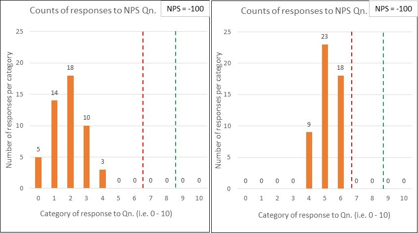
 So this post is part 2 of a two-part piece in respect of budgeting.
 I find it mesmerising! And it’s pretty cool seeing how it actually works 🙂
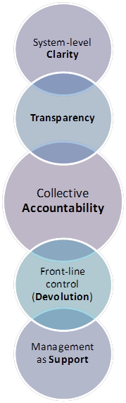 1. System-level Clarity:
 What a great phrase! Putting lipstick, some earrings and a blonde wig on a pig doesn’t change what it is…even if you are doing so with good intentions! (Ewe, that’s a weird thought).