 This is a bit of a ‘back to basics’ post, inspired by refreshing my memory from reading a superb book. It’s long…but hopefully interesting 🙂
Some years back I was working with a most excellent colleague, who managed a busy contact centre operation. Let’s call her Bob. She was absolutely committed to doing the best she could, for her staff and her customers.
Bob came to me one day for some help: Things weren’t going well, she had a meeting with senior management coming up and she was going to ask them to approve a radical thing – to change, by which I mean relax, their current call handling target.
I didn’t know too much about contact centres back then…so I started by asking some dumb questions. And it went something like this:
Me: “What’s this ‘80 in 20’ measure about?”
Bob: “It’s our main ‘Key Performance Indicator’ (KPI), called ‘Grade of Service’ (or GOS for short) and it means that we aim to pick up 80% of all incoming calls within 20 seconds of the customer calling.”
Me: “Oh…and where do these figures comes from?”
Bob: “It’s an industry recognised KPI. All ‘up to date’ contact centres use it to measure how they are doing and ‘80 in 20’ is Best Practise.”
Me: “…what ‘industry body’ and where did they get these figures?”
Bob: “The [insert name of a] ‘Contact Centre Association’…and I’ve got no idea where the figures come from.”
Me: “So, we have a target of picking up a customer’s call within an arbitrary 20 seconds…and we have an arbitrary target on meeting this target 80% of the time? …so it’s a target on a target?”
Bob: “Yes…I suppose it is…but we are having a real tough time at the moment and we hardly ever achieve it.”
Me: “Okay…but why do you want to ask senior management to ‘relax’ this target-on-a-target? What will this achieve?”
Bob: “Because we publish our GOS results against target for all our contact centre team leaders to see…and frankly there’s not much they can do about it…and this is really demoralising. If I could just get senior management to relax it to, say, 70% in 30 seconds then my staff could see that they at least achieve it sometimes.”
…and that’s how my discussion with Bob started.
I have just finished reading Donald Wheeler’s superb book ‘Understanding Variation – the key to managing chaos’ and my work with Bob1 all those years ago came flooding back to me…and so I thought I’d revisit it, and jot down the key points within. Here goes…
Confusing ‘Voice of the Customer’ and ‘Voice of the Process’
 I’ll start with clarifying the difference between the customer and the process. In the words of Donald Wheeler:
“The ‘voice of the customer’ defines what you want from a system.
The ‘voice of the process’ defines what you will get from a system.”
The difference in words is subtle, but in meaning is profound.
In Bob’s case, she has determined that customers want the phone to be picked up within 20 seconds2. However, this wishful thinking (a target) is completely outside the system. Bob could set the customer specification (target) at anything, but this has got nothing to do with what the process can, and will predictably3, achieve.
What we really want to see is what the system (‘handling4 customer calls’) is achieving over time.
A target is digital (on/off) – either ‘a pat on the back’ or ‘not good enough!’
 “A natural consequence of this specification [target] approach…is the suddenness with which you can change from a state of bliss to a state of torment. As long as you are ‘doing okay’ there is no reason to worry, so sit back, relax, and let things take care of themselves. However, when you are in trouble, ‘don’t just stand there – do something!’ …This ‘on-again, off again’ approach is completely antithetical to continual improvement.” (Wheeler)
Unfortunately, Bob is constantly the wrong side of the (current) specification and therefore has the unwavering torment of ‘don’t just stand there – do something!’
But do what? And how would Bob know if whatever they try is actually an improvement or not? Using a target is such a blunt (and inappropriate) tool. Future results:
- might ‘beat target’ (gaining a ‘pat on the back’) and yet simply be noise5; or
- might still be lower than target (receiving another ‘kick’) and yet contain an important signal.
Bob cannot see the true effects of any experimentation on her system whilst relying on her current Industry best practise ‘Grade of Service’ KPI. She does not have a method to separate out potential signals from probable noise.
Thinking that a target can change things for the better
 “When people are pressured to meet a target value, there are three ways they can proceed:
- They can work to improve the system;
- They can distort the system; or
- They can distort the data.”
(Wheeler, referencing Brian Joiner)
What can a call agent do to ‘hit’ that target? Well, not much really. They can’t influence the number of calls coming in or what those customers want or need. They CAN, however, try to ‘get off the phone’ so as to get to the next call. Mmm, that’s not going to help the (customer-defined) purpose…and is probably likely to create failure demand, complaints and re-work…and make things worse.
What can the contact centre management (from team leaders and upwards to Bob) do to ‘hit’ that target? They could try to improve the system* (which, whilst being the right thing to do, is also the hardest) OR they could simply ask for the target to be relaxed. If they aren’t allowed to do either, then they might begin to ‘play games’ with the data…and hide what is actually happening.
* To improve the system, Bob needs contextual data presented such that it uncovers what is happening in the system…which will enable her to listen to the process, see signals, ask relevant questions, understand root cause, experiment and improve. She, and her team, cannot do this at present using her hugely limiting KPI.
In short, the target is doing no good…and probably some (and perhaps a lot of) harm.
It’s perhaps worth reflecting that “Bad measures = bad behaviours = bad service” (Vanguard)
What’s dafter than a target? A target on a target!
 Why? Well, because it removes us from the contextual data, stripping out the necessary understanding of variation within and thus further hiding the ‘voice of the process’.
It’s worth noting that, in Bob’s ‘20 seconds to answer’ target world:
- A call answered in 3 seconds is worth the same as one answered in 19 seconds; and, worse
- A call answered in 21 seconds is treated the same as one answered in, say, 480 seconds….and beyond…perhaps even an hour!
Note: I’ve added an addendum at the end of this post with a specific ‘target on a target’ example (hospital wait times). I hope that it is of use to demonstrate that using a ‘target on a target’ is to hide the important data underneath it.
“Setting goals [targets] on meeting goals is an act of desperation.” (Wheeler)
Worse still, a ‘target on a target’ can fool us into thinking that we are looking at something useful. After all, I can still graph it…so it must be good…mustn’t it?
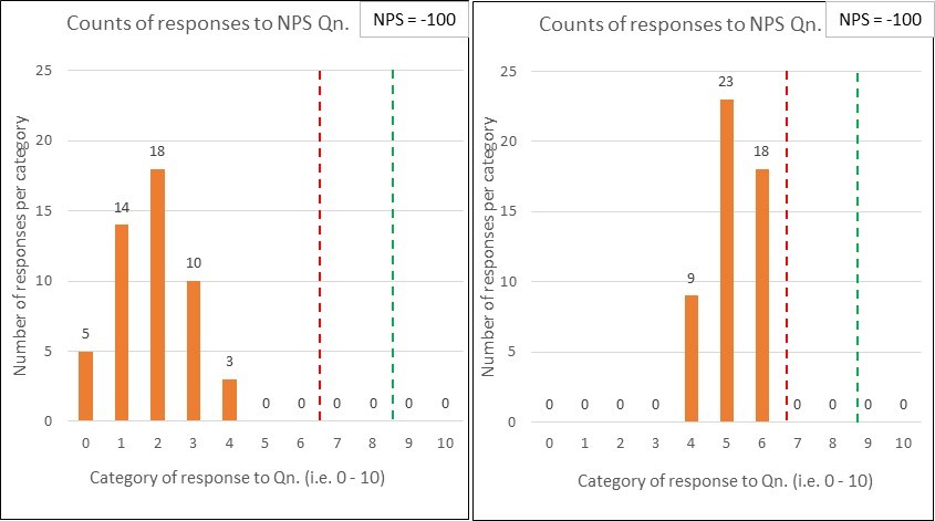
Here’s a control chart of Bob’s ‘Grade of Service’ (GOS) KPI:
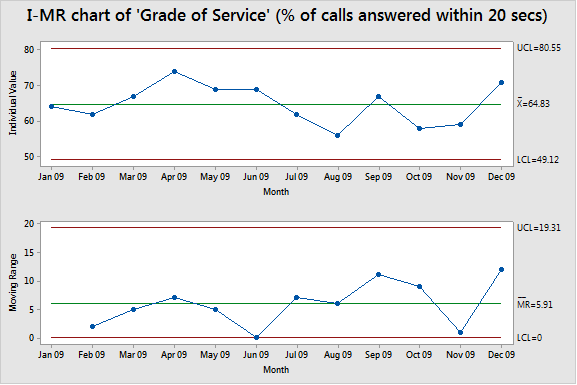
You might look at it and think “Wow, that looks professional with all that I-MR control charty stuff! I thought you said that we’d be foolish to use this ’80 in 20’ target on a target?”
You can see that Bob’s contact centre never met the ’80 in 20’ target-on-a-target6 (and, with the current system, isn’t likely to)…and you can perhaps see why she wants to ‘relax’ it to ’70 in 30’….but we can’t see what really happens.
What’s the variation in wait times? (times of day, days of week etc.)
Do some people get answered in 5 seconds? Is it common for some people to wait for 200 seconds? (basically, what’s actually gong on?!)
Is the variation predictable? Are there any patterns within?
Are those months really so comparable?…are any games being played?!
Okay, so I’ve shot at what Bob has before her…but what advice can I offer to help?
Does Bob need to change her ’80 in 20’ KPI? Yes, she does….but not by relaxing the target.
‘The right data, measured right’ (‘what’, and ‘how’)
 At its very simplest, Bob’s measures need to help her (and her people) understand and improve the system.
To do this, they need to see:
| WHAT matters to the customer? |
…which could be uncovered by: |
| “Don’t make me queue” |
Volume of calls, time taken to answer, abandonment rate. |
| “I want you to deal with me at my first point of contact” |
% of calls resolved at first point of contact (i.e. didn’t need to be passed on). |
| “Don’t put me on hold unnecessarily” |
% of calls put on hold (including reason types and frequencies). |
| “I want to deal with the right person (i.e. with the necessary knowledge, expertise, and authority)” |
% of calls passed on (including reason types and frequencies). |
| “I want you to action what you have promised, when I need it…and to do so first time.” |
Failure demand, either chasing up or complaining (including reason types and frequencies). |
Now, Bob (and most contact centres) might reply “We already measure some of that stuff!”
Yes, I expect you do.
What also matters is HOW you measure it. Measures should be:
- shown over time, in chronological order (i.e. in control charts, to show variation), with control limits (to separate out signals from noise);
- updated regularly (i.e. at meaningful intervals) and shown visually (on the floor, at the gemba), providing feedback to those working in the system;
- presented/ displayed together, as a set of measures, to show the system and its interactions, rather than a ‘Grade of Service’ KPI on a dashboard;
- monitored and analysed to identify signals, and consider the effect of each experimental change towards the customer purpose;
- devoid of a target! The right measures, measured right will do just fine.
Why are control charts so important? Wheeler writes that:
“Instead of attempting to attach a meaning to each and every specific value of the time series, the process behaviour [i.e. control] chart concentrates on the behaviour of the underlying process.”
 Why do we need to see a set of measures together? Simon Guilfoyle uses the excellent analogy of an aeroplane cockpit – you need to see the full set of relevant system measures to understand what is happening (speed, altitude, direction, fuel level…). There isn’t ‘One metric that matters’ and it is madness to attempt to find one.
Looking at Bob’s proposed set of capability measures (the table above), you can probably imagine why you’d want to see them all together, so as to spot any unintended consequences to changes you are experimenting with.
I.e. if one measure appears to be improving, is another one apparently worsening? Remember – it’s a system with components!
To summarise:
 If I am responsible for a process (a system) then I want to:
- see the actual voice of the process;
- get behind (and then drop) any numerical target;
- split the noise from any signals within;
- understand if the system is ‘in control’ (i.e. stable, predictable) or not; and
- spot, and investigate any special causes7
and, perhaps more important, I want to:
- understand what is causing the demand coming into the system (rather than simply treating all demand as work to be done);
- involve all of the people in their process, through the use of visual management (done in the right way); and then
- experiment towards improving it…safe in the knowledge that our measures will tell us whether we should adopt, adapt or abandon each proposed change.
Bob and I continued to have some great conversations 🙂
I said that I would add an addendum on the subject of ‘a target on a target’…and here it is:
Addendum: An example to illustrate the point
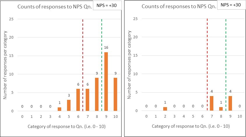
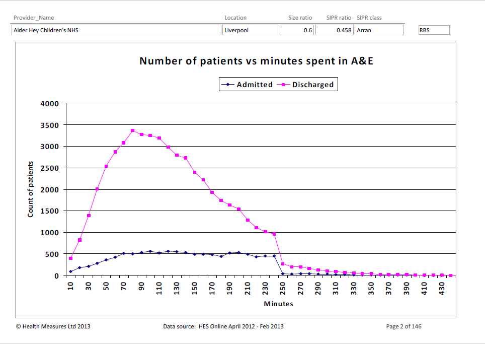
I’ll borrow two diagrams8 from a really interesting piece of analysis on NHS hospitals (i.e. in the UK) and their Accident and Emergency (A&E) wait times.
The first chart is of Alder Hey Children’s hospital. It shows a nice curve of the time it takes for patients to be discharged:
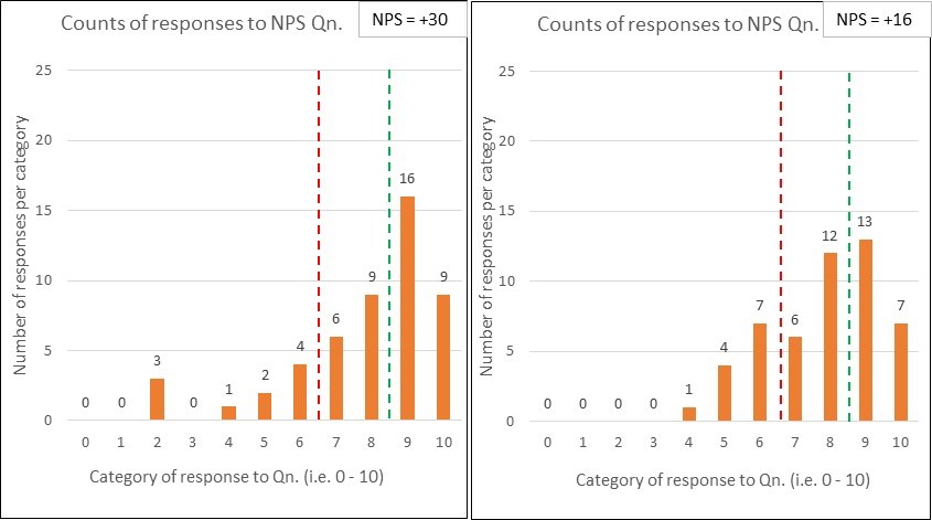
The second chart is of Croydon University Hospital. Same type of chart, but their data tells a vastly different story!
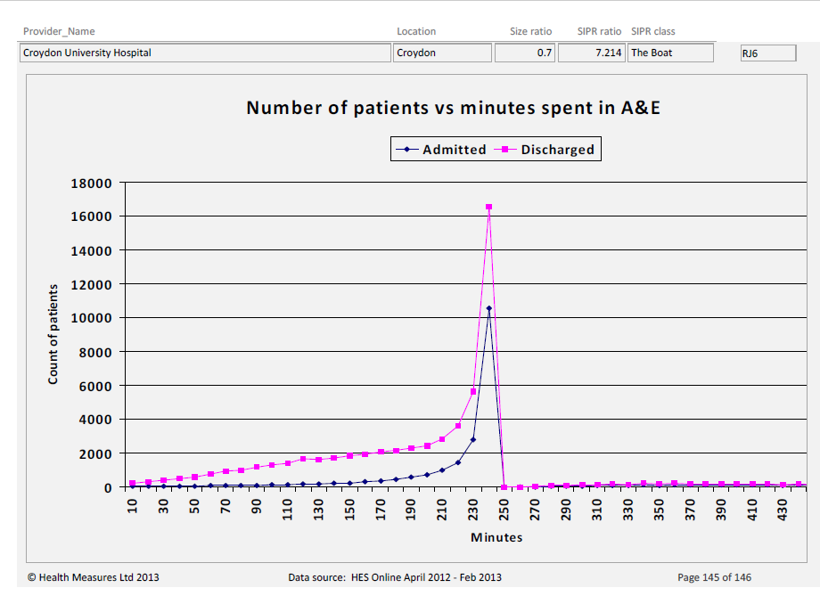
Q1: Do you think that an activity target has been set on the A&E system and, if so, where do you think it has been set?
I’d bet (heavily) that there is an A&E ‘time to discharge’ target, set from management above, of 4 hours (i.e. 240 minutes). It’s sort of evident from the first graph…but ‘smacks you between the eyes’ in the second.
Two further questions for you to ponder9: Looking at the charts for these two hospitals…
Q2: Which one has a smooth, relatively under control A&E system, and which do you think might be engaged in ‘playing (survival) games’ to meet the target?
I’d say that Alder Hey is doing rather well, whilst Croydon is (likely) engaged in all sorts of tricks to ship patients somewhere (anywhere!) ‘before the 4 hour buzzer’ – with a likely knock-on effect to patient experiences and outcomes;
Q3: Which one looks better on a ‘% of patients that met the 4 hour target’ league table? (i.e. a target on a target)
It is typical for health services to set an A&E ‘target on a target’ of, say, ‘95% discharged from A&E within 4 hours’10. This is just like Bob’s ‘80% in 20 seconds’.
Sadly, Croydon will sit higher up this league table (i.e. appear better) than Alder Hey!
If you don’t understand why, have a closer look at the two charts. Look specifically at the volume of patients being discharged after the 240 min. mark. Alder Hey has some, but Croydon has virtually none.
Foot notes
1. Just in case you hadn’t worked it out, she (or he) wasn’t called Bob!
2. Customer Target: Setting aside that the customer target shouldn’t (and indeed can’t) be used to improve the ‘handling calls’ system, I have two problems with the 20 second ‘customer specification’.
a. An industry figure vs. reality: rather than assuming that a generic industry figure of 20 seconds is what Bob’s customers want, I asked Bob to provide me with her call abandonment data.
I then graphed a histogram of the time (in seconds) that each customer abandoned their call and the corresponding volume of such calls. This provided us with evidence as to what exactly was happening within Bob’s system…which leads me on to:
b. An average customer vs. variety: There’s no such thing as ‘an average customer’ and we should resist thinking in this way. Some people were abandoning after a couple of seconds, others did so after waiting for two minutes. We can see that there is plenty of customer variety within – we should be thinking about how we can absorb that variety rather than meet some non-existent average.
3. Predictably, assuming that it is stable and there is no change made to the process.
4. Handling: I specifically wrote ‘handling’ and not ‘answering’. Customers don’t just want their call answered – they want their need to be met. To properly understand a system we must first set out its purpose from the customer’s perspective, and then use an appropriate set of measures that reveal the capability of the system against this customer purpose. ‘Answering calls’ may be necessary, but it’s not sufficient.
5. Noise vs. Signal: I’m assuming in this post that you understand the difference between noise and signals. If you don’t (or would like a refresh) then an earlier (foundational) posts on variation might assist: The Spice of Life
6. A clarification in respect of the example ‘I’ control chart: The Upper Control Limit (UCL) red line (at 80.55%) does not represent/ is not the 80% target. It just happens to be the case that the calculated UCL for Bob’s data works out to be nearly the same as the arbitrary target – this is an (unfortunate) fluke. A target line does not belong on a control chart!
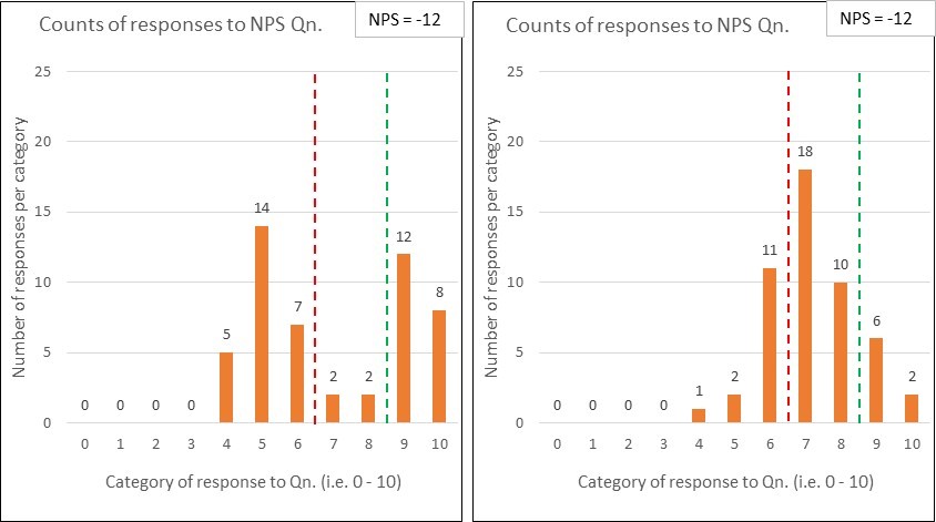
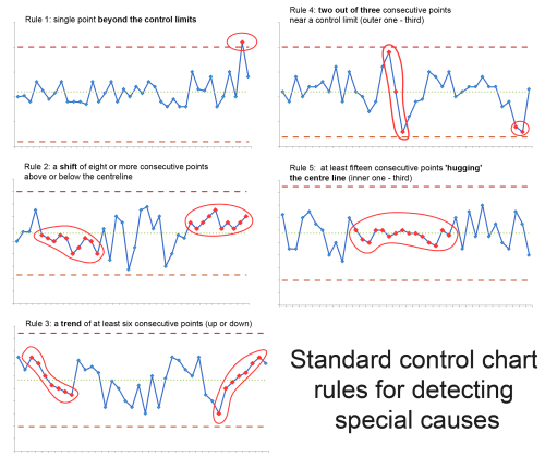
7. Special Cause tests: The most obvious signal on a control chart can been seen when a point appears outside the upper or lower control limits. There are, however, other types of signals indicating that something special has occurred. These include ‘trends’, ‘shifts’, and ‘hugging’. Here’s a useful diagram (sourced from here):
8. Hospital charts: The full set of charts (covering 144 NHS hospitals for the period 2012-13) is here. I’ve obviously chosen hospitals at both extremes to best illustrate the point.
I can’t remember where I first came across these hospital charts – which annoys me!…so if it was via a post on your blog – I’m sorry for my crap referencing/ recognition of your efforts 🙂
9. Here’s a 4th and final question to ponder: If, after pondering those two questions, you still think that a ‘target on a target’ makes sense then how do you cope with someone not always meeting it? Do you set them a target…to motivate them?
How about a target for the ‘target on a target’???
- A 95% target of achieving an ‘80% of calls answered in 20 seconds’ target
- A 90% target of achieving an ’95% of patents discharged within 4 hours’ target
- ….
…and, if you are okay with this…but they don’t always meet it then how about setting them a target…where does the madness end?!
We are simply ‘playing with numbers’, moving ever further from reality and usefulness.
10. Hospital ‘Emergency department’ League tables:
 Here’s a New Zealand ‘Emergency departments’ league table, ranking district health boards against each other (Source).
Notice that it shows:
- A ‘target on a target’ (95% within 6 hrs)
- A single quarter’s outcome
- A binary comparison ‘with last quarter’
- A (competitive) ranking
All of which are, ahem, ‘problematic’ (that’s me being polite 🙂
You can’t actually see how each district is performing (whether stable, getting better…or worse)
…and you certainly can’t see whether games are being played.

 So, let’s walk through this table.
 Let’s move away from Bob’s presentation skills.
 6. Visualising the data: So how might we look at the evaluation of Bob’s session?
 This post is a promised follow up to the recent
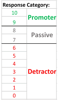 A respondent scoring a 9 or 10 is labelled as a ‘Promoter’;