Context: I regularly participate in reflective conversations with people. I often ask them to ponder the question “what is the purpose of your organisation (or part thereof)?” and I’m struck by how often the response includes something about “our reputation”2 (as in gaining, bolstering, or protecting it).
And so, to repeat the title of this post, your reputation has absolutely NO place in a purpose statement3, nor any system of measurement against this.
I recently finalised a ‘measurement of performance’ guide and, within this, I explain various archetypes of services, and the types of measures that best fit each.
I’m particularly interested in relational services – the big hairy ‘social system’ ones that (should) really matter for the most vulnerable and ‘in need of help’ humans.
Most societies have decided to organise (i.e. intervene) because of a desire (or perhaps obligation) to help people. As such, knowing whether that ‘outside help’* is valuable to those in need is rather important…and it really won’t be about ‘how many/how much we did’ of something, or ‘how fast we did it’ (Ref. Our work this Year)
It will be about whether:
it is wanted/ accepted/ engaged with;
it assists, moving a person forward to a better place – as defined by them; and
any progress is sustained and transformative
…noting that achieving and sustaining 1. above is very probably a pre-requisite for any advances in the space of 2. and 3.
That’s a shit name…but I haven’t thought of anything better…yet.
Footnote:
1. I’m already working on a Version 2.0 because there’s a specific section that I want to add…but it will require a good bit of thought to write.
2. You are very welcome to contact me with any observations you have on the document but, as per everything ‘blogging’ (i.e. the sharing of partially formed thought) please be constructive, as opposed to troll-like 🙂
It’s a Friday afternoon for me…and I was just about to log off and go home. I haven’t posted in a wee while and thought I’d have a quick peek at the set of ‘posts I’ve written but didn’t publish’ and I found a short one that amused me.
I wrote it at the peak of COVID-itus and, given some dramatic protests going on at that time, I chose to keep my powder dry.
But, bugger that…here it is (better late than never):
I’ve seen a repeating misunderstanding (e.g. within social media1) of the mathematics re. the relationship between vaccinated people and those being treated in hospital with COVID. Continue reading →
I regularly notice many service organisations1 communicate to the public with a list of facts that apparently demonstrate that their services are a good thing. This usually occurs at their reporting year-end and is titled something like “Our work this year”2.
I call this the ‘didn’t we do well!’ comms.
Don’t get me wrong, I’m a big supporter of the concept of services that help people….and, yes, I’d like to know what these services are doing and how well this is going.Continue reading →
A key component of Deming’s ‘Theory of Profound Knowledge’ is in relation to the measurement of performance (of a system) and the ‘Theory of Variation’.
I’ve noticed over the years that, whilst the foundational points around variation can be well understood, the use of control charts within operational practice can be ‘absolutely butchered’ (technical term 🙂 ).
This caused me to write a ‘how to’ guide a while back, for me and my colleagues.
I recently ‘dusted it down’ and tidied it up into a version 2.0 in order that I can share it more widely, for anyone who can find value within.
I attach it as a pdf document for anyone interested:
It doesn’t replace the excellent writings of Donald Wheeler…though it hopefully makes you curious to ‘pull’ his writings towards you.
It doesn’t tell you what to measure…because it couldn’t!
It doesn’t ‘do it for you’…but, hopefully, it does give you enough so that you can experiment with doing it for yourself.
…and it can’t beat working alongside someone who knows what they are doing, and can act as your coach.
Note: If you do end up using/ sharing this guide then I’d be grateful if you could add a simple comment at the bottom of this page so that I am aware of this. Not because I’m going to invoice you (I’m not!)…but because I would find this knowledge useful (#feedback).
You might tell me: what you thought of it (warts and all), where you might use it, whether you have shared it with others (and whether they appreciated this or not!)… and if it has improved your measurement practices.
Measures of (targets on (measures of things)); and
Targets on (measures of (targets on (measures of things)))
Wow, that last one is hard to write, let alone say out loud! You might think that it’s a nonsense (which it is) but, sadly, it’s very common.
Note: I added the brackets to (hopefully) make really clear how each one builds on the last.
I’ll attempt to explain…
1.Measures of things:
Seems straight forward enough: I’m interested in better understanding a thing, so I’d like to measure it1.
Some examples…
A couple of personal ones:
What’s my (systolic) blood pressure level? or
How quickly do I ride my regular cycle route?
A couple of (deliberately) generic work ones:
how long does it take us to achieve a thing? or
how many things did we achieve over a given period?
Here’s a graph of a measure of a thing (in chronological order):
Nice, we can clearly see what’s going on. We achieved 13 things in week 1. Each thing took us anything between 2 and 36 days to achieve…and there’s lots of variation in-between.
It doesn’t surprise me that it varies2 – it would be weird if all 13 things took, say, exactly 19 days (unless this had been structurally designed into the system). There will likely be all sorts of reasons for the variation.
However, whilst I ‘get’ that there is (and always will be) variation, the graph allows us to think about the nature and degree of that variation: Does it vary more than we would expect/ can explain?3 Are there any repeating patterns? Unusual one-offs? (statistically relevant) Trends?
Such a review allows us to ask good questions, to investigate against and learn from.
“Every observation, numerical or otherwise, is subject to variation. Moreover, there is useful information in variation.” (Deming)
2.Targets on (measures of things):
Let’s say that we’ve been asked to achieve a certain (arbitrary4) target.
Here’s an arbitrary target of 30 days (the red line) set against our measure:
And here’s how we are doing against that target, with some visual ‘traffic lighting’ added:
Instance (X)
1
2
3
4
5
6
7
8
9
10
11
12
13
Target of 30 days met? (Yes/No)
N
Y
Y
N
Y
Y
Y
Y
Y
Y
Y
N
Y
We’ve now turned a rich analogue signal into a dull digital ‘on/off’ switch.
If we only look at whether we met the target or not (red vs. green), then we can no longer see the detail that allowed us to ask the good questions.
We met ‘target’ for instances 2 and 3…but the measures for each were quite different
Conversely, we met ‘target’ for instances 5 all the way through to 11 and then ‘suddenly’ we didn’t…which would likely make us think to intensely question instance 12 (and yet not see, let alone ponder, the variation between 5 and 11).
The target is causing us to ask the wrong questions5, and miss asking the right ones.
3.Measures of (targets on (measures of things)):
But I’m a fan of measures! So, let’s show a measure over time of how we are doing against our target.
In week 1 we met our 30-day target for 10 out of our 13 instances, which is 77%. Sounds pretty good!
Here’s a table showing how many times we met target for each of the next five weeks:
Week
1
2
3
4
5
Things achieved
13
15
14
11
12
Number meeting 30-day target
10
14
12
7
8
% meeting 30-day target
77%
93%
86%
64%
67%
Let’s graph that:
It looks like we’ve created a useful graph, just like in point 1.
But we would be fooling ourselves – we are measuring the movement of the dumbed-down ‘yes/no’ digital switch, not the actual signal. The information has been stripped out.
For example: There might have been huge turbulence in our measure of things in, say, week 3 whilst there might have been very little variation in week 4 (with lots of things only just missing our arbitrary ‘target’)…we can’t see this but (if we want to understand) it would be important to know – we are blind but we think we can see.
4.Targets on (measures of (targets on (measures of things))):
And so, we get to the final iteration:
How about setting an arbitrary target on the proportion of things meeting our arbitrary target…such as achieving things in 30 days for 80% of the time (the red line)…
And here’s the table showing how we are doing against that target:
Week number:
1
2
3
4
5
80% Target on 30-day Target met?
N
Y
Y
N
N
Which is a double-dumbing down!
We’ve now got absolutely no clue as to what is actually going on!!!
But (and this is much worse) we ‘think’ we are looking at important measures and (are asked to) conclude things from this.
The table (seemingly) tells us that we didn’t do well in week’s 1, 4 and 5, but we did in week’s 2 and 3…
The base data series used for this example:
In order to write this post, I used the Microsoft Excel random number generator function. I asked it to generate a set of (65) random numbers between 1 and 40 and then I broke these down into imaginary weeks. All the analysis above was on pure randomness.
Here’s what the individual values look like when graphed over time:
(Noting that instances 1 – 13 are as per the graph at point 1, albeit squashed together)
Some key points:
There is nothing special about any of the individual data points
The 30-day target has got nothing to do with the data
There is nothing special about any of the five (made up) weeks within
The 80% target on the 30-day target has got nothing to do with anything!
The point: Whilst I would want to throw away all the ‘targets’, ‘measures of target’ and ‘targets on measures of target’…I would like to understand the system and why it varies.
This is where our chance of improving the system is, NOT in the traditional measures.
Our reality:
You might be laughing at the above, and thinking how silly the journey is that I’ve taken you on…
…but, the ‘targets on (measures of (targets on (measures of things)))’ thing is real and all around us.
80% of calls answered within 20 seconds
95% of patients discharged from the Emergency department within 4 hours
70% of files closed within a month
[look for and add your own]
…
Starting from a position of targets and working backwards:
If you’ve got a target and I take it away from you…
…but I still ask you “so tell me, how is [the thing] performing?” then what do you need to do to answer?
Well, you would now need to ponder how has the thing been performing – you would then need to look at a valid measure of a thing over time and ponder what this shows.
In a nutshell: If you’ve got a target, take it away BUT still ask yourself ”how are we doing?”
A likely challenge: “But it’s hard!”
Yes… if you peel back the layers of the ‘targets on targets’ onion so that you get back to the core of what’s actually going on, then you could be faced with lots of data.
I see the (incorrect) target approach as trying to simplify what is being looked at so that it looks easy to deal with. But, in making it look ‘easy to deal with’, we mustn’t destroy the value within the data.
“Everything should be made as simple as possible, but no simpler.” (attributed to Einstein)
The right approach, when faced with a great deal of data, would be to:
Look at it in ways that uncover the potential ‘secrets’ within (such as in a histogram, in a time-series plot); and
understand how to disaggregate the data, such that we can split it up into meaningful sub-groups. We can then:
compare sub-groups to consider if and how they differ; and
look at what’s happening within each sub-group (i.e. comparing apples with apples)
To close:
If you are involved in ‘data analysis’ for management, I don’t think your role should be about ‘providing the simple (often 1-page) picture that they’ve asked for’. I would expect that you would wish your profession to be along the lines of ‘how can I clearly show what’s happening and what this means?’
If you are a manager looking at measures: why would you want an (overly) simple picture so that you can review it quickly and then move on to making decisions? Wouldn’t you rather understand what is happening and why … so that good decisions can be made?
Footnotes
1. Measurement of things – a caution: We should be careful not to fall into the trap of thinking that everything is measurable or, if we aren’t measuring it, then it doesn’t matter.
There’s plenty of stuff that we know is really important even though we might not be measuring it.
As a simple example: If you took a regular reading of your resting heart rate, don’t you think it would be weird if you got, say, 67 beats per minute every single time? You’d think that you’d turned into some sort of android!
3. Expect/ can explain – clarification: this is NOT the same as ‘what we would like it to be’.
4. Arbitrary: When a numeric target is set, it is arbitrary as to which number was picked. Sure, it might have been picked with reference to something (such as 10% better than average, or the highest we’ve ever achieved, or….) but it’s arbitrary as to which ‘reference’ you choose.
5. Wrong questions: These wrong questions are then likely to cause us to jump to wrong conclusions and actions (also known as tampering). Such actions are likely to focus on individuals, rather than the system that they work within.
6. ‘Trigger’: The writing of this post was ‘triggered’ the other day when I reviewed a table of traffic-lighted (i.e. against a target) measures of targets on measures of things.
This post sits squarely within the ‘measurement’ section of this blog – a topic dear to me, given the vagaries of measurements that we are subjected to or are required to produce in our working lives1.
The catalyst for writing it was from revisiting a ‘Donald Wheeler’ chapter2 and reminding myself of being around some ‘daft work assignments’ of years ago.
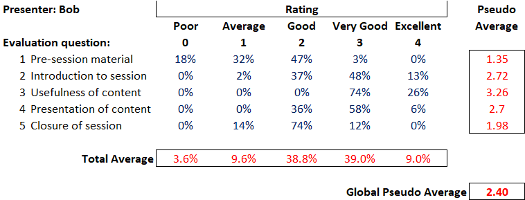
I’ll start with an ordinary looking table that (let’s say) represents3 the feedback received by a presenter (Bob), after running a 1 hour session at a multi-day conference.
I’ve deliberately used a rather harmless-looking subject (i.e. feedback to a presenter) so that I can cover some general points…which can then be applied more widely.
So, let’s walk through this table.
Conference attendees were asked to evaluate Bob’s session against five perfectly reasonable questions, using a five-point rating scale (from ‘Poor’ through to ‘Excellent’). The body of the table (in blue) tells us the percentage of evaluators that awarded each rating per question (and, as you would expect, the ratings given for each question sum to 100%).
Nice, obvious, easy….but that table is sure hard to read. It’s just a blur of boring numbers.
Mmm, we’d better add some statistics3 (numbers in red)…to make it more, ahem, useful.
Pseudo-Average
So the first ‘analysis’ usually added is the ‘average score per question’. i.e. we can see that there is variation in how people score…and we feel the need to boil this down into the score that a (mythical) ‘average respondent’ gave.
To do this, we assume a numerical weighting for each rating (e.g. a ‘poor’ scores a 0…all the way up to an ‘excellence’ scoring a 4) and then use our trusty spreadsheet to crunch out an average. Looking at the table, Bob scored an overall 1.35 on the quality of her pre-session material, which is somewhere between ‘average’ (a score of 1) and ‘good’ (a score of 2).
…and it is at this point that we should pause to reflect on the type of data that we are dealing with.
“While numbers may be used to denote an ordering among categories, such numbers do not possess the property of distance. The term for numbers used in this way is ordinal data.” (Wheeler)
There is a natural order between poor, average, good, very good and excellent…however there is no guarantee that the distance between ‘excellent’ and ‘very good’ is the same as the distance from ‘good’ to ‘average’ (and so on)…yet by assigning numbers to categories we make distances between categories appear the same5.
If you compute an average of ordinal data then you have a pseudo-average.
“Pseudo averages are very convenient, but they are essentially an arbitrary scoring system which is used with ordinal data. They have limited meaning, and should not be over interpreted.”
Total Average
Okay, so going back to our table of Bob’s feedback: we’ve averaged each row (our pseudo-averages)…so our next nifty piece of analysis will be to average each column, to (supposedly) find out how Bob did in general…and we get our total average line. This shows that Bob mainly scored, on average, in the ‘good’ and ‘very good’ categories.
But what on earth does this mean? Combining scores for different variables (e.g. the five different evaluation questions in this case) is daft. They have no meaningful relationship between themselves.
It’s like saying “I’ve got 3 bikes and 10 fingers….so that’s an average of 6.5”. Yes, that’s what the calculator will say…but so what?!
“The total average line(i.e. computing an average from different variables) is essentially a triumph of computation over common sense. It should be deleted from the summary.”
Global Pseudo-Average
And so to our last piece of clever analysis…that table of numbers is quite hard to deal with. Is there one number that tells us ‘the answer’?
Well, yes, we could create a global pseudo average, which would be to compute a pseudo average from the total average line. Excellent, we could calculate a one-number summary for each presenter at our conference…and then we could compare them…we could even create a (fun!) league table 🙂
Oh, bugger, our Bob only got a 2.4. That doesn’t seem very good.
To compute a global pseudo-average would be to cross-pollinate the misleading pseudo-average with the nonsensical total average line and arrive in computation purgatory.
The wider point
Let’s move away from Bob’s presentation skills.
Who’s seen pseudo-averages, total average lines and global pseudo-averages ‘used in anger’ (i.e. with material decisions being made) on ordinal data?
A classic example would be within software selection exercises, to (purportedly) compare competing vendors in a robust, objective and transparent manner.
In terms of pseudo averages, we get situations where 10 ‘nice to have’ features end up supposedly equaling 1 ‘essential’ function;
In terms of total average lines, we get variables like software functionality, support levels and vendor financial strength all combined together (which is akin to my bikes and fingers);
…and at the very end, the ‘decider’ between selecting Vendor A or B might go down to which one has been lucky enough to garner a slightly superior global pseudo-average. “Hey, Vendor B wins because they got 6.85”
The above example refers to software but could be imagined across all selection exercises (recruitment, suppliers,….).
Ordinal data is used and abused regularly. The aim of this short post is just to remind (or educate) people (including myself) of the pitfalls.
Side note: as a rule-of-thumb, my ‘bullshit-ohmmeter’ usually starts to crackle into life (much like a Geiger counter) whenever I see weightings applied to categories…
In summary
Before ‘playing with numbers’, the first thing we should do is think about what we are dealing with.
“In order to avoid a ‘triumph of computation over common sense’ it is important for you to think about the nature of your data…
…a spreadsheet programme doesn’t have any inhibitions about computing the average for a set of telephone numbers.”
Addendum: ‘Back to school’ on data types
This quick table gives a summary of the traditional (though not exhaustive) method of categorising numerical data:
Footnotes
1. It’s not just our working lives: We are constantly fed ‘numbers’ by central and local government, the media, and the private sector through marketing and advertisement.
2. Wheeler’s excellent book called ‘Making Sense of Data: SPC for the service sector’. All quotes above (in blue) are from this book.
3. ‘Represents’: If you are wondering, these are not real numbers. I’ve mocked it up so that you can hopefully see the points within.
4. Statistic:“a fact in the form of a number that shows information about something” (Cambridge Dictionary).
We should note, however, that just because we’ve been able to perform a calculation on a set of numbers doesn’t make it useful.
5. Distance: A nice example to show the lack of the quality of distance within ordinal data is to think of a race: Let’s say that, after over 2 hours of grueling racing, two marathon runners A and B sprint over the line in a photo finish, whilst runner C crawls over the line some 15 minutes later…and yet they stand on the podium in order of 1st, 2nd and 3rd. However, you can’t comprehend what happened from viewing the podium.
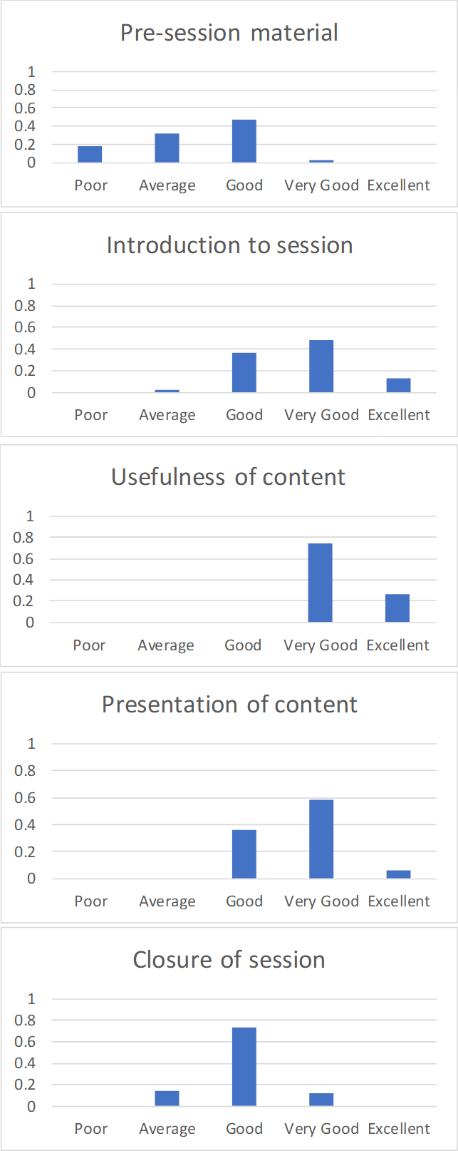
6. Visualising the data: So how might we look at the evaluation of Bob’s session?
How about visually…so that we can easily see what is going on and take meaningful action. How about this set of bar graphs?
There’s no computational madness, just the raw data presented in such a way as to see the patterns within:
The pre-session material needs working on, as does the closure of the session;
However, all is not lost. People clearly found the content very useful;
…Bob just needs to make some obvious improvements. She could seek help from people with expertise in these areas.
Note: There is nothing to be learned within an overall score of ‘2.4’…and plenty of mischief.
such variety is hugely important, particularly in service organisations (e.g. see ‘I’m just a spanner’);
we should make sure that we uncover (rather than hide) variation…so that we can properly understand what’s going on (e.g. see ’80 in 20…erm, how can we change that’).
Donald Wheeler, in his superb book ‘Understanding Variation’, nicely sets out Dr Walter Shewhart’s1‘Rule One for the Presentation of Data’:
“Data should always be presented in such a way that preserves the evidence in the data…”
Or, in Wheeler’s words “Data cannot be divorced from their context without the danger of distortion…[and if context is stripped out] are effectively rendered meaningless.”
And so to a key point: The Net Promoter Score (NPS) metric does a most excellent job of stripping out meaning from within. Here’s a reminder from my previous post that, when asking the ‘score us from 0 – 10’ question about “would you recommend us to a friend”:
A respondent scoring a 9 or 10 is labelled as a ‘Promoter’;
A scorer of 0 to 6 is labelled as a ‘Detractor’; and
A 7 or 8 is labelled as being ‘Passive’.
….so this means that:
A catastrophic response of 0 gets the same recognition as a casual 6. Wow, I bet two such polar-opposite ‘Detractors’ have got very different stories of what happened to them!
and yet
a concrete boundary is placed between responses of 6 and 7 (and between 8 and 9). Such an ‘on the boundary’ responder may have vaguely pondered which box to tick and metaphorically (or even literally) ‘tossed a coin’ to decide.
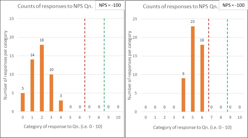
Now, you might say “yeah, but Reichheld’s broad-brush NPS metric will do” so I’ve mocked up three (deliberately) extreme comparison cases to illustrate the stripping out of meaning:
First, imagine that I’ve surveyed 100 subjects with my NPS question and that 50 ‘helpful’ people have provided responses. Further, instead of providing management with just a number, I’m furnishing them with a bar chart of the results.
Comparison pair 1: ‘Terrifying vs. Tardy’
Below are two quite different potential ‘NPS question’ response charts. I would describe the first set of results as terrifying, whilst the second is merely tardy.
Both sets of results have the same % of Detractors (below the red line) and Promoters (above the green line)…and so are assigned the same NPS score (which, in this case would be -100). This comparison illustrates the significant dumbing down of data by lumping responses of 0 – 6 into the one category.
I’d want to clearly see the variation within the responses i.e. such as the bar charts shown, rather than have it stripped out for the sake of a ‘simple number’.
You might respond with “but we do have that data….we just provide Senior Management with the single NPS figure”….and that would be the problem! I don’t want Senior Management making blinkered decisions2, using a single number.
I’m reminded of a rather goodInspector Guilfoyle posterthat fits perfectly with having the data but deliberately not using it.
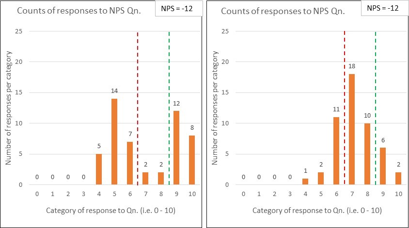
Comparison pair 2: ‘Polarised vs. Contented’
Below are two more NPS response charts for comparison….and, again, they both derive the same NPS score (-12 in this case) …and yet they tell quite different stories:
The first set of data uncovers that the organisation is having a polarising effect on its customers – some absolutely love ‘em …whilst many others are really not impressed.
The second set shows quite a warm picture of contentedness.
Whilst the NPS scores may be the same, the diagnosis is unlikely to be. Another example where seeing the variation within the data is key.
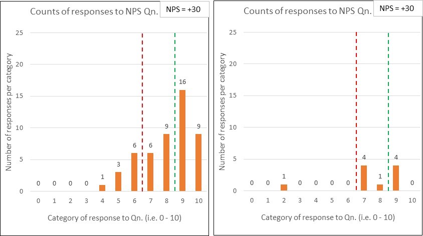
Comparison pair 3: ‘No Contest vs. No Show’
And here’s my penultimate pair of comparison charts:
Yep, you’ve guessed it – the two sets of response data have the same NPS scores (+30).
The difference this time is that, whilst the first chart reflects 50 respondents (out of the 100 surveyed), only 10 people responded in the second chart.
You might think “what’s the problem, the NPS of +30 was retained – so we keep our KPI inspired bonus!” …but do you think the surveys are comparable. Why might so many people not have responded? Is this likely to be a good sign? Can you honestly compare those NPS numbers? (perhaps see ‘What have the Romans ever done for us?!’)
….which leads me nicely onto the second part of this post:
Frequency: that NPS surveys should be frequently performed (e.g. weekly), rather than, say, a quarterly exercise.
The article doesn’t, however, refer to the essential need to always present the results over time, or whether/ how such ‘over time’ charts should (and should not) be interpreted.
Consistency: that the survey method should be kept constant because two different methods could produce wildly different scores.
The authors comment that “the consistency principle applies even to seemingly trivial variations in methodologies”, giving an example of the difference between a face-to-face method at the culmination of a restaurant meal (deriving an NPS of +40) and a follow-up email method (NPS of -39).
Response rate: that the higher the response rate, then the greater the accuracy – which I think we can all understand. Just reference comparison 3 above.
But the article goes to say that “what counts most, of course, is high response rates from your core or target customers – those who are most profitable…” In choosing these words, the authors demonstrate the goal of profitability, rather than customer purpose. If you want to understand the significance of this then please read ‘Oxygen isn’t what life is about’.
I’d suggest that there will be huge value in studying those customers that aren’t your current status quo.
Freedom from bias: that many types of bias can affect survey data.
The authors are clearly right to worry about the non-trivial issue of bias. They go on to talk about some key issues such as ‘confidentiality bias’, ‘responder bias’ and the whopper of employees ‘gaming the system’ (which they unhelpfully label as unethical behaviour, rather than pondering the system-causing motivations – see ‘Worse than useless’)
Granularity: that of breaking results down to regions, plants/ departments, stores/branches…enabling “individuals and small teams…to be held responsible for results”.
Owch….and we’d be back at that risk of bias again, with employees playing survival games. There is nothing within the article that recognises what a system is, why this is of fundamental importance, and hence why supreme care would be needed with using such granular NPS feedback. You could cause a great deal of harm.
Wow, that’s a few reliability issues to consider and, as a result, there’s a whole NPS industry being created within organisational customer/ marketing teams3…which is diverting valuable resources from people working together to properly study, measure and improve the customer value stream(s) ‘in operation’, towards each and every customer’s purpose.
Reichheld’s article ends with what it calls “The key”: the advice to “validate [your derived NPS number] with behaviours”, by which he explains that “you must regularly validate the link between individual customers’ scores and those customers’ behaviours over time.”
I find this closing advice amusing, because I see it being completely the wrong way around.
Rather than getting so obsessed with the ‘science’ of compiling frequent, consistent, high response, unbiased and granular Net Promoter Scores, we should be working really hard to:
“use Operational measures to manage, and [lagging4] measures to keep the score.”[John Seddon]
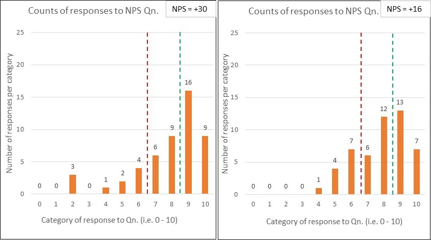
…and so to my last set of comparison charts:
Let’s say that the first chart corresponds to last month’s NPS survey results and the second is this month. Oh sh1t, we’ve dropped by 14 whole points. Quick, don’t just stand there, do something!
But wait…before you run off with action plan in hand, has anything actually changed?
Who knows? It’s just a binary comparison – even if it is dressed up as a fancy bar chart.
To summarise:
Net Promoter Score (NPS) has been defined as a customer loyalty metric;
There may be interesting data within customer surveys, subject to a heavy caveat around how such data is collected, presented and interpreted;
NPS doesn’t explain ‘why’ and any accompanying qualitative survey data is limited, potentially distorting and easily put to bad use;
Far better data (for meaningful and sustainable improvement) is to be found from:
studying a system in operation (at the points of demand arriving into the system, and by following units of demand through to their customer satisfaction); and
using operational capability measures (see ‘Capability what?’) to understand and experiment;
If we properly study and redesign an organisational system, then we can expect a healthy leap in the NPS metric – this is the simple operation of cause and effect;
NPS is not a system of management.
Footnotes
1. Dr Walter Shewhart (1891 – 1967) was the ‘father’ of statistical quality control. Deming was heavily influenced by Shewhart’s work and they collaborated together.
2. Blinkered decisions, like setting KPI targets and paying out incentives for ‘hitting it’.
3. I should add that, EVEN IF the (now rather large) NPS team succeeds in creating a ‘reliable’ NPS machine, we should still expect common cause variation within the results over time. Such variation is not a bad thing. Misunderstanding it andtamperingwould be.
4. Seddon’s original quote is“use operational measures to manage, and financial measures to keep the score” but his ‘keeping the score’ meaning (as demonstrated in other pieces that he has written) can be widened to cover lagging/ outcome/ results measures in general…which would include NPS.
Seddon’s quote mirrors Deming’s ‘Management by Results’ criticism (as explained in the previous post).
 …nor in your (leading1) measures of success.


 So, let’s walk through this table.
 Let’s move away from Bob’s presentation skills.
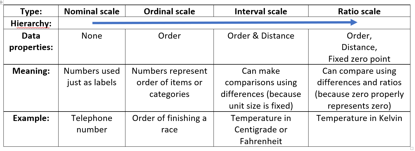
 6. Visualising the data: So how might we look at the evaluation of Bob’s session?
 This post is a promised follow up to the recent
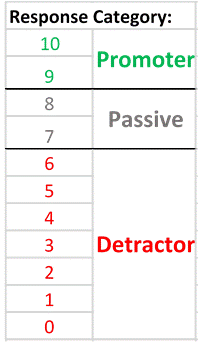 A respondent scoring a 9 or 10 is labelled as a ‘Promoter’;